Your Brand’s Type Is Where Trust Quietly Begins
There’s a tiny moment in branding that most teams never really talk about. It happens before your logo gets admired, before your color palette has a chance to shine, and definitely before anyone reads a full sentence. In that split-second, people instinctively decide: Do I trust this brand?
The funny thing is, this first impression rarely comes from the things brands obsess over. Instead, it often comes from something subtle - the typeface. Yes, those letters you call “fonts.” They may look quiet, but they whisper (and sometimes shout) clues about who you are.
You might be wondering how something so basic could matter this much. The reason is simple: type is storytelling without words. It’s a tone. A personality. A silent handshake. And that handshake happens instantly.
But I digress… let’s get back to fonts.
Fonts: The Silent Voice Your Brand Speaks With
Some brands stay in your memory not because of their complex logos but because their typography feels unmistakably theirs. The shapes, the curves, the weight distribution - all of it carries emotional weight.
You don’t consciously read a font. You feel it. And that feeling becomes your brand’s first impression.
Different Styles, Different Signals
Let’s break down how fonts quietly influence perception:
Bold, geometric fonts radiate confidence and stability. They feel strong, like a brand that won’t crack under pressure.
Thin, delicate typefaces suggest elegance and refinement. Think luxury, boutique, curated experiences.
Rounded fonts soften every interaction. They feel warm, welcoming, friendly - almost like a casual smile in letter form.
These micro-signals add emotional texture, the way seasoning transforms a bland meal into something memorable.
These micro-signals add emotional texture, the way seasoning transforms a bland meal into something memorable.
Typography: A Strategy, Not Decoration
Many brands treat fonts as decorative “nice-to-haves,” but typography is actually structural. If your visual identity were a house, type would be its foundation. A shaky foundation… well, you get the point.
A fintech brand using an overly quirky typeface feels unserious.
A luxury brand using clunky, pixelated text feels cheap.
These mismatches weaken credibility before the user reads a single word.
Typography is strategy wearing the clothes of design.
Typography and E-Commerce Trust: A Make-or-Break Moment
Online visitors make snap judgments. Research often mentions that people form an opinion in less than a second - give or take. Pretty wild if you think about it.
That first second is shaped by layout, spacing, colors… and especially typography.
Readable Fonts Create Instant Comfort
When users see clean, readable type, their first subconscious reaction is:
"Okay, this feels safe."
Unreadable or overly stylized fonts make people pull back. Sometimes they don’t even know why.
Consistency Feels Like Professionalism
Mixing fonts across pages (homepage, product pages, checkout, emails) creates cognitive friction. If the brand voice shifts visually, the user senses instability.
Consistent type, on the other hand, feels like the brand knows what it’s doing.
Mobile-Friendly Fonts Carry Trust Across Devices
A font that looks great on a desktop can collapse into chaos on a small phone screen.
Bad mobile typography destroys trust instantly.
And we’re not even getting into the technical issues yet:
Heavy font files slow websites down. Unlicensed fonts create legal risks. Unoptimized typography causes rendering problems.
This is why modern teams treat fonts as part of digital brand security.
Five Smart Rules for Choosing the Right Font
Finding the right typeface isn’t magic. It’s more like setting the tone for a long conversation.
1. Identify Your Brand Personality
Is your brand modern, classic, friendly, technical, bold, or understated?
Your font should match that personality like a voice matches a face.
2. Prioritize Readability
If people struggle to read your content, they won’t trust your content. It’s as simple as that.
3. Use a Consistent Font Family
Across web, print, packaging, social… everywhere.
Consistency turns scattered signals into one steady message.
4. Choose Fast-Loading, Browser-Safe Web Fonts
Typography shouldn’t slow down your site.
Lightweight, optimized fonts support performance and clarity.
5. Always Test on Mobile
Different screens distort letter shapes in surprising ways.
Check weight, spacing, and balance across multiple devices.
How Colors and Fonts Shape Emotion Together
Type sets tone. Color sets mood.
Together, they shape emotional perception almost instantly.
A few common combinations:
Black & white — timeless, confident, clean
Neutral & beige tones — modern, balanced, minimal
Bright colors — energetic, bold, youth-oriented
Pastels — gentle, friendly, elegant
You can add texture, micro shadows, or subtle gradients to enhance personality… just don’t overdo it. That’s where things start to look messy fast.
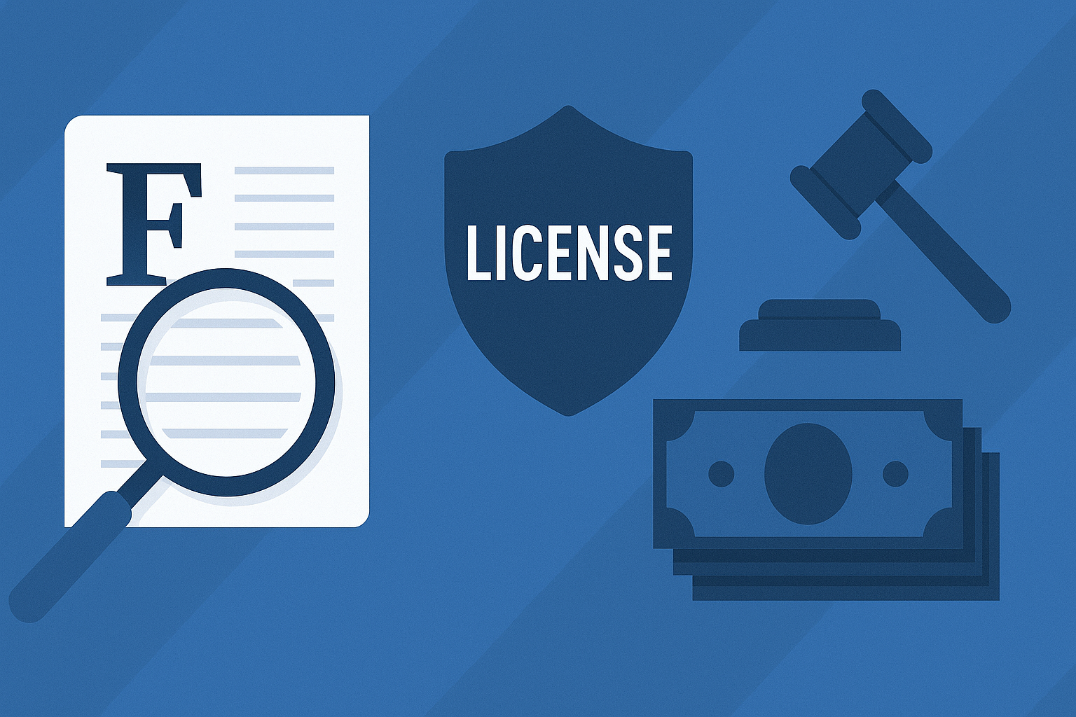
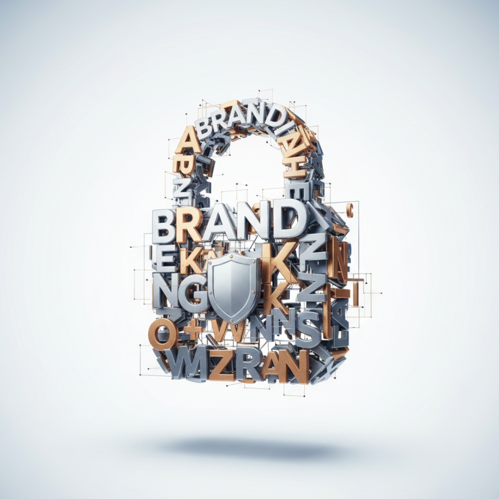
Font Security: The Hidden Shield Behind Your Brand
Here’s the part most teams never expect: typography involves legal responsibility.
A surprising number of brands unintentionally use unlicensed fonts.
Sometimes agencies forget to transfer licenses. Sometimes someone downloads a “free” file from a sketchy site. Sometimes old projects hide expired licensing.
The Problems This Creates
Legal risks
Damaged reputation
Inconsistent identity
Slow or broken performance
Tools like FontCheckerPro now scan your digital assets to:
Verify font licenses
Detect inconsistencies
Analyze how typography is being used
Protect your brand from compliance issues
Think of it as a digital health check for your identity. Every letter gets verified as truly yours.
Building Trust, One Letter at a Time
Brands don’t earn trust through grand gestures; they earn it through details.
Colors shape emotion. Logos create recognition.
And fonts?
They whisper the truth about who you are.
Every headline, every button label, every tiny paragraph reinforces your voice. Long before visitors understand your story, your typography tells them what kind of storyteller you are.
If someone judged your brand based only on its letters… would they trust you?
A strangely helpful question to revisit now and then.
FAQ: Typography, Fonts & Brand Trust
1. Why do fonts influence trust so strongly?
Because people react emotionally before they react logically. Fonts shape tone and personality instantly, even before the reader processes the message. That emotional cue becomes a “trust signal.”
2. What kind of font feels most trustworthy?
Fonts that are readable, balanced, and consistent typically feel the safest. Sans-serifs often feel modern and clear, while serif fonts feel traditional and reliable. But the right choice depends on the brand personality.
3. Are custom fonts worth it?
They can be, especially for brands wanting a unique identity. But they require proper licensing, optimization, and performance testing. Many brands underestimate these steps.
4. How many fonts should a brand use?
Most strong identities use one primary font family with 2–3 weights. More than that often feels chaotic unless managed extremely well.
5. Do fonts affect SEO or performance?
Indirectly, yes. Heavy or unoptimized fonts slow down websites, which lowers user satisfaction and may impact SEO. Lightweight fonts improve loading speed and clarity.
6. What happens if my team accidentally uses an unlicensed font?
It can create legal risk, and in some industries, reputational damage. This is why tools that scan and verify licenses are becoming essential.
7. Should fonts be chosen before or after logo design?
Ideally, at the same time. Typography and logo design influence each other, and the final identity feels more cohesive when they grow together.