A Helvetica lookalike isn't automatically a safer choice. Most advice about a Helvetica font similar option stops at appearance, as if matching the silhouette solves the problem. It doesn't. In production, the font that looks closest can still change line breaks, wrap buttons, alter PDF pagination, trigger licensing issues, or add unnecessary payload.
A better comparison starts with specimens and metrics, then moves into real interface sizes and deployment rules. Teams should test x-height, width, spacing, weight coverage, hinting, fallback behavior, and what happens when the custom file fails to load. They should also separate web-font rights from desktop rights, because those rights often aren't interchangeable. That distinction matters for agencies handing off files, in-house teams generating PDFs, and compliance groups reviewing what was shipped.
Research supports taking a broader view. A readability study with 1,203 participants found only a small overall serif-versus-sans-serif difference in ease of reading, with serif fonts rated about 5.4% lower on the ease-of-reading scale, while Calibri scored highest and Garamond lowest among the six fonts tested in that comparison, according to Lyngo Lab's summary of the study. In other words, “sans serif” alone doesn't settle the question, and “looks clean” definitely doesn't.
This article is informational, not legal advice. If your team needs an exportable record rather than a design opinion, Font Checker Pro can audit live URLs, PDFs, images, and zipped font sets so you can document what's in use before a redesign, procurement review, or client handoff.
1. Inter – Open Source Sans-Serif with Permissive Licensing
Inter is often treated as the default open-source answer to Helvetica. That shorthand misses the decision. Inter is a production-friendly sans serif with different metrics, different spacing behavior, and a different legal and technical footprint.
For teams searching for a helvetica font similar option, that distinction matters. Inter usually works best when the goal is stable UI typography across web apps, dashboards, docs, and marketing pages, not when the goal is preserving Helvetica-driven line breaks or print pagination. Its larger x-height and screen-first drawing style tend to improve readability at interface sizes, but they can also change copy fit in navigation, tables, and buttons compared with narrower or more tightly spaced neo-grotesque faces.
Where Inter makes sense
Inter is strongest in digital product environments where screen rendering, variable font support, and broad weight coverage matter more than historical similarity. Designers get a neutral tone without inheriting a proprietary licensing workflow. Developers get a family built for modern web delivery, including a variable font option that can reduce file management complexity.
That does not make it the automatic choice.
If a team is replacing Helvetica in a design system with tightly constrained components, Inter should be tested as a metrics decision first. Compare real layouts, not specimen sheets. Check form labels, data tables, button copy, dense sidebars, and exported PDFs. A font can look close in a headline and still reflow interface text enough to create QA work later.
A practical test sequence helps:
- Measure width and wrap behavior: Review whether labels, menus, and table columns expand or contract compared with the current Helvetica setup.
- Check weight coverage against actual usage: Confirm that the family includes the weights your product, brand, and document templates already rely on.
- Test rendering in context: Compare browser, operating system, and PDF output, especially at smaller UI sizes where stroke handling changes the feel of the interface.
- Separate rights by workflow: Web use, local installation in design tools, app embedding, and client handoff can raise different licensing questions even with open-source fonts.
- Document what shipped: If compliance or procurement needs evidence, verify the delivered font files and fallback stack rather than assuming the design spec matches production.
Inter is usually a defensible choice for organizations that want an open-source sans serif with a clean deployment path and good screen behavior. It is less defensible as a drop-in Helvetica substitute for regulated documents, fixed-layout assets, or legacy brand systems where metric compatibility matters more than visual tone.
2. IBM Plex Sans – Enterprise-Grade Open Source with Clear Attribution
IBM Plex Sans makes the most sense in organizations that are choosing a font policy, not chasing a visual stunt. As a Helvetica alternative, its value comes from governance, family range, and traceable usage rights as much as from appearance.
That distinction matters in production.
Plex usually reads as slightly more expressive than Helvetica, with shapes that feel less anonymous in interface copy and internal documentation. For some brand systems, that is a drawback. For procurement, legal, and design-ops teams, it can be useful because the type choice is easier to identify, document, and audit across web assets, design files, exported PDFs, and installed desktop environments.
The practical question is not whether Plex is the closest match on a specimen sheet. The practical question is whether it holds layout discipline well enough for your real templates while reducing approval friction. In many enterprise settings, that answer is yes, especially if the current goal is to replace ad hoc font usage with a family that has a clear open-source license path and broad style coverage.
Two checks matter more here than pure visual similarity:
First, compare width and x-height against the Helvetica-based materials you already ship. Plex Sans can change line breaks, table density, and form-label fit, so it should be reviewed in dashboards, policy documents, reporting templates, and transactional emails before approval.
Second, separate license comfort from legal certainty. Open licensing often simplifies deployment, but teams still need to confirm how they are using the files across web serving, local installation, app packaging, vendor handoff, and archived deliverables. For teams documenting those distinctions, this practical guide to the Open Font License for teams gives a useful framework. It is still not a substitute for counsel where contractual or regulated use is involved.
A better way to judge Plex is by operational fit:
- Choose it for managed systems: It works well in design systems, documentation sets, client portals, and internal products that need one coordinated sans family across many touchpoints.
- Treat metric changes as a QA cost: If your current layouts are tightly tuned to Helvetica widths, test reflow before rollout.
- Use its distinct identity deliberately: Plex is easier to defend as an intentional choice than as an invisible clone.
- Keep records of the exact files deployed: Compliance review is easier when teams can show what was served, embedded, or installed rather than what a style guide intended.
IBM Plex Sans is rarely the safest answer for fixed layouts that must stay visually close to Helvetica. It is often the safer answer for organizations that need a documented, auditable font standard with fewer licensing questions and a clearer paper trail.
3. Roboto – Google's Helvetica Alternative for Android and Web
Roboto is often recommended as a Helvetica substitute, but the stronger reason to choose it is operational, not aesthetic. It ships well across Android-heavy products, it is familiar in UI contexts, and it usually creates fewer surprises for app teams than a closer visual homage to Swiss grotesks.
That distinction matters. A font can resemble Helvetica and still be the wrong production choice if its widths, rendering behavior, or licensing model create extra QA work.

Roboto generally reads larger and more open than Helvetica because of its proportions and spacing. In practical terms, that can help small interface text stay readable on dense screens, but it also means it is not the safest candidate for layouts tuned tightly to Helvetica line breaks. Designers replacing Helvetica in marketing pages, PDFs, or regulated templates should test navigation labels, form fields, table columns, and multi-line buttons before treating it as a low-risk swap.
Its strongest use case is digital product work with broad device coverage. Android familiarity reduces the chance that Roboto feels out of place in app UI, support content, dashboards, and product documentation. Teams also benefit from wide weight coverage and mature webfont support, which makes it easier to standardize one family across design files, front-end systems, and packaged applications.
A useful way to judge Roboto is to separate three questions that often get blurred together:
Does it look close enough? Close enough for many interface patterns, yes. Close enough for strict Helvetica replacement, often no.
Will it behave well in production? Usually yes for web and app delivery, especially where screen rendering matters more than print-era metric fidelity.
Is the licensing story simple enough for deployment? Usually simpler than commercial Helvetica licensing, but teams still need to confirm how files are served, embedded, installed locally, and handed off to vendors or archived with deliverables.
That last point is where compliance teams should stay careful. Open or permissive licensing can reduce friction, but it does not remove the need for records. Keep the exact font files, version history, delivery method, and any packaging decisions for mobile apps or client handoff. If a later audit asks what was deployed, a screenshot of a style guide will not answer the question.
For performance, Roboto is usually a better web choice than licensed Helvetica files served into a stack that then falls back unpredictably across devices. If your priority is payload discipline, though, a system stack may still be more defensible because it avoids font downloads altogether. If your priority is brand continuity with existing Android-oriented UI, Roboto often wins the trade-off.
Choose Roboto when you need a familiar, readable sans for apps and web interfaces, and when small metric differences are acceptable. If the job requires Helvetica-like widths, exact fallback control, or a legal position tied to licensed originals, Roboto should be tested as an alternative, not assumed as a substitute.
4. DM Sans – Minimalist Open-Source Helvetica Proxy
DM Sans is useful in a narrower set of cases than many Helvetica-alternative lists suggest. It is not a metric stand-in for Helvetica, and treating it like one can create avoidable reflow in navigation, buttons, and dense UI labels. The better reason to choose it is operational. It gives teams a clean, modern sans with open-source distribution, modest visual personality, and enough compactness to support restrained interface systems.
That distinction matters in production.
Helvetica replacement decisions often get framed as visual resemblance first. DM Sans is easier to justify when the decision starts with deployment constraints instead: acceptable text expansion, required weights, webfont payload, and whether desktop installation or document embedding needs separate review.
Where DM Sans holds up
DM Sans tends to read clearly on screens at common UI sizes, especially in product marketing pages, simple dashboards, and lightweight design systems where the type needs to stay unobtrusive. Its proportions feel controlled rather than editorial, which helps if a brand wants neutrality without inheriting the stronger associations of older neo-grotesque defaults.
Its family design also supports a practical compromise. Teams can ship a limited set of styles for web use and keep the interface visually consistent without loading a large typographic palette. That can reduce file overhead, but only if the project uses a narrow weight range.
A better evaluation framework is to ask four questions:
- Will width changes break layouts? DM Sans can feel compact, but it is not a drop-in Helvetica match. Test menu items, form labels, pricing tables, and truncated strings before approving it.
- Do you need broad weight coverage? If the system depends on many intermediate weights for hierarchy, verify what is available in the files you plan to ship.
- Is screen use the primary target? DM Sans is easier to defend for web and app interfaces than for workflows built around print fidelity or PDF replacement.
- Can your team document the license and distribution path? Open-source availability reduces friction, but agencies and compliance teams still need records for local installs, handoff packages, and archived deliverables.
One non-obvious trade-off is fallback behavior. A minimalist sans can look close enough in mockups, then diverge once the webfont fails and the browser falls back to a system font with different widths and spacing. If layout stability matters more than aesthetic similarity, a system stack or licensed Helvetica may be the safer choice because the behavior is easier to predict and audit.
Choose DM Sans when the brief calls for a quiet UI sans, open-source distribution, and some tolerance for metric drift. If the job requires Helvetica-like measurements, broader enterprise licensing assurances, or strict document reproduction, test DM Sans as an independent production choice rather than as a proxy by assumption.
5. Source Sans Pro – Adobe's Open-Source Pro Alternative
Source Sans Pro makes the strongest case when the brief is operational, not nostalgic. Teams that need one sans for interface labels, dense tables, help content, and exported reports often get more value from stable reading behavior than from a close Helvetica impression.
That is the key distinction here.
Helvetica alternatives usually get judged on silhouette first. In production, Source Sans Pro is better judged on how it handles text-heavy screens, repeated numeric patterns, and mixed-content systems where navigation, metadata, and body copy sit side by side. Its proportions and spacing are not a metric clone of Helvetica, so it should not be treated as a drop-in replacement for fixed layouts. But its larger, clearer reading texture can reduce friction in dashboards, policy portals, and documentation-heavy products.
A practical review looks less like a style debate and more like a handoff checklist:
- Compare widths in real components, especially tables, sidebars, and button labels that were designed around tighter Helvetica copy.
- Confirm weight coverage for both screen UI and brand usage, instead of assuming the family shipped to design tools matches what engineering will deploy.
- Test numeral features and alignment in data views, since reporting interfaces often expose weaknesses faster than marketing pages.
- Review license terms separately for web embedding, local installation, editable files, and archived client deliverables. Open-source availability helps, but legal and procurement teams may still want a documented interpretation for specific distribution models.
Source Sans Pro tends to be a stronger choice for information architecture than for visual impersonation. That makes it useful in systems where people read, scan, compare, and export content all day. If the requirement is tighter metric compatibility, highly predictable fallback behavior, or document reproduction that must stay close to an existing Helvetica-based workflow, a system stack or properly licensed Helvetica can still be the more defensible production choice.
6. Outfit – Contemporary Variable Font with Accessible Licensing
Outfit works better as a fresh production choice than as a Helvetica stand-in. The family has a contemporary, open texture, and that matters in practical terms. At small UI sizes, it reads larger and slightly less compact than Helvetica, so teams should expect copy to occupy more horizontal space in tight components.
A useful test is simple: set the same navigation labels, table headers, and button text in Outfit and Helvetica at 13px. In many interfaces, Outfit's higher apparent x-height and roomier fit will improve legibility, but labels that were tuned around Helvetica's tighter width can wrap earlier. That makes Outfit a reasonable option for new systems, yet a weaker candidate for retrofitting existing layouts that depend on stable line breaks.
Its variable format is part of the appeal, but the licensing angle matters just as much. Teams that need one family across mockups, websites, and product UI often prefer a font with fewer procurement frictions than traditional commercial desktop and web arrangements. That said, “accessible licensing” is still not the same as universal permission. Legal or procurement review may still be necessary if the project includes app embedding, editable client handoff, archived source files, or other distribution scenarios.
Outfit is strongest in design systems that want a single sans family with broad weight control and a more current tone than Helvetica. It is less convincing where metric predictability matters more than style, especially in inherited templates, regulated document workflows, or interfaces already tuned to Helvetica-based fallbacks.
Before approving it, run three production checks:
- Compare 13px and 14px text against Helvetica in real UI strings, then record line-break shifts in menus, filters, and dense settings screens.
- Verify whether the widths of regular and semibold text change component behavior, since button labels and tab sets often reveal spacing problems first.
- Review fallback behavior in the actual stack. If Helvetica or a system sans appears before Outfit loads, measure the visual jump rather than assuming it will be minor.
Outfit can reduce font-management overhead and give new products a cleaner voice. If the brief calls for close Helvetica behavior under constrained widths, low-risk fallback swaps, or document fidelity across environments, a system stack or properly licensed Helvetica remains easier to defend.
7. Helvetica Neue Alternatives via Commercial Licensing
A close substitute is not always the lower-risk choice. If a company already runs on Helvetica Neue across packaging, PDFs, signage, shared templates, and vendor files, changing fonts can create width changes, reflow, approval delays, and licensing questions that are harder to audit than paying for the original.
The production question is simple. Are you trying to match a look, or preserve an existing system?
Helvetica Neue often earns its keep in environments where consistency matters more than saving on font files. Teams with inherited document libraries, regulated communications, or external production partners usually care less about abstract similarity and more about whether a replacement keeps line lengths, labels, and approved layouts stable. A metrically looser alternative can look acceptable in a mockup and still break dense tables, packaging copyfit, or multilingual UI strings once it reaches production.
That makes commercial licensing a practical option, not just a branding preference.
Instead of asking whether a substitute resembles Helvetica Neue, ask whether substitution reduces total risk across these areas:
- Metric stability: Compare line breaks, character widths, and vertical spacing in live assets, not specimen sheets.
- Weight coverage: Confirm the licensed family includes the weights and italics already used in templates, codebases, and exported documents.
- Rendering behavior: Test small text on the operating systems and browsers your users have.
- Rights by channel: Desktop use, web embedding, app inclusion, PDF circulation, and editable handoff are often licensed separately.
- Audit trail: Procurement records, renewal terms, and named font files should be easy to trace during review.
The licensing side is where many font decisions become expensive. An organization may be cleared for desktop installation and still need separate rights for web delivery or software embedding. Archived source files can create another review point if outside agencies, printers, or clients receive editable packages. This article is informational, not legal advice. Counsel or procurement should still review the agreement against the actual distribution model.
A useful rule applies here. Buy Helvetica Neue when the requirement is operationally real. Replace it when the request is mostly stylistic and the organization can tolerate small metric differences, fallback shifts, and a fresh approval cycle.
That distinction saves time. It also produces a more defensible record if compliance, procurement, or brand governance asks why the team chose the original instead of a lookalike.
8. Ubuntu Font – Canonical's Professional Open-Source Sans
Ubuntu is a production choice for teams that want to stop chasing Helvetica similarity and solve for tone, readability, and rights in one move.
Its shapes are more humanist, the rhythm is more open, and the voice is more branded than a neutral grotesk. That makes Ubuntu a weak match if your brief is strict visual substitution. It can be a strong match if the requirement is a professional sans that stays readable in product UI, documentation, and internal systems while remaining open source.
The practical trade-off is metric behavior. Ubuntu's proportions and character shapes will not drop into Helvetica-driven layouts without visible change. Expect different line wraps, a different texture in paragraphs, and a more noticeable personality in headings and navigation. For agencies and in-house teams, that means less time asking, “Does it look close enough?” and more time testing whether the revised spacing still works across templates, components, and exported files.
Licensing is the other reason to evaluate Ubuntu carefully. The font is open source, but its license is not the same one many legal and procurement teams see most often. That usually shifts Ubuntu from a quick design decision to a reviewable asset decision. Compliance teams should confirm the exact font files in use, the approved source, and whether the planned uses include web delivery, desktop installation, app bundling, document circulation, or editable handoff. This article is informational, not legal advice. Counsel should still review the license against the actual distribution model.
A useful way to frame Ubuntu is by failure mode.
If replacing Helvetica would create brand-review friction because the new typeface feels too anonymous, Ubuntu can solve that. If replacing Helvetica would break a tightly tuned layout because the original metrics matter, Ubuntu is the wrong shortcut.
Best-fit cases are usually specific:
- Product interfaces that need warmth without becoming casual
- Developer-facing docs and dashboards where clarity matters more than Helvetica mimicry
- Organizations that prefer open-source font workflows and can document approval cleanly
Ubuntu works best as a deliberate departure. Teams that need close visual continuity, fallback stability, or legal certainty around an existing Helvetica-dependent system should either stay with licensed Helvetica or choose a substitute with nearer metrics.
9. Work Sans – Minimalist Variable Font for UI and UX Design Systems
Work Sans makes the most sense when the brief is operational, not nostalgic. Teams choosing it are usually optimizing for controllable web delivery, broad weight options, and a neutral enough texture for interface copy, labels, and product marketing that need to coexist inside one system.
Its case against Helvetica is not visual mimicry. It is production behavior.
For UI work, that distinction matters. Work Sans generally reads larger than tighter neo-grotesque faces because of its proportions, so the same nominal font size can shift line breaks, button widths, and table density. That means it is rarely a drop-in substitute for layouts tuned around Helvetica metrics, but it can be a cleaner design-system choice when you have room to retune spacing tokens instead of preserving an inherited spec.
A practical way to evaluate it is through three implementation questions rather than a lookalike test.
First, how much typographic range does the system need? Variable font support gives designers and developers more control over weight selection without managing a long list of static files. That can simplify component libraries, especially where headings, labels, helper text, and navigation all need distinct emphasis levels.
Second, how sensitive is the product to width changes? Work Sans can alter wrap points faster than closer Helvetica substitutes, so teams should test forms, nav bars, pricing tables, and translated strings before approving it. If those layouts are already tight, a nearer-metrics alternative or licensed Helvetica may be easier to defend.
Third, who has to approve the asset trail? Work Sans is often easier to document than commercial desktop and web font mixes, but approval still depends on the exact files, source, hosting method, and distribution model. Agencies handing off editable files, product teams self-hosting web fonts, and organizations bundling fonts into apps should still confirm that the planned use matches the license terms. This article is informational, not legal advice. Counsel should review edge cases.
If you're trying to build a scalable design system, Work Sans is useful because it forces a healthy decision: tune the system around the font you can ship and govern, or keep Helvetica because the existing metrics, brand precedent, and fallback behavior already justify the license cost.
Use Work Sans when the priority is a disciplined UI type system with adjustable weights and manageable deployment. Pass on it when close Helvetica continuity is the requirement.
10. System Font Stacks and FontCheckerPro Auditing – Licensing-Free Strategy with Compliance Monitoring
The closest Helvetica substitute may be no substitute at all. For many interfaces, a system font stack is the cleaner production decision because it removes font payload, reduces rendering dependencies, and avoids the separate licensing questions that appear once teams self host, embed, or redistribute font files.
That trade-off matters most in software, account areas, support centers, and other products that change often. In those environments, typography is judged less by brand romance and more by width stability, fallback behavior, audit trails, and failure tolerance.
A system stack also changes how “Helvetica similar” should be evaluated. Instead of asking whether one family mimics Helvetica's shapes, ask whether the stack preserves readable x-height across platforms, keeps common UI labels from reflowing unpredictably, and holds up when a device falls back to a different default sans-serif. The answer is sometimes yes, and that can make a licensed Helvetica deployment harder to justify.
The practical model is simple: use the operating system's native UI fonts for core interface text, then document where that policy stops. A stack such as -apple-system, BlinkMacSystemFont, 'Segoe UI', Roboto, sans-serif usually loads fast and degrades predictably, but it will not produce identical metrics on every platform. That is acceptable in many products. It is less acceptable in tightly art-directed campaigns, regulated templates, or interfaces where line breaks have already been tuned around a specific commercial family.
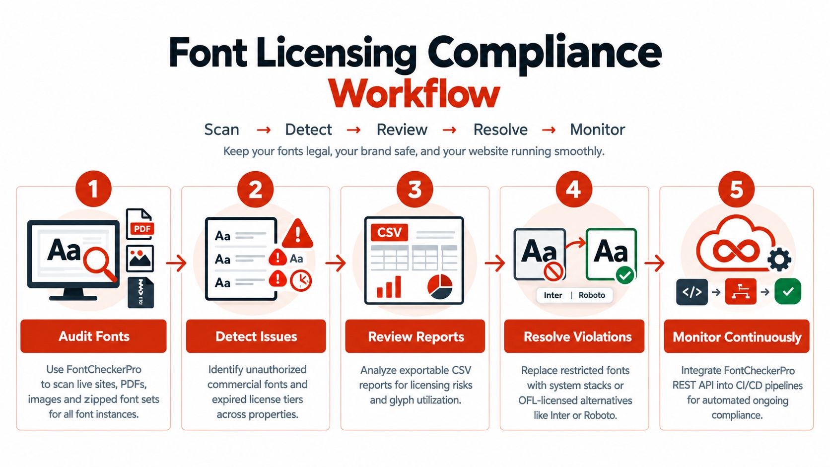
Compliance work shifts rather than disappears. If a team exports PDFs, ships editable design files, stores campaign archives, or embeds fonts inside apps, reviewers still need to verify what assets are in circulation. A “system fonts only” policy fails the moment a commercial font file appears in a prototype, handoff package, or microsite build.
Three checks usually separate a disciplined strategy from a casual one:
- Measure fallback tolerance. Test navigation, tables, buttons, and localized strings on multiple operating systems to see where width and x-height differences change wrap points or hierarchy.
- Map the asset boundary. Identify which outputs rely on live system fonts and which outputs, such as PDFs or images, may freeze a different typeface into the deliverable.
- Log exceptions. If a brand, legal, or campaign team introduces a licensed font anywhere in the workflow, record the file source, deployment method, and allowed uses so compliance review can follow the actual implementation.
FontCheckerPro is useful here in a narrow, factual sense. It helps teams inspect live properties and stored assets so the typography record reflects what shipped, not what the design system intended.
Use the system stack approach when performance, operational simplicity, and auditability matter more than exact Helvetica continuity. Keep licensed Helvetica, or a closer paid alternative, when the organization needs tighter metric control across outputs and is prepared to document the rights accordingly.
Top 10 Helvetica Alternatives, Quick Comparison
| Typeface / Strategy | Implementation Complexity | Resource Requirements | Expected Outcomes | Ideal Use Cases | Key Advantages |
|---|---|---|---|---|---|
| Inter – Open Source Sans-Serif with Permissive Licensing | Low, CDN or self‑host; variable font optional | Moderate, large glyph set; subset/variable reduces payload | Highly legible screen text with consistent rendering | Web apps, product UIs, design systems | OFL permissive, excellent hinting, wide adoption |
| IBM Plex Sans – Enterprise-Grade Open Source with Clear Attribution | Low–Moderate, CDN/self‑host; recommend subsetting | Moderate–High, multi‑weight family; robust character set | Enterprise-grade readability and accessibility | Corporate sites, accessibility‑focused systems, design systems | Backed by IBM, maintained, OFL with requested attribution |
| Roboto – Google's Helvetica Alternative for Android & Web | Low, Google Fonts CDN recommended; variable optional | Moderate–High, extensive weights and scripts | Consistent cross‑platform and Android-native appearance | Material Design, Android apps, large cross‑platform sites | Apache 2.0 (patent grant), global CDN, ubiquitous support |
| DM Sans – Minimalist Open-Source Helvetica Proxy | Low, minimal setup and deployment | Low, very small file sizes; limited variants | Neutral, performant Helvetica‑like appearance | Performance‑critical sites, startups, lean design systems | Tiny payload, OFL, functional Helvetica substitute |
| Source Sans Pro – Adobe's Open-Source Pro Alternative | Low–Moderate, CDN or self‑host; optimize for numerals | Moderate, professional features increase payload | Polished typographic results with strong numeral handling | Editorial content, financial/data apps, agencies | Adobe quality, OFL, superior numerals and spacing |
| Outfit – Contemporary Variable Font with Accessible Licensing | Low–Moderate, variable font syntax recommended | Low–Moderate, single variable file replaces many weights | Flexible, modern neutral typography with fewer requests | Responsive design systems, PWAs, adaptive typography | Variable font efficiency, OFL, contemporary proportions |
| Helvetica Neue Alternatives via Commercial Licensing | High, legal review, license tracking, governance needed | High, licensing fees, management, renewal overhead | Exact brand fidelity with indemnity and vendor support | Brands that must use authentic Helvetica for identity | Official licensing, legal indemnification, vendor support |
| Ubuntu Font – Canonical's Professional Open-Source Sans | Low, download or CDN; standard setup | Low–Moderate, modest family (4 weights) | Distinctive, friendly geometric sans with good legibility | Ubuntu/Canonical projects, tech brands, open‑source projects | Canonical‑backed, unique voice, permissive licensing (non‑standard) |
| Work Sans – Minimalist Variable Font for UI/UX Design Systems | Low–Moderate, variable usage advised; testing required | Low, variable file keeps payload small | Optimized UI performance and clear interface typography | UI/UX design systems, mobile/web apps prioritizing speed | UI‑focused design, OFL, variable font performance benefits |
| System Font Stacks & FontCheckerPro Auditing – Licensing-Free Strategy | Moderate, CSS stacks trivial; integrating audit tooling required | Low licensing cost; service cost for FontCheckerPro | Zero direct font licensing risk for body text plus audit trails | Performance-first sites, enterprises needing compliance reports | No font licenses, fastest rendering, automated compliance monitoring |
Choose by Use Case, Then Verify the Rights
The best Helvetica substitute isn't the one that looks closest in a specimen sheet. It's the one that survives real deployment without creating avoidable design, licensing, or maintenance problems. That usually means choosing by use case first, then proving the rights and technical behavior second.
If interface performance leads the brief, Inter and Work Sans are strong starting points. They fit modern UI work, keep the tone neutral, and adapt well to component-driven systems. Roboto is often the easier cross-platform choice when familiarity matters, especially in app-like experiences. DM Sans works well when you want a compact neutral system that stays visually quiet.
For structured enterprise environments, IBM Plex Sans and Source Sans Pro are often the better fit. They support documentation, dashboards, and operational content without feeling flimsy or trend-driven. Outfit is compelling when variable-font flexibility is part of the implementation plan and the team is prepared to test fallback behavior carefully. Ubuntu makes sense when you want a more distinctive open-source voice and you're comfortable clearing a less standard licensing path.
Then there's the option many articles underplay. Licensed Helvetica Neue can be the right answer when brand requirements are explicit, templates are already built around it, and the organization benefits from staying within an established typographic system. In those cases, replacing Helvetica may create more review work than it saves. On the other hand, if rendering speed, resilience, and licensing simplicity dominate, a system stack is often the most defensible decision available.
Whatever you choose, don't confuse open-source status, system-font availability, or widespread usage with blanket approval. Teams still need to verify the actual license, the source of the files, the embedding method, and the project terms. Web rights and desktop rights aren't interchangeable. Editable handoff files, PDFs, apps, and live websites may all trigger different review requirements. This article is informational, not legal advice.
The most reliable process is simple. Document invoices and license files. Record where font files came from. Test WOFF2 payload, fallback rendering, and any FOUT or FOIT behavior before rollout. Keep an auditable inventory of what's live, what's embedded in downloadable assets, and what sits inside design handoff packages. If your team needs exportable records for procurement, client delivery, or compliance review, a scanning tool such as Font Checker Pro can help maintain that typography inventory across URLs, PDFs, images, and archived font bundles.
Font decisions become much easier when you can see what's deployed. Font Checker Pro scans live URLs, PDFs, images, and zipped font sets, then returns exportable reports on typefaces, licensing signals, and performance details that matter when evaluating a Helvetica-like replacement. If you're standardizing a new stack or checking whether old Helvetica files are still in circulation, it gives designers, developers, agencies, and compliance teams a concrete record to review.