You're preparing a website handoff, and the brand guide names Futura Condensed Bold. The headline looks right, but the theme contains a font file nobody can trace to a purchase, while the designer's receipt only mentions desktop use. Before approving the launch, you need to establish which file is deployed and what its license permits.
That's the practical gap behind a search for the font Futura Condensed Bold. Recognizing the design doesn't establish the identity or rights of the digital asset. This guide is informational, not legal advice.
What Futura Condensed Bold Is
Futura Condensed Bold is a narrow, heavy cut of Futura, the geometric sans-serif designed by Paul Renner for the Bauer Type Foundry. It names a specific style, not a filter applied to regular Futura.
Think of Futura as the family and Condensed Bold as the sibling that grew up narrower and heavier. If a designer asks for this member, horizontally compressing another Futura style isn't an equivalent substitute.
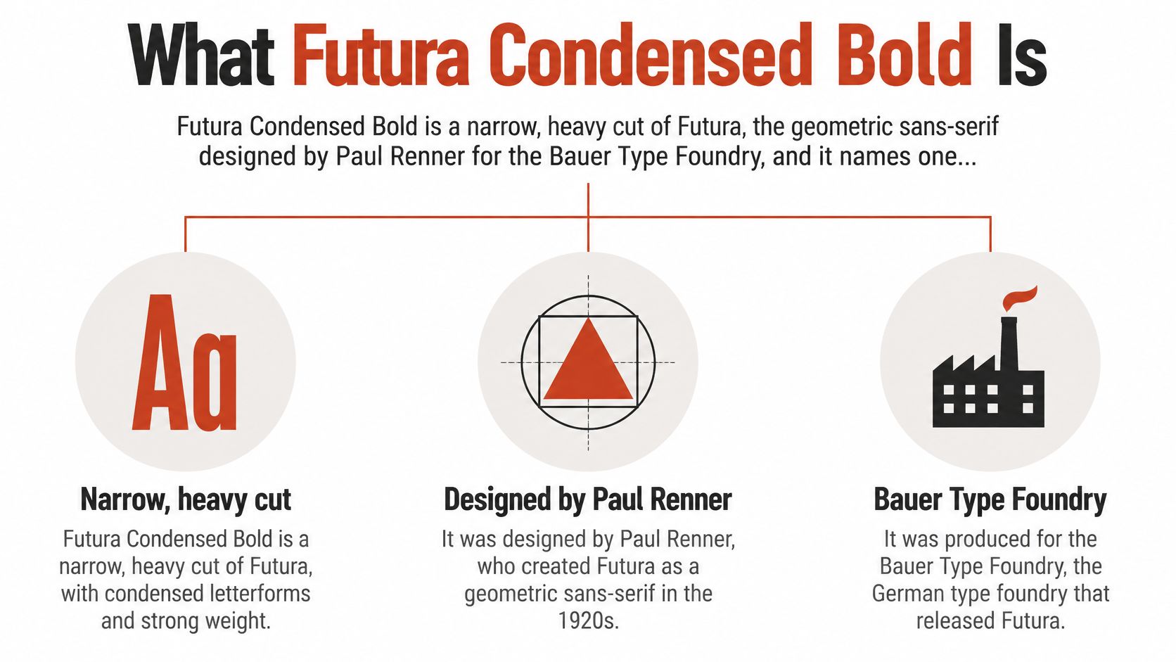
The Futura typeface history) records Renner's foundational designs in 1924–1926, commercial release in 1927, condensed bold and bold oblique in 1930, medium and extra-bold condensed styles with their obliques in 1936, and light condensed styles with their obliques in 1950. The family was associated with the New Frankfurt housing project and drew on circles and basic forms, but it wasn't a direct Bauhaus commission.
Contemporary descriptions commonly distinguish six regular-proportion weights and four condensed weights, with corresponding italics in many digitizations. Those modern releases aren't necessarily interchangeable interpretations of the original design.
Practical takeaway: A historically specific style name isn't a unique digital-file identifier.
For a brand refresh, preserve more than the name in the specification. Record the selected release so another designer doesn't replace it with a similarly labeled cut. The approval question is whether the file on your screen matches the intended design and whether its planned use is licensed.
Which Exact Futura Condensed Bold File You Have
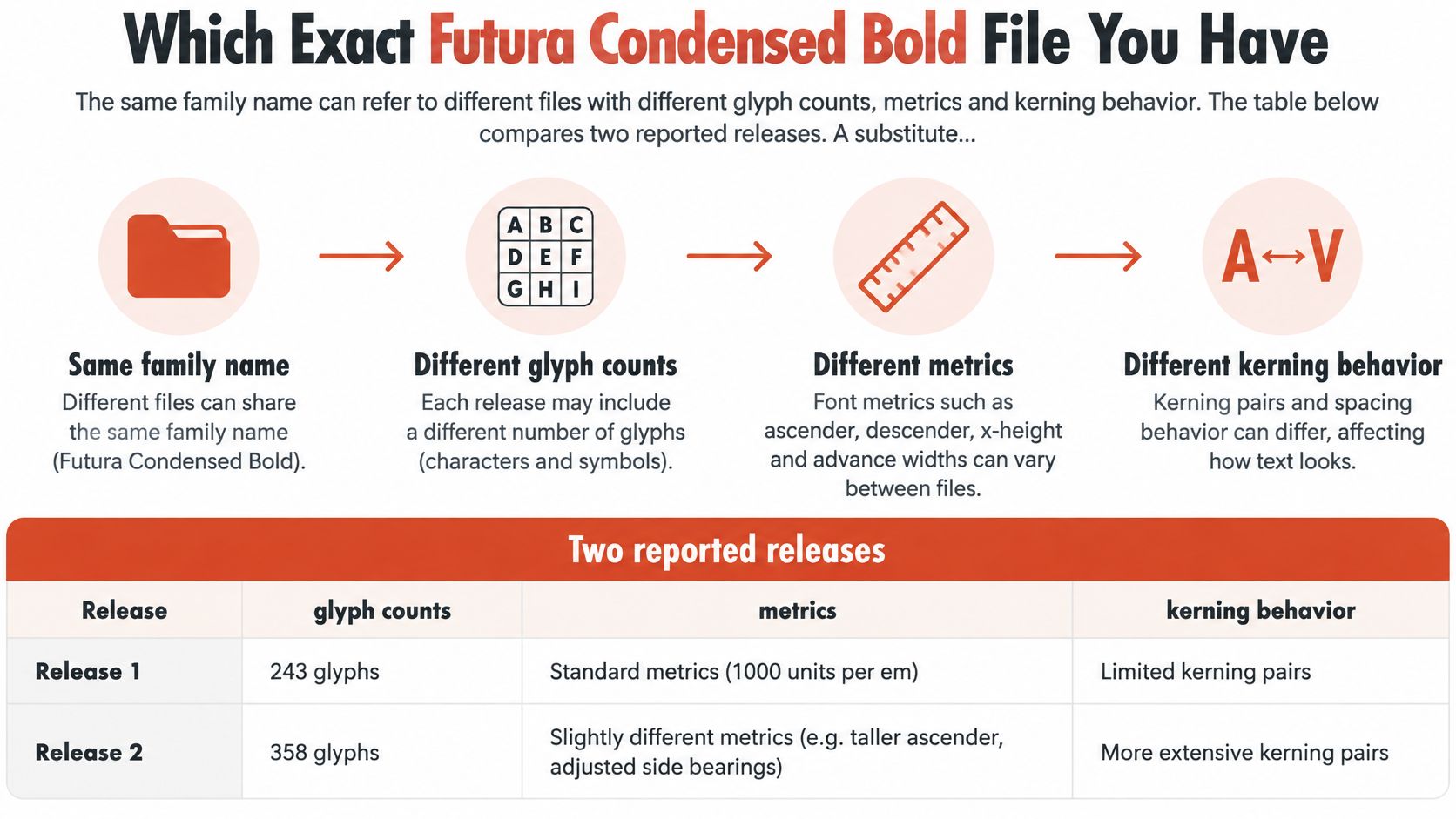
The same family name can identify files with different glyph inventories, metrics and kerning behavior. The FontsGeek Futura Condensed Bold specifications describe the reported releases compared below; measurements are in font units unless otherwise stated.
Metric differences between two Futura Condensed Bold releases
| Attribute | OpenType release | TrueType release |
|---|---|---|
| Glyphs | 229 | 399 |
| Units per em | 1,000 | 1,000 |
| Ascender | 1,015 | 766 |
| Descender | -261 | -233 |
| Total height | 1,276 | 1,149 |
| Maximum advance width | 1,234 | Not reported in the specification |
| Kerning | No stored kerning table | Kerning enabled |
A substitute can change headline widths, line breaks and baseline clearance despite an unchanged CSS family declaration. Condensed means narrower proportions, not monospacing or a fixed reduction in every text run.
- Inspect delivery. Open browser developer tools and filter the Network panel for fonts to find the actual assets.
- Record the mapping. Save each file's URL, format and CSS family name.
- Inspect metadata. Read the PostScript name, version and foundry from the file's name table.
- Compare metrics. Check glyph count, ascender and descender against the relevant release.
- Test representative text. Compare a headline and body line with their fallback rendering.
- Attach the rights record. Match the binary to its purchase and EULA. For PDFs, inspect embedded font names too.
Our guide to font file formats, licensing and performance explains why format belongs in this record.
FontCheckerPro can help record identification evidence. Our classification uses actual serving origins and AI visual identification, not just declared family names; license forensics shows whether evidence comes from the loading domain, Google/Adobe catalogue or self-hosted origin. Identification isn't warranted to be error-free, so verify the result against the file itself.
Licensing by Use for Print, Web and Apps
A desktop license isn't automatically a website license. Use the deployment, rather than the appearance of the finished design, to select the permission you need.
License type by use case
| Use case | License type usually needed | Watch for |
|---|---|---|
| Print materials and presentations | Desktop license | Seat count and named users or computers |
| Images and flattened PDFs | Desktop license | Confirm static outputs are covered |
| Video and advertising | Desktop license | Check that distributed video is listed |
Self-hosted website webfont through CSS @font-face |
Webfont license | A desktop license does not cover it automatically |
| CDN or server-distributed webfont | Webfont license | Confirm CDN delivery is named |
| Mobile app or embedded product | App or embedding permission specified by the EULA | Check the EULA; app rights vary by vendor |
| Logo or brand identity use | License expressly permitting the intended identity use | Check the EULA; don't assume it from a desktop purchase |
The LegalClarity font-licensing guide explains that desktop permissions generally cover installation on specified computers or use by specified employees to create static outputs, while web delivery requires separate authorization. Browsers receive font software to render live text, which makes deployment different from distributing a finished image.
For print and presentations, confirm who may install and operate the font. A shared studio folder doesn't establish permission for everyone who accesses it.
For images and flattened PDFs, confirm that static-output rights cover the deliverable. Don't assume that an editable document with embedded font software is equivalent to a flattened export.
For video and advertising, check the distribution and advertising language. The fact that an editor can render a title doesn't settle every permitted campaign use.
The brochure-to-website mistake
Say a marketing team holds a desktop license that permits brochure production. It creates the brochure, then copies a webfont version into the website theme. The brochure can fall within the purchased permission while the website deployment remains unauthorized.
For cost context, Font Bros lists Futura Condensed Bold from $19.95 on a page updated in 2026. That starting price describes an available purchase, not the scope of every permission your project requires.
Self-hosting and CDN delivery both need appropriate web rights. Hosting location may affect the contract requirements, but moving the file to another server doesn't turn desktop permission into web permission.
Separate embedding from identity use
A mobile app or embedded product requires examination of the relevant embedding terms. Logo and brand identity work also needs an explicit check of the permitted output, modification and handoff conditions.
Our explanation of web and desktop licensing differences helps separate these deployment categories. The governing rights still come from the foundry or reseller EULA attached to the exact file.
Font Checker Pro doesn't license typefaces to customers. Identifying a face in a report grants no right to use it.
Before publishing, confirm:
- License type. Match the purchase to the deployment.
- Covered uses. Check every planned deliverable.
- Limits. Record applicable users, machines, domains and distribution conditions.
This is informational guidance, not legal advice. For disputed terms, obtain qualified legal advice rather than treating a font identification as permission.
Web License Metering and Compliance Records
A campaign goes live, traffic climbs, and the page looks unchanged. If nobody compares page views with the contracted allowance, the first warning may be a licensing notice rather than an alert from the analytics dashboard. The design did not change, but the delivery volume did.
The Corporate Counsel Now font-licensing explanation describes audience-based licensing, including page-view measures and prepaid annual allowances that must be renewed or expanded when consumed. That metric applies because a webfont is delivered to visitors' browsers, not just to the designers who prepared the page. Desktop receipts and print invoices answer a different question; they do not prove a live deployment stays within its web scope.
Meter the contracted unit
Use the unit named in the EULA. If page views are the measure, track them against the annual allowance and note when the allowance resets. If domains are the measure, list every hostname that serves the font. A staging subdomain can load the same file as production and still sit outside the licensed domain list. Record that gap before launch, not after a review request.
Assign renewal ownership
Put the renewal date in the project calendar and name one person who can retrieve the contract and approve an upgrade. A shared inbox is not an owner. When the allowance nears its limit, that person decides whether to expand the allowance or reduce delivery.
Keep a deployment record
Copy this checklist into the project's compliance record:
- Licensed domains. Record the covered properties exactly as the contract identifies them.
- Annual allowance. Note the page-view allowance where that is the governing metric, or record the alternative measure.
- Renewal date. Assign a reminder and an accountable owner.
- Environment coverage. Verify subdomains, staging sites, mirrors and CDN delivery.
- Contract owner. Name the person authorized to retrieve documents and approve changes.
- EULA version. Preserve the terms that apply to the purchase.
Font Checker Pro matches each face to its foundry, license tier and origin. Those fields help locate the entitlement, but the contract record must establish what was purchased.
Review before the notice
Use an audit trail for font compliance to preserve deployment changes and the evidence supporting each approval. Save the applicable contract alongside the inventory instead of leaving it in a former employee's inbox. A dispute can require document review, corrective purchases, removal or deployment changes. There is no universal fine or standard settlement amount; the contract, circumstances and jurisdiction govern the outcome.
Implementing the Font in CSS Without Breaking Layout
Use the identified family name and point the declaration to the licensed file. This example uses a placeholder path, which must be replaced by your approved asset location:
@font-face { font-family: 'Futura Condensed Bold'; src: url('/fonts/futura-condensed-bold.woff2') format('woff2'); font-weight: 700; font-style: normal; font-display: swap; }
.campaign-heading { font-family: 'Futura Condensed Bold', 'Approved Condensed Fallback', sans-serif; font-weight: 700; }
The fallback name is also a placeholder, not a recommendation to install an unidentified font. Replace it with a tested, available condensed sans.
Match declarations to the asset
The family label should match your documented font mapping, using the name-table family as the starting point. The source declaration identifies the approved file and its format.
font-weight: 700 registers this asset as the bold cut so a matching bold request can select it rather than relying on synthetic emboldening. font-style: normal distinguishes the upright face from an oblique.
WOFF2 provides compressed webfont delivery, but use a supplied, licensed webfont rather than assuming conversion is permitted. Check the EULA before subsetting, converting or otherwise modifying the binary.
Control the fallback transition
font-display: swap shows fallback text while the file loads. That gives readers text sooner, but a differently proportioned fallback can cause visible reflow; our guide to font-display swap and fallback fixes explains that trade-off.
- Width mapping.
font-stretchselects properly registered width variants; it isn't a substitute for deploying the intended condensed design. A separate family name is often clearer. - Metric matching. Define a fallback face and tune
size-adjustagainst measured representative strings. Don't copy an adjustment from another release. - Layout checks. Test wrapping, clipping and line height during both fallback and final rendering.
Record the file size and load time in the browser's Network panel. Add those measurements and the tested fallback mapping to the audit record so a later replacement can be evaluated against an actual baseline.
Accessibility, Languages and Fallback Fonts
Futura Condensed Bold earns its place in headlines, logos and display branding. Its narrow proportions help create a compact visual statement, while its geometric construction gives short text a recognizable character.
Those strengths don't make it a universal reading face. Tight widths and heavy strokes can crowd small text, especially where readers must distinguish characters quickly in buttons, navigation or dense paragraphs.
Separate family expansion from file coverage
The Fonts In Use Futura 100 overview describes 12 scripts released in September 2025, a plan for 23 scripts overall, and a stated goal of reaching more than 90% of the world's population. Planned expansion includes major Indic scripts, Simplified Chinese and Hangeul.
That project doesn't mean a traditional Futura Condensed Bold binary suddenly contains those scripts. Coverage belongs to the selected file, not to every product sharing the family's heritage.
The newer project also includes optical-size options that adjust spacing and proportions for text-size use. That's a useful reminder to choose designs for their intended reading conditions rather than forcing a static bold-condensed face into every role.
Test the actual reading task
Use finished copy wherever possible. A character sampler can reveal missing glyphs, but it won't show whether a translated action label fits its button or whether fallback punctuation disrupts a sentence.
- Headline at target width. Check the approved wording inside the container.
- Body text at small sizes. As a practical test case, inspect paragraphs at 14 to 16 px, then at enlarged settings. This is a test range, not an accessibility guarantee.
- Buttons and navigation. Inspect wrapping, clipping and recognizable character shapes.
- Accented Latin characters. Include names, addresses and punctuation used in production.
- Localized strings. Test each target script with meaningful copy, not isolated characters.
- Fallback rhythm. Compare width, apparent size, baseline alignment and line spacing.
Don't solve failed interface tests by shrinking text until it fits. Use a more suitable text face, increase available space or revise the component.
Preserve selectable text where practical instead of turning every heading into an image. Test zoom and fallback rendering as part of the same approval, because users won't all encounter the page under the designer's preferred conditions.
A headline that fits in English can break in another language.
Alternatives Worth Testing When Futura Condensed Bold Does Not Fit
Alternative condensed bold faces to test
| Alternative | Best use | License model |
|---|---|---|
| Oswald | Tall, compact headlines and posters | SIL Open Font License, verify the source and version |
| Roboto Condensed | Interfaces and long text with a neutral tone | Verify the license bundled with the selected source and version |
| Barlow Condensed | Clean headlines and UI labels | SIL Open Font License, verify the source and version |
| Helvetica Neue Condensed Bold | Classic grotesque headlines | Commercial license; verify supplier-specific webfont terms |
These are testing candidates, not interchangeable substitutes. The suggested uses are starting judgments, not assurances about a particular release's language coverage or licensing scope.
An open license isn't unrestricted permission. Preserve the license text distributed with the selected version and check its conditions, including any provisions governing modification, redistribution or naming.
Shortlist by the requirement that failed
Start with the reason you're considering a replacement. A headline that needs a different tone calls for visual comparison; missing script support calls for a coverage review; an unsuitable deployment license calls for a rights review.
- Compare real compositions. Shortlist a small group and set the same headline, supporting paragraph and interface labels in each. Judge apparent size and spacing, not just identical CSS sizes.
- Repeat localization tests. Use the same translated strings and inspect the actual characters provided by each file. A family's broad reputation doesn't prove the chosen cut includes the required glyphs.
- Approve the deployment. Match each candidate's source, version and license to the planned output before making it part of the design system.
For a broader look at the grotesque direction, our guide to Helvetica-style alternatives for web design provides additional selection context.
Keep the original when it passes
Futura Condensed Bold may remain the right choice once the binary and rights are confirmed. Replacing it solely because another file is easier to download can create unnecessary brand inconsistency.
Choose an alternative when it solves a defined problem without introducing a worse one. A useful replacement must work across the design, required languages and licensed deployment, not merely resemble a specimen on screen.
Confirm Your Rights Before You Publish
Publication approval needs a dated record, not a confident recall of the family name. Run four checks and write the outcome beside each one, with the owner's role and the approval date. That record travels with the release.
- File identity. Log the format, foundry, PostScript name and version. Reconcile the deployed file with the approved file.
- Rights fit the output. Check the planned website, print, video, app or logo use against the actual license scope. A broad claim that the team owns Futura is not enough.
- Web deployment. Record the allowance, domains, environments and renewal responsibility. Confirm each entry is retrievable before release.
- Rendering. Test localized strings and fallbacks on the production build. An unresolved coverage or rights exception blocks the release.
Sign-off record
File identity: production engineer, approval date.
Rights review: brand or legal owner, approval date.
Web record: web lead, approval date.
Rendering: QA lead, approval date.
Font Checker Pro has indexed 8,300+ font families. A catalogue match belongs in the evidence folder, beside the signed record and the governing EULA. The release owner still approves the deployment.
This is informational guidance, not legal advice. Refer unclear contract language and questions about remedies to qualified counsel.
Confirm the file and the license before the next release.
Font Checker Pro scans live pages and uploaded assets to identify typefaces and produce exportable audit reports. Visit Font Checker Pro to document your Futura Condensed Bold deployment, then match the findings to your purchase records and governing EULA before approving publication.