The most popular advice about standard serif fonts is the least reliable. You're told serifs guide the eye, so pick one for long reading, avoid them on small screens, and treat any bundled or open source family as settled. That's a category judgment doing three different jobs, design, readability, and licensing, and it gets all three muddled. I would start the other way round. Name the exact family and file, test it at the size readers will use, then match the delivery format to a license that covers that use.
Standard Serif Fonts at a Glance
When people say standard serif fonts, they usually mean a short list of familiar families, not every serif ever drawn. The table below is a starting point for choosing, not a permission slip.
Common standard serif families and where they fit
| Family | Classification | Typical use | License note |
|---|---|---|---|
| Times New Roman | Transitional | Newspapers, books, office documents | Bundled desktop license; web embedding needs a separate check |
| Georgia | Transitional | Screen body text and editorial | Bundled; confirm web embedding terms |
| EB Garamond | Old-style | Books and editorial work | SIL Open Font License |
| Baskerville | Transitional | Formal documents and print | Commercial license from the vendor for that version |
| Libre Baskerville | Transitional | Long-form web text | SIL Open Font License |
| Bodoni | Modern, high contrast | Fashion and display headlines | Usually commercial |
| Noto Serif | Transitional digital design | Multilingual body text | SIL Open Font License |
How to Read the Four Columns
Family is the named design, and the exact version matters because two Baskervilles from different vendors aren't interchangeable files. Classification tells you where the design sits historically, old-style, transitional, or modern, which predicts contrast and proportions. Typical use is where that design tends to work, not a guarantee it'll work in your layout. License note is the shortest possible reminder of the right you need to check, and it's deliberately cautious because the full terms live in the license itself.
Web-safe needs a plain definition. A family is web-safe when most visitors' systems already have it installed, so the browser can render it without downloading anything. That says nothing about whether you may serve the file from your own domain, embed it in an app, or send it to a printer. Times New Roman and Georgia are widely available because they're bundled with Windows and macOS, but bundled availability and web embedding rights are different questions.
The category tells you about the design, not whether a given file is licensed for your use.
That's the central distinction in this article. EB Garamond, Libre Baskerville, and Noto Serif sit under the SIL Open Font License, which still carries conditions you'll need to keep. Bodoni is usually commercial and its high contrast makes it a display choice anyway. Use the table to shortlist, then use the licensing guidance later in this article for rules and the verification steps at the end for the record you should keep. I'd shortlist two families at most before testing, because every extra family you carry into review multiplies the files, weights, and licenses someone has to clear.
What Makes a Serif Font Standard
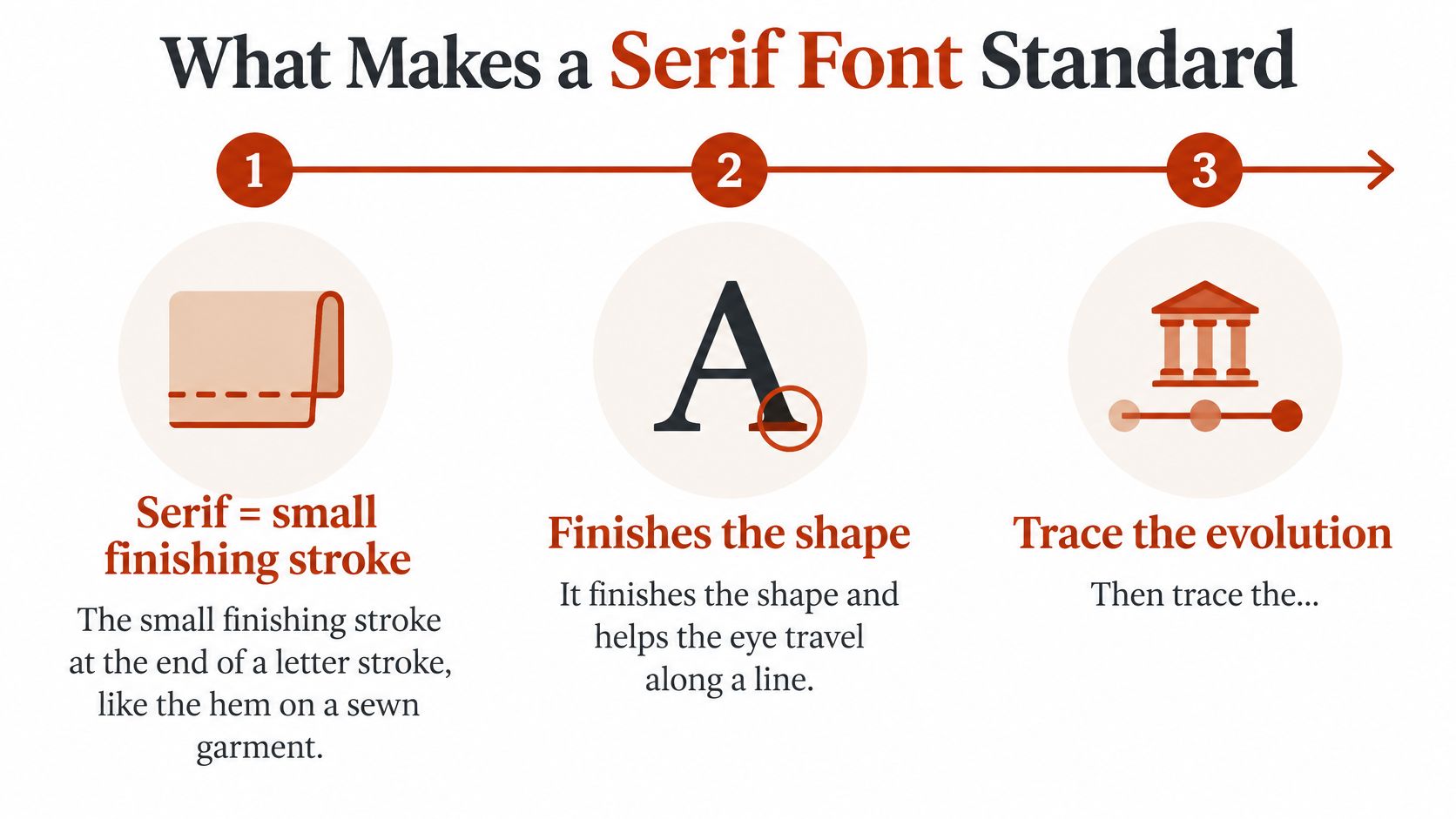
A serif is the small finishing stroke at the end of a letter stroke, like the hem on a sewn garment. It finishes the shape cleanly and, in a line of text, gives each letter a defined endpoint. Remove it and you have a sans serif, keep it and the details of how it's drawn start to define whole eras of printing.
Classes Shaped by Printing Problems
Old-style serif typefaces emerged around 1465, shortly after Johannes Gutenberg adopted the movable-type press, and transitional serif designs became common from approximately the mid-18th century through the early 19th century, according to the Wikipedia entry on serifs. Old-style faces answered early presses and rough paper with sturdy, low contrast strokes modeled on handwriting. Transitional designs sat between those humanist models and the higher contrast modern styles associated with Bodoni and Didot, where smoother paper and better presses allowed hairlines to survive printing.
So standard doesn't describe one visual formula. It describes a centuries-long family shaped by printing technology, paper, ink, and reading conventions. Garamond, Baskerville, Bodoni, Times New Roman, and Noto Serif all share the finishing stroke, but their proportions, contrast, stress, spacing, and intended use vary substantially. That long lineage is also why serifs still signal print authority in books, newspapers, formal documents, and institutional branding.
Times New Roman as the Worked Example
Stanley Morison and draftsman Victor Lardent created Times New Roman for the London newspaper The Times, and the typeface first appeared in the newspaper on October 3, 1932, as recounted in a history of 1930s typography. The brief was practical, not decorative. Narrow columns and dense layouts needed economy of space while preserving readable text, so the design packs more words per line than a book face would.
The newspaper held exclusive rights for one year, after which related commercial versions spread the design through printing, and later into books, magazines, office documents, and digital publishing. That path, engineering first, institutional adoption second, familiarity third, is typical. If you want the earlier end of the story in more depth, this guide to old-style serif history, traits, and web licensing covers how humanist models differ from what came later.
The practical point for your own shortlist is simple. Don't ask whether a family looks traditional. Ask which problem it was drawn to solve, narrow newspaper columns, book pages, low resolution screens, or display headlines, and whether your layout presents that same problem. A modern high contrast face drawn for large headlines will struggle as small body text no matter how standard its name sounds.
Are Serif Fonts Easier to Read
The common claim goes like this. Serifs guide the eye along the line, so they suit long reading in print, while sans serif is the safer choice on screens. It's tidy, it's repeated in most font roundups, and the evidence doesn't support it as a universal rule.
An eye-tracking experiment with 82 adults comparing serif and sans-serif typefaces found no statistically significant overall difference in reading performance, in the ACM study on serif and sans-serif reading. Serif reading was only slightly faster, and smaller sizes produced longer fixations and slower reading whatever the family. A separate review behind that work likewise found no general legibility advantage for either category and noted that familiarity with a typeface can influence reading speed.
What the Wider Evidence Shows
A 2025 systematic review of 42 peer-reviewed studies found that serif presence was not a significant independent legibility factor, in the systematic review published in Visible Language. No single typeface or size optimized readability for every reader, and most head-to-head comparisons produced null, inconclusive, or conditional results. In other words, the category label you're arguing about in a design review is one of the weakest variables in the room.
The variables that matter more are testable ones. Display size, x-height, contrast, spacing, reading distance, language, and reader familiarity all move the result. That applies in small spaces too, which is why guidance on readable fonts for business signatures is useful context for email footers, where size and rendering constraints punish delicate faces quickly.
Contrarian takeaway: Switching a serif for a sans may not fix an accessibility problem if size, spacing, or contrast remain poor.
So benchmark the complete typographic system instead of enforcing a blanket serif rule. Measure font size, x-height, line spacing, and character width alongside family category, and flag small text and poor spacing as higher priority risks than the mere presence of serifs. If you need size starting points before testing, this breakdown of the best font size for website readability gives you a baseline. My rule is to test the actual face at the actual CSS sizes, on the devices readers use, with real copy. Preference isn't legibility, and a familiar serif set well will beat an unfamiliar sans set badly.
Pairing and Sizing Serif Type for Hierarchy
Start with a default scale, then adjust it to the family you've chosen, because serifs with different x-heights look different sizes at the same pixel value.
Serif type scale for web text
| Text role | Line height | Line length |
|---|---|---|
| Body text | 1.5-1.6 | 45-75 characters |
| Subheading | 1.25-1.35 | One to two lines, under 60 characters |
| Headline | Tighter than body | One to three lines, under 50 characters |
| Caption or note | 1.4-1.5 | 50-70 characters |
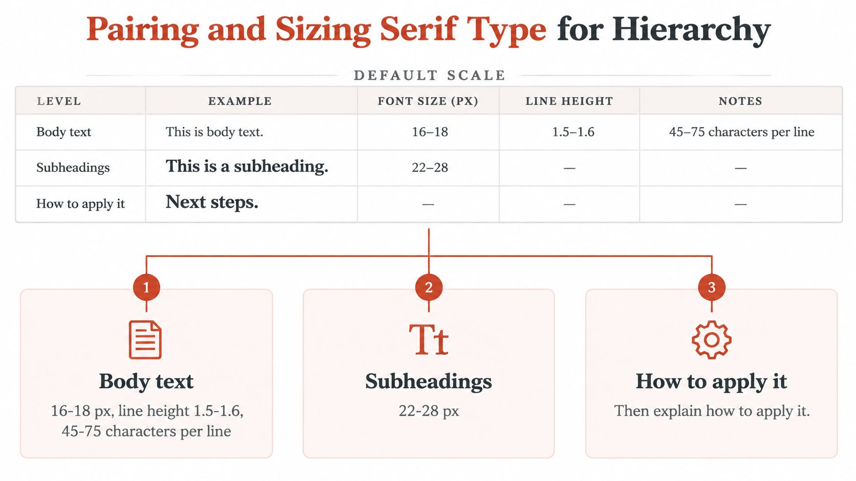
Set body text at 16-18 px with that generous leading, subheadings at 22-28 px, and headlines at 32-48 px with tighter leading because large type needs less air between lines. Keep captions at 13-14 px and don't go smaller for anything readers must read rather than glance at.
Pairing Rules That Hold Up
Build hierarchy first through size, weight, spacing, and colour. Add a second family only when those tools aren't enough. In practice that means one serif family carries most of the page, and a second face appears only when it does a different job, a serif headline over a plain sans body, or a serif body with a heavier weight for emphasis and headings.
Avoid two serifs of similar contrast competing at the same level. Readers can't tell which one outranks the other, so the hierarchy collapses into noise. If your serif lacks a true bold or italic, pick a different family rather than letting the browser synthesize one, because faked weights distort the letterforms you chose the face for. For a fuller framework, this walkthrough of typography hierarchy for every screen shows how the scale flexes across breakpoints.
Why Spacing Does Quiet Work
In a controlled study using lowercase typefaces that differed only in serif size, 0%, 5%, and 10% of cap height, the 5% serif condition produced an extremely small acuity advantage, in the serif size study in PMC. Continuous reading showed no significant speed difference, including among participants with low vision. The researchers suggest any benefit may come partly from the increased letter spacing serifs introduce, rather than from the strokes themselves.
That's actionable. When you set a serif body, check your tracking before you blame the family. Finish with a plain test. Set a full paragraph at its real CSS size on a phone and a desktop, read all of it, and only then adjust.
Accessibility and Performance of Serif Web Fonts
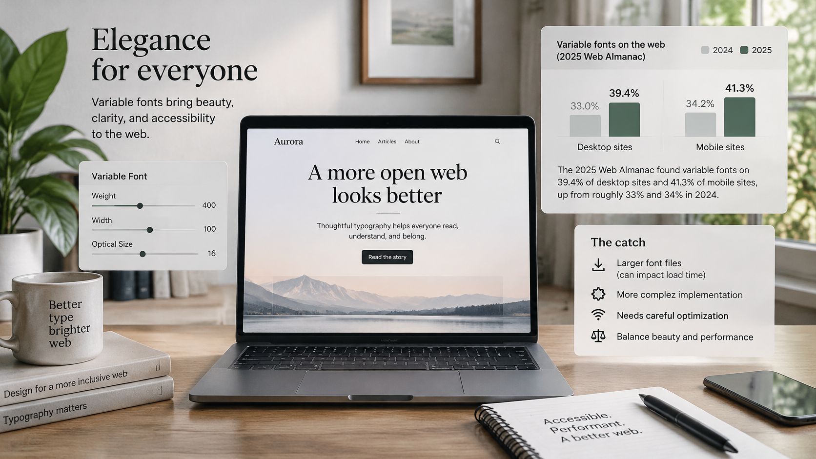
In the 2025 Web Almanac fonts chapter, variable fonts appeared on 39.4% of desktop websites and 41.3% of mobile websites, up from approximately 33% and 34% in 2024, and the same chapter put median mobile font resources at about 122 KB, median individual font files around 35-36 KB, and files near the 90th percentile at about 115 KB. Adoption is climbing fast. A smaller payload does not automatically follow.
Two Cases, Two Winners
A standard serif name tells you the style is familiar; it does not tell you the delivered file is light or stable. One variable file wins when your site needs many weights or widths, because it consolidates styles and cuts requests. Two subsetted static files, regular and bold, win when that is all you use, because a full-featured variable file with broad character sets and no subsetting carries glyphs and axes you will never render.
Late or shifting text is an accessibility problem as much as a speed problem, and the SiteSelf accessibility information is a helpful plain-language reference for why stable, prompt rendering matters to readers. When fallback metrics change mid-swap, readers lose their place and have to scan back to recover it.
The Controls, in Order
- Choose only the axes you use, and drop width or optical size axes your design never touches.
- Subset to the Unicode ranges your content needs, especially if you publish in one or two languages.
- Preload only the critical face, usually the regular body weight, not the whole family.
- Match fallback metrics so the swap does not shift layout.
- Pick a font-display strategy that balances FOUT and FOIT for your readers, rather than hiding text until fonts arrive.
Serve WOFF2 where you can, keep a sensible system fallback stack behind the serif, and measure rendered text performance, not file format alone. That measurement habit is covered further in this guide to web font performance and licensing risks. I'd treat any serif file well above the median size as a prompt to inspect its subsets, axes, and delivery cache headers.
Licensing Serif Fonts for Web and Desktop
Web and desktop rights are separate licensing questions, and conflating them is where most serif mistakes happen. Downloading a font for self-hosting means accepting that font's license, and non-open fonts generally require purchasing the licenses needed for the intended use, as explained in Google Fonts guidance on self-hosting web fonts.
License rules by font source and use
| Source | Typical license | Website use | Desktop use |
|---|---|---|---|
| Google Fonts family | SIL OFL, Apache or Ubuntu license | Self-hosting allowed when license terms and notices are kept | Commercial design work allowed under the same terms |
| Commercial foundry font | Commercial desktop or web license | Web tier usually set by monthly unique visitors | Installation covered; uploading desktop files to a site is not |
| Operating system font, such as Times New Roman | Operating system license | Check before embedding in a site | Covered for use on the installed machine |
| Desktop TTF or OTF file used on a website | Desktop license | Usually breaches license terms | Covered only for desktop use |
| WOFF or WOFF2 web font file | License named in the source agreement | Built for web delivery | Generally cannot be installed as a desktop font |
Why the Same Font Can Be Allowed and Not Allowed
Commercial web pricing or permitted use is often tied to the number of unique website visitors per month, so the right tier follows anticipated traffic, not headcount. A desktop license normally governs installation for creating designs or documents and does not automatically grant permission to upload the font files to a website. Ordinary TTF or OTF desktop files used as web fonts usually contravene license agreements, while WOFF and WOFF2 are web-oriented formats that generally cannot be installed as desktop fonts. Format is a clue to the right you bought.
Open source does not remove the conditions. Catalog fonts may be used commercially, but usage and redistribution remain governed by the applicable license, per the Google Fonts FAQ. Keep license and copyright notices, observe reserved font name provisions, and don't redistribute beyond what the license allows. That's why no family in this article is described as free or safe.
The risks are unglamorous and expensive: legal notices, forced font replacement, unexpected license fees, and redesign costs when a fallback changes your layout. Font Checker Pro does not license typefaces to customers, and identifying a face in a report does not grant any right to use that face. For tier details, use this web font license compliance guide. Everything here is informational and not legal advice, so contracts and disputes need counsel.
Verify Your Serif Licenses Before You Publish
Confirm every serif in use before the next release. Six steps get you from an unknown stack to a defensible record.
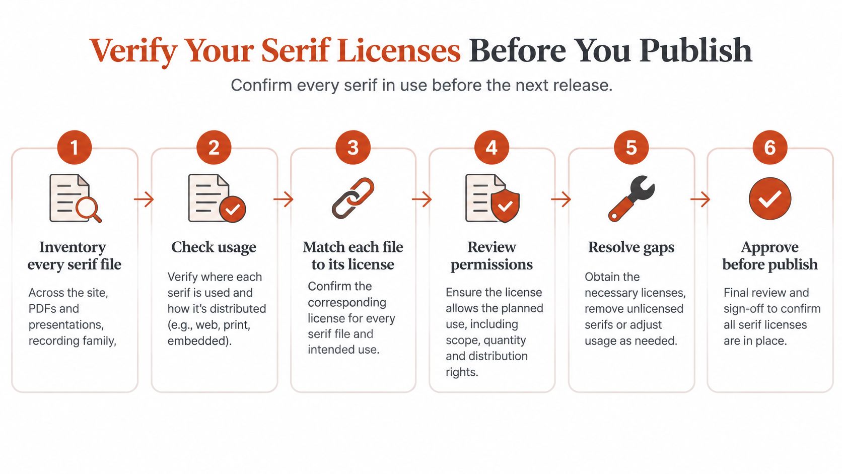
- Inventory every serif file across the site, PDFs, and presentations, recording family, version, where it appears, and who installed it. You can't clear what you haven't listed.
- Inspect each live page in browser developer tools to find every @font-face rule and the domain or file each one loads from. Declared family names in CSS can be generic, localized, or misleading.
- Classify each face by origin. Sort every @font-face rule and image-identified face by the domain it loaded from, the Google or Adobe catalogue, or a self-hosted origin. Each verdict shows its source. Results classify a font as Google, Adobe, or system.
- Check the font's OpenType metadata and naming tables for mismatches. Sound classification rests on where a font is served from and on AI visual identification, not only on the declared font-family name, because a file whose declared name conflicts with its appearance may be renamed, modified, or incompletely packaged.
- Match each license to its use, a web tier sized to monthly visitors, a desktop license for design work, and notices kept for open-source families. Record the exact family and version each license names.
- Store the license documents with the audit record, and set a system font stack as fallback so a licensing problem can be fixed without breaking the layout.
What Automation Can and Cannot Do
A scanner such as Font Checker Pro can automate steps 2 to 4, classifying each face by where it's served from and keeping an audit trail your design, engineering, procurement, and legal teams can share. Manual review still owns steps 1, 5, and 6: only your team knows who installed a file, which license was purchased, and where the documents live.
That report stays informational and doesn't replace legal review. A readable font can still be improperly deployed, and a properly licensed font can still render badly. Keep those two verdicts separate in your signoff.
End with one decision, made explicitly. Confirm the serif stack and its licenses before publishing, with a named owner for the record. If a family can't be traced to a license that covers its actual use, swap it for one that can, before launch day forces the swap for you on worse terms.
Run your live pages, PDFs, and uploaded font files through Font Checker Pro to identify every serif in use, see where each file is served from, and keep an exportable audit trail your design and compliance teams can act on. Start with your highest traffic templates, clear or replace anything you can't trace to a license, and publish with a serif stack you can defend.