Telling a team to “just use 12” sounds practical. Most of the time, it isn't.
12 font size gets passed around as if it were a universal readability baseline, a browser default, a print convention, and an accessibility-safe choice all at once. It's none of those on its own. It's a number tied to a unit, a medium, a rendering context, and sometimes a license. If you don't know which one you mean, you can end up with body text that feels cramped, CSS that scales badly, or a webfont deployment that violates the rights you bought.
Designers inherit 12 from print. Developers meet it again through px, rem, and browser defaults. Legal and compliance teams usually meet it after launch, when someone realizes the font on the live site was licensed for desktop use only. That's why this topic deserves more than the usual “12 is standard” advice.
Why 12 Font Size Deserves a Closer Look
The most misleading thing about 12 is how familiar it sounds. Teams say “make it 12” as if the meaning is obvious, but 12pt, 12px, 0.75rem, and 0.75em are not interchangeable decisions.
A printed contract set at 12pt behaves differently from a web card caption set at 12px. A nested component set in em can shrink without anyone noticing until QA opens a deep settings panel. A root-based rem system can make the same nominal choice much more predictable. The number stays the same. The reading experience doesn't.
That's where people get tripped up:
- Unit confusion: A designer means points, a developer enters pixels, and nobody notices until the production build looks tight.
- Context confusion: Small helper text can survive at 12 in some interfaces. Long-form reading often can't.
- Accessibility confusion: Teams hear “12 is standard” and assume that means universally safe.
- Licensing confusion: The same font at the same visible size can still require different rights depending on whether it's installed locally or served on the web.
Good typography work starts by naming the context precisely. If your team is tightening visual systems, reviewing old brand guidelines, or cleaning up inherited CSS, it helps to pair this topic with broader expert graphic design tips that cover hierarchy, spacing, and visual balance.
Practical rule: If someone says “12 font size,” your next question should be “12 in what unit, for what medium, and for what kind of reading?”
That one habit prevents a surprising number of bad decisions.
How the 12 Point Standard Became the Default
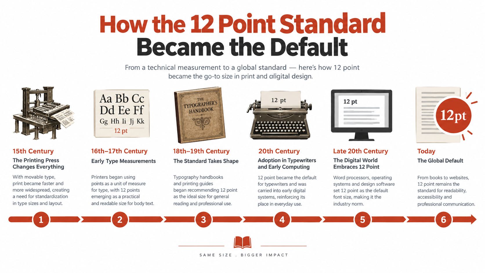
Twelve didn't become important because someone proved it was perfect. It became important because printing systems standardized around it and the convention stuck.
According to a historical overview of printing measurement at this typography history reference, Pierre-Simon Fournier proposed a point-based system in 1737, François-Ambroise Didot refined it in 1770, the Didot point was adopted as the continental European standard in 1879, the United States Type Founders' Association recommended an American point system in 1886, and England adopted that system in 1898. In practice, 12 points became the pica unit, and historical references describe 12-point as a common body-size measure for type, leads, and related printing materials.
Why printers kept returning to 12
Standardization made 12 useful because it scaled cleanly. The same historical source notes that the underlying measurement was standardized in the late nineteenth century at roughly 0.35 to 0.38 millimeters per point, and the modern PostScript point was later defined as exactly 1/72 of an inch, or 0.3527 mm. That means 12-point type is about 4.23 mm by point-system convention, or roughly 1/6 of an inch for the pica equivalent.
Those measurements matter because they made composition predictable. Printers could measure, space, and repeat layouts with confidence. That predictability is the real reason 12 survived.
Why the convention lived on after metal type
Modern typography references still treat 10 to 12 point as a standard body-text range, and one university design guide equates 12 points with 16 pixels and 1 rem in default text settings, as explained in this practical typography guide. The point isn't that 12 is always ideal. The point is that it became a stable bridge between metal type, print composition, and digital layout.
A lot of “standard” advice is just inherited workflow. Sometimes that inheritance is useful. Sometimes it survives longer than the conditions that created it.
That's why 12 still appears in brand guides, document templates, CMS defaults, and old design systems. It's historically grounded, not automatically correct.
Reading 12 Across pt, px, em, and rem
Once you move from print to screens, the trouble starts. The number 12 stays put, but the unit changes the result.
The clearest anchor is this: in common web typography guidance, 12pt maps to 16px and 1rem in default settings, as noted in the practical typography reference already cited above. From there, the rest of the conversions become easier to reason about.
The same number, four different behaviors
Here's the quick comparison needed when discussing 12 font size in design specs and CSS handoff.
| 12 Font Size Across Common Typography Units | Declared Value | Resolved Pixel Size | Typical Use |
|---|---|---|---|
| pt | 12pt | 16px | Print styles, document specs, PDF-oriented layouts |
| px | 12px | 12px | Small UI text, dense interface labels, captions |
| rem | 0.75rem | 12px at a 16px root | Scalable interface text tied to root sizing |
| em | 0.75em | 12px if parent is 16px | Component-relative sizing that changes with inheritance |
A few things usually confuse readers here.
First, 12pt is not the same as 12px. In default web terms, 12pt is closer to 16px, not 12px. If a brand guide says “body copy should be 12,” and your team converts that to font-size: 12px, you've made the text materially smaller.
Second, rem and em are only simple when the reference size is clear. With a 16px root, 0.75rem resolves to 12px. With em, 0.75em only resolves to 12px if the parent is 16px. Change the parent, and the child changes too.
Why em still catches teams off guard
The em compounding trap shows up in nested components. A card body gets reduced. Then the note inside the card is set to 0.75em. Then the badge inside the note is set to 0.875em. Nobody meant to create tiny text, but the cascade does it anyway.
That's why many systems now prefer rem for body sizing and reserve em for relationships inside a component, such as icons that should scale with nearby text.
If you work across multilingual teams, summarizing technical conversion notes can also help prevent handoff mistakes. For distributed reviews, lightweight tools that support AI summaries in Portuguese can make dense typography documentation easier to circulate without rewriting everything from scratch.
For teams shaping a system rather than a single page, this guide on typography hierarchy that works for every screen is a useful companion to the unit discussion.
- Use pt when the deliverable is print-oriented.
- Use px when you need tight control over compact UI elements.
- Use rem for predictable scalable body text on the web.
- Use em when proportional relationships inside a component are the point.
Converting and Coding 12 in CSS and Print
Most conversion errors happen because teams skip the baseline. Start there.
If the browser root is at its default size, the practical typography convention above gives you the familiar mapping: 12pt = 16px = 1rem in that default text context. From that baseline, common CSS math becomes straightforward.
The core formulas
For web work, the simplest conversion formula is:
- px to rem: px ÷ 16 = rem
- rem to px: rem × 16 = px
That means:
- 12px = 0.75rem
- 16px = 1rem
For em, the logic is similar, but the parent value matters:
- child px ÷ parent px = em
So if a child needs to resolve to 12px inside a parent set to 16px, the value is 0.75em.
| 12 Across Units at Default Browser Baseline | Value for 12 | Equals In Pixels | Equals In Points | Equals In Rem |
|---|---|---|---|---|
| px | 12px | 12px | 9pt | 0.75rem |
| pt | 12pt | 16px | 12pt | 1rem |
| rem | 0.75rem | 12px | 9pt | 0.75rem |
| em | 0.75em with 16px parent | 12px | 9pt | 0.75rem |
Three coding examples that prevent common mistakes
Body copy at a compact web size
html {
  font-size: 100%;
}

.article-body {
  font-size: 0.75rem; /* 12px at default root */
  line-height: 1.6;
}
This is the technically correct way to declare a 12px-equivalent body size in a root-based system. Whether it's a good reading choice is a separate question.
Small UI label with breathing room
.meta-label {
  font-size: 12px;
  line-height: 1.4;
  letter-spacing: 0.01em;
}
A lot of tiny UI text fails because the line-height is too tight, not just because the text is small. Labels, filters, and short metadata often become clearer when you loosen spacing slightly.
Print stylesheet with point-based output
@media print {
  @page {
    margin: 1in;
  }

  body {
    font-size: 12pt;
    line-height: 14pt;
  }
}
Points still make sense for print stylesheets and PDF export because they map to a physical measurement convention that print workflows understand.
Conversion habit: Write the intent in comments when the number could be misread. “12px equivalent” and “12pt print body” are not the same instruction.
Which unit to reach for
Use px when the interface element is intentionally fixed and compact. Use rem when you want body text to respond predictably to root scaling and user preferences. Use pt when the deliverable is print-first and physical measurement matters.
The operational side matters too. Teams that maintain typography in production should document the code-to-design mapping clearly, especially when design specs still speak in points. This practical guide to website typography in design and code helps align those decisions before they turn into handoff defects.
When 12 Is Readable and When It Falls Short
“12 is standard” is one of those statements that sounds safe but hides the question. Readable for what?
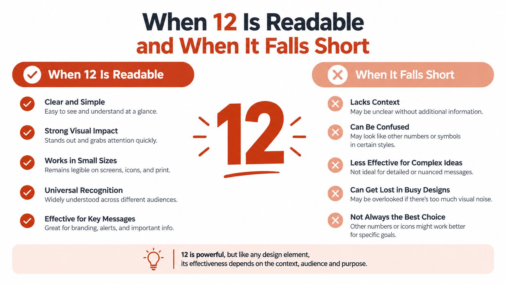
Accessibility guidance doesn't give you a universal 12pt rule. According to this accessibility article on font size and WCAG, WCAG does not set a hard minimum font size. At the same time, accessibility guidance still commonly recommends around 12pt or 16px for body text, with at least 9pt or 12px as a practical floor in some contexts. That's a more nuanced picture than most style guides admit.
Where 12 can work
A compact size can be defensible when the text is brief, secondary, and easy to enlarge.
- Captions and metadata: Short labels under images or beside controls can work at 12px if contrast and spacing are handled carefully.
- Dense UI areas: Tables, tool panels, and helper text sometimes need a smaller setting to preserve structure.
- Legal or reference text: Small print still shouldn't be hostile, but constrained layouts often push these elements downward in size.
The key condition is resizing. The same accessibility guidance notes that 12px can be acceptable for captions, legal text, or dense UI if the content still scales cleanly to 200% and uses relative units. If users can enlarge it without breakage, the choice is easier to defend.
Where 12 usually underperforms
Longer reading sessions expose the limits fast. A controlled study on web readability found that 12pt text produced significantly longer fixation durations and lower readability ratings than larger sizes, with readability and comprehension improving up to 18/22pt in text-heavy websites, according to the cited readability study PDF.
That doesn't mean every site should jump to giant body copy. It does mean 12 should not be treated as automatically comfortable for sustained reading, educational content, or any experience where comprehension matters more than fitting more text on the screen.
Small text problems rarely appear one at a time. Size, contrast, spacing, glare, fatigue, and viewing distance stack on top of each other.
That's why it helps to understand how overcoming daily vision disruptions affects real reading comfort. Typography decisions live inside a broader visual environment.
For teams trying to turn this into a repeatable review process, this breakdown of readability scoring formulas and metrics is a useful next step.
A defensible checklist for using 12
Use 12 only if most of these are true:
- The text is short: Labels and supporting text tolerate compact sizing better than paragraphs.
- Users can resize it: Zoom and reflow must hold up.
- Contrast is strong: Small text needs visual support.
- Line spacing is generous enough: Tight leading makes small text feel smaller.
- The audience doesn't depend on it for deep reading: If comprehension is the main task, start larger.
That's a much better rule than “12 is standard.”
12 on Screen Compared to 12 on Paper
A 12 that feels ordinary in print can feel cramped on screen. A 12 that survives in a web UI can look oddly loose in a PDF. The mismatch isn't imaginary. The media are doing different jobs.
The same nominal size, different experience
On paper, 12pt is a physical measure tied to print composition. On screen, 12px is a CSS instruction interpreted through a display, a browser, and a viewing distance. Those aren't equivalent reading conditions.
| 12 on Screen vs 12 on Paper | 12 on Screen | 12 on Paper |
|---|---|---|
| Measurement basis | CSS pixels or computed units | Point-based physical convention |
| Typical feeling | Often compact, especially for long reading | Familiar and conventional in documents |
| Scaling behavior | Affected by root size, zoom, and layout rules | Stable in print output |
| Line spacing needs | Usually needs more generous line-height | Often paired with modestly larger leading |
| Best use | UI text, metadata, controlled layouts | Contracts, letters, reports, books, PDFs |
Why perception shifts
Viewing conditions change everything. Readers usually hold paper closer and read it as a fixed object. Screens get viewed from more varied distances, on more varied devices, and under more lighting conditions. Even before accessibility comes into the picture, the same nominal size can feel less comfortable on screen because the environment is less stable.
Then there's layout behavior. A printed page has fixed margins and line breaks. A responsive page might collapse a column, widen a measure, or wrap helper text under a control. If the text starts small, those layout shifts make the smallness more obvious.
A better starting rule
For print, 12pt remains a familiar baseline for formal documents and many reading contexts. For screen, treat 12 as a compact interface choice, not an automatic body-copy answer.
If your team works across both media, it helps to study how editorial typography changes when content moves between fixed pages and responsive interfaces. This overview of newspaper fonts across print and web is a practical reference for that comparison.
Web Versus Desktop Licensing for Type at Size 12
The rendered size of the text does not decide the license. The delivery method does.
Design, development, and compliance teams often talk past each other. A designer buys a font, installs it locally, and uses it in mockups. A developer later serves the same font files on a live site. Visually, the text may still appear at 12 font size. Legally and operationally, the usage category may have changed completely.
The core distinction teams miss
According to this explanation of font licensing categories, a desktop font license and a web font license are separate rights. Desktop licenses cover local installation for design work, while web licenses cover serving the font to browsers on live sites. Using a desktop license for web delivery is described as a common compliance mistake, not a safe default.
That distinction matters because the files can look identical to the team using them. The browser doesn't care how you acquired the font. The license does.
| Desktop vs Web Font Licence at 12 | Desktop Licence | Web Licence |
|---|---|---|
| Main use | Installed locally for design and production work | Served to browsers on a live website |
| Typical workflow | Mockups, local documents, static design files | CSS embedding, self-hosted or licensed web delivery |
| Key compliance question | Who installed it and for what local use | Does the site have the right to serve it publicly |
| Risk if misused | Unauthorized local distribution or embedding | Unlicensed live serving across user sessions |
| Relevance of size | 12pt does not change the category | 12px does not change the category |
Why this becomes a real business problem
Unauthorized font use isn't just a theoretical policy issue. Legal-adjacent and industry sources note that companies may be required to pay negotiated fines or settlement-style fees after infringement is identified, as discussed in this legal and social science journal article. For teams managing active sites, the risk grows when the wrong license type gets repeated across deployments, sessions, or installs.
This article is informational, not legal advice. But the operational lesson is simple. Don't assume that because text is small, common, or visually ordinary, the licensing is low-risk.
What to check before launch
A practical review usually includes these steps:
- Verify the license category: Check whether your rights cover desktop use, web use, app use, PDFs, or more than one of those.
- Document the source files: Keep records of where the font came from and which team uploaded it.
- Review the deployment path: A font embedded in a browser-facing stylesheet is a web use case, even if it began life in a desktop design file.
- Keep an audit trail: Agencies and in-house teams should be able to show what was used, where, and under what terms.
For ongoing oversight, some teams use FontCheckerPro as an audit step because it scans deployed typography, identifies the fonts in production, and helps surface whether the live usage matches the license records a team has on file. If licensing confusion keeps appearing between design handoff and release, that kind of verification closes a real gap. This companion article on the licensing differences between web and desktop fonts is worth sharing with both engineering and procurement.
Never call a font “free” or “safe” unless you've checked the actual terms. That applies whether the text is 12px, 12pt, or anything else.
If your team keeps asking whether “12” is the right size, the need is usually better visibility into units, rendering, and licensing. Font Checker Pro helps by scanning live URLs, PDFs, images, and font files so you can see what type is in use and whether the deployment matches the rights you hold. It's a practical way to catch the gap between a harmless-looking 12 on screen and the production choices sitting behind it.