You're staring at a file, a layout, or a website mockup, and one number keeps showing up: 12 pt. It looks simple, but that single setting can mean something slightly different in print, in CSS, in a browser at a different zoom level, or under a licensing agreement that cares about how the font is deployed, not just how it looks.
What 12 Pt Font Actually Means
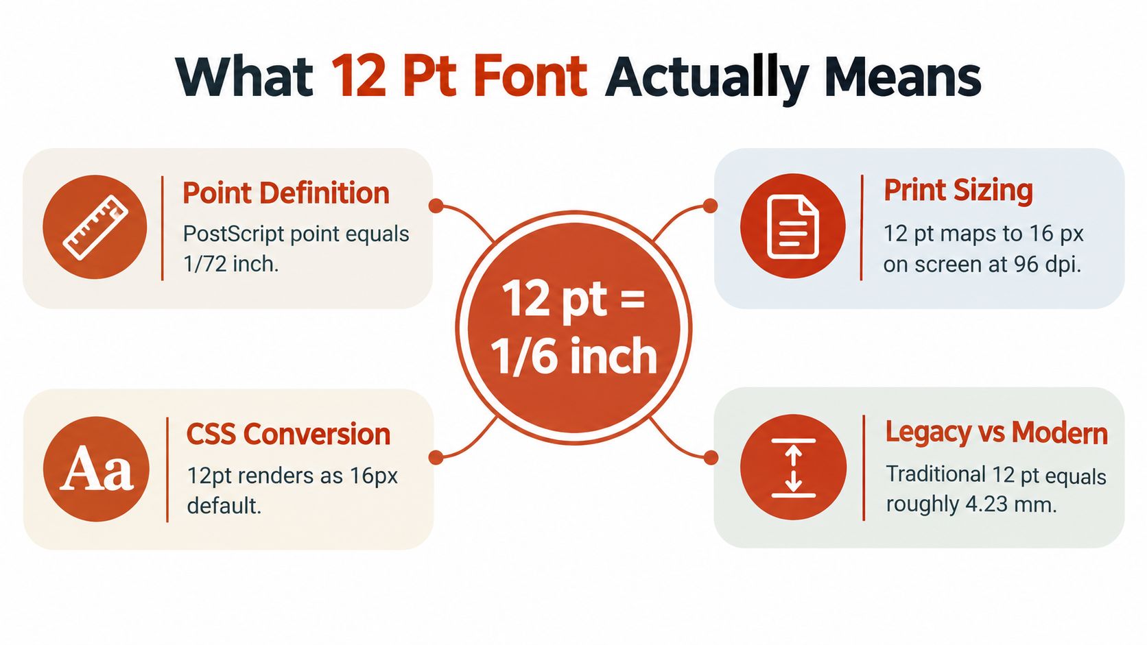
A 12 pt font starts with a measurement, not a promise about how big the letters will feel. A PostScript point is 1/72 of an inch, so 12 points is nominally 1/6 inch, or about 4.23 mm. In CSS, the standards-based conversion is 1 pt = 1.333 CSS pixels, so 12 pt maps to about 16 CSS px under the nominal 96-pixels-per-inch model, but that's still a coordinate, not a guarantee of visual size, as explained in the WCAG contrast guidance on text sizing and rendering W3C's typography and contrast guidance.
Why the letters don't all look the same
The number on the spec sheet doesn't describe the literal height of visible letters. x-height, ascenders, descenders, and other internal metrics shape the way a typeface appears on the page or screen. That's why two fonts set at 12 pt can look noticeably different, even before line spacing enters the picture.
A narrow, tall face can feel more spacious than a compact face at the same nominal size. A type family with a large x-height often reads bigger than one with a smaller x-height, even when both are declared as 12 pt. That's the first trap teams fall into, they treat the unit as if it were the rendered result.
Practical rule: audit the declared size, but never stop there. The visible letterform is the real output, not the unit label.
For teams trying to align terminology before a larger typography review, a plain-language overview of type basics can help, such as this internal guide on what typography means.
Point to Pixel Conversions Across Media
A 12 pt label can shift meaning fast once the medium changes. In a browser, the point-to-pixel conversion is useful for layout math, but it still does not tell you how the text will feel after font family, zoom, and device scaling enter the picture. On paper, points behave more predictably, which is why print workflows usually line up more closely with the size people expect.
Screen rendering changes the outcome
Screens add variables that print does not. Device pixel density can make the same declared size occupy different physical space, browser scaling can change how large the text feels, and user-controlled text scaling can shift the layout again. A heading or body style that reads cleanly on one device may look cramped or oversized on another, even when the CSS is identical.
That is why point-to-pixel normalization is only the starting line. The declared size helps you compare styles, but actual rendered appearance depends on font metrics and the environment where the text appears. Compare the rendered sample, the computed size, and the line box alongside the nominal value. For teams building a repeatable scale, a typography hierarchy that works for every screen gives a useful framework for keeping size decisions consistent across devices.
What to compare instead of trusting the label
Use the declared unit as one field in a broader audit. Then look at the output users see.
- Declared unit: note whether the source says pt, px, or another unit.
- Computed size: check the browser's calculated pixel value.
- Rendered text: inspect the sample on real devices, not just in a design file.
- Font metrics: compare family shape, x-height, and fallback behavior.
- Line box: confirm spacing around the text, since the box can matter as much as the glyphs.
When teams do this well, they stop arguing about the number and start evaluating the result.
Readability Standards and Evidence
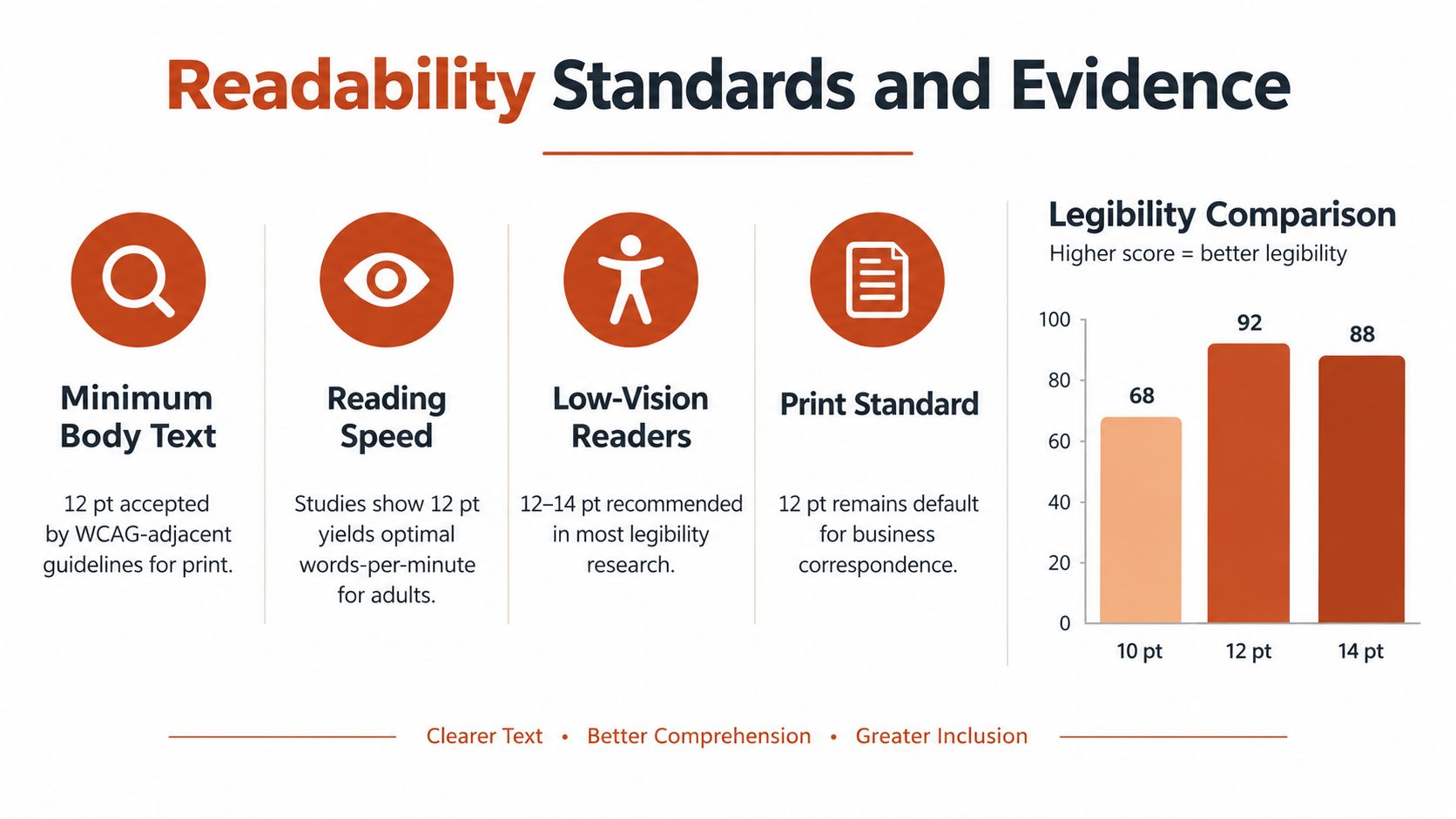
The research around 12 pt is useful, but it is narrower than many readers assume. A ScienceDaily's summary of the study reported that type size had the strongest effect on readability in the tested conditions, with a sharp decline below 12 pt, and that under normal contrast, more than 80% of visually impaired participants could read 12-point text in those tests. That makes 12 pt a meaningful lower boundary in some print-oriented contexts, not a universal accessibility finish line.
Why baseline doesn't mean guaranteed
Independent human-factors summaries also report that 12-point Arial and Times New Roman were preferred over 10-point versions. Later screen experiments, reported in the same research line, found 14-point fonts produced better reading efficiency than 12-point fonts. That does not cancel out the usefulness of 12 pt. It shows that readability shifts as the medium changes.
Contrast, viewing distance, rendering environment, line spacing, and font family all interact with size. A small-x-height face can be harder to read than a larger one at the same nominal size. Treat 12 pt as a baseline to test rather than a compliance guarantee.
Validate the rendered text, not just the style token. If a font family reads small at 12 pt, test it separately instead of assuming the label covers the risk.
For teams building accessibility checks into design review, the DesignStack accessibility guide can help connect contrast, spacing, and legibility decisions in one workflow.
The disciplined takeaway
A good typography review asks three questions at once. Does the text render clearly, is the contrast adequate, and does the font family hold up at the chosen size? If the answer is no to any of those, the declared 12 pt value does not rescue the result.
An internal framework for measuring legibility can help teams make that call more consistently, especially when they need to compare body text styles across print and screen. A scoring method only matters if it is applied to actual output, which is why readability scoring formulas and metrics belongs in the toolkit.
Common Use Cases for 12 Pt Font
In practice, 12 pt appears in very different settings, and the reason matters. In one context, it's a legal threshold. In another, it's a house style. In a third, it's just a convenient baseline that might be too small for the medium. Teams get into trouble when they treat all three as the same problem.
When 12 pt is a rule
California's court-filing rules say that, unless another rule says otherwise, filed papers must use a font size of at least 12 points. The rule also requires the paper filing to be produced in a way that yields clear, permanent copies with legibility equivalent to printing, which makes the output condition just as important as the nominal size California court filing rule. That's a procedural requirement, not a universal readability standard, and the court or counsel should confirm current requirements for the specific filing.
When 12 pt is a preference
Corporate documents, editorial templates, and internal style systems often use 12 pt because it's familiar and relatively safe for body copy. That doesn't make it the right choice for every deliverable. A dense contract, a printed handout, and a responsive web page all have different constraints, so a single number rarely solves all three.
When 12 pt is not enough
Responsive interfaces add their own demands. A body style that looks acceptable in a document editor can feel undersized on a phone, especially when the typeface has a small x-height or the surrounding layout is tight. In those environments, the governing question is not “is it 12 pt?” but “does this size read comfortably on real devices?”
Practical takeaway: verify the governing rule or style guide for the job at hand. 12 pt can be mandatory, preferred, or irrelevant, depending on the context.
Licensing Risks Behind 12 Pt Usage
A document can look fine at 12 pt and still carry licensing problems underneath. The visual result and the font rights are separate matters, and teams often miss that because the text on the page seems harmless. That is where risk begins.
Desktop rights are not web rights
Major font-platform agreements separate desktop use from web use. Fonts installed locally are governed by their own end-user agreements, while web-delivered fonts follow the platform's licensing terms, and self-hosting or app embedding often requires rights from the foundry or an authorized reseller Adobe font licensing guidance.
That means a team may be allowed to use a typeface in design software and still lack permission to upload it to a website, package it in an app, or distribute it to clients. License status has to match the actual deployment method rather than the appearance of the font in a design tool.
Web licenses can still be limited
Some foundries sell web licenses that work through CSS @font-face with WOFF2 files, tie the license to one domain owned by the licensee, and link the license to estimated monthly visitors The Designers Foundry licenses. Those terms can also prohibit use in desktop applications.
For agencies, that matters quickly. One licensed package copied across multiple client domains can exceed the permitted use. A file handed off for independent use can also create a gap between the license you thought you had and the rights the recipient needs.
A useful internal reference on the licensing differences between web and desktop fonts can help teams separate what is visible from what is permitted.
The operational habit that prevents mistakes
Keep a record of the font source, the license type, the permitted media, the domain or user limits, and the expiry or subscription status. That record matters more than a screenshot of the final design. FontCheckerPro can support that workflow by auditing live URLs and font assets, but its reports support operational review rather than replacing legal judgment.
How to Audit 12 Pt Typography Correctly
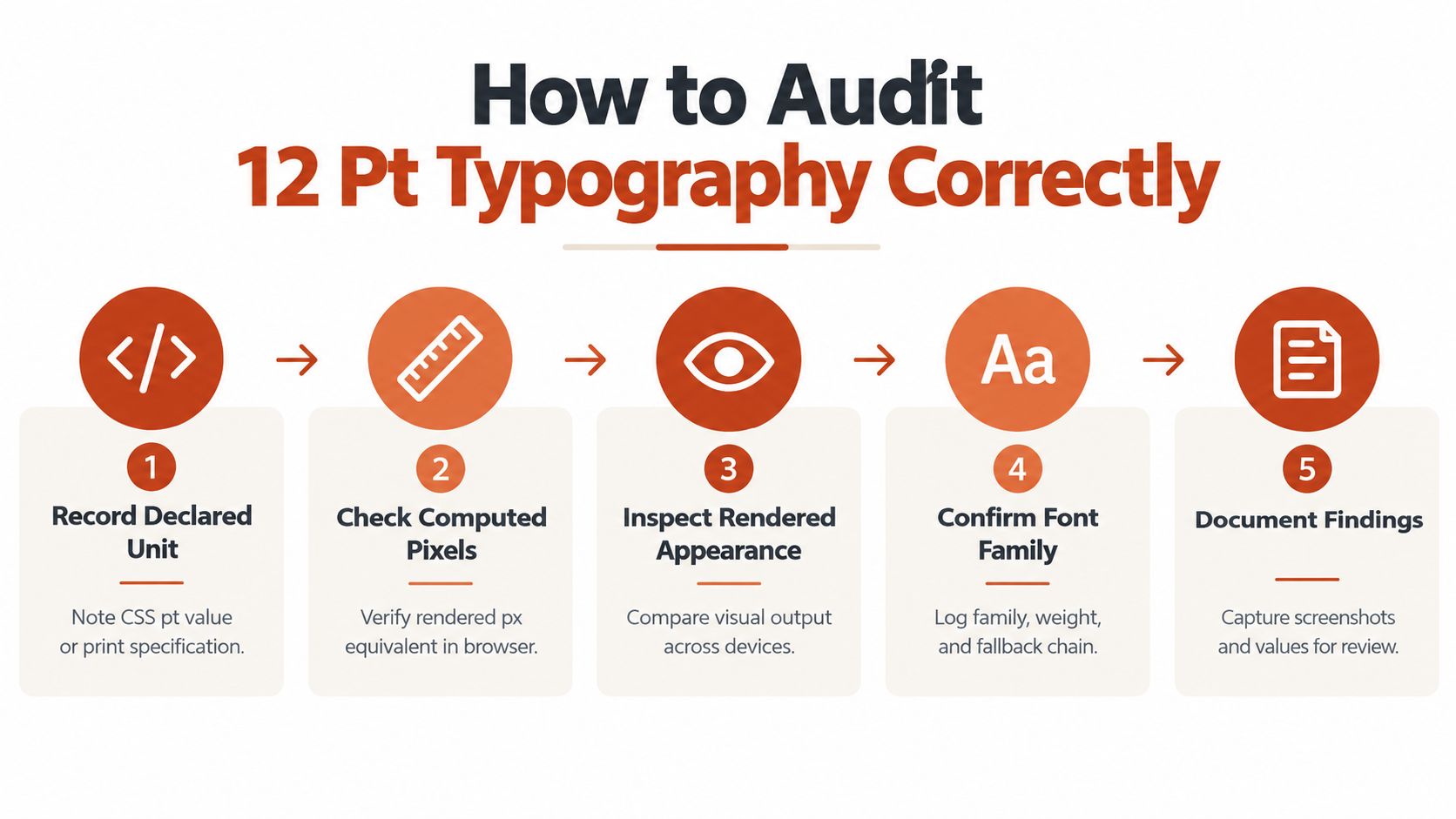
A good audit treats 12 pt as a starting point, then proves what happened in production. Begin with the declared unit, then check the computed size, then inspect the rendered result on the actual device or output medium. If those three disagree, the number alone isn't telling you enough.
Build the checklist in the order risk appears
Start with the source declaration. Note whether the file, stylesheet, or print spec says 12 pt, then record the computed pixel equivalent where that applies. After that, inspect the actual rendering on the device or in the print proof, because browser scaling and device density can change the outcome.
Then log the font family, the weight, the fallback chain, and the line-height. Those are the values that explain why one 12 pt text block feels open and another feels cramped. If the page or document is using multiple faces, test each one separately rather than assuming they'll behave the same.
Keep print audits separate from interface audits
A print document audit is mostly about prepared text, legibility, and output fidelity. A responsive interface audit also has to account for zoom behavior, user scaling, and cross-device variation. Those are different environments, so they deserve different checklists.
Audit rule: if the deployment method changes, re-check the typography and the license. A clean-looking proof doesn't prove the rights or the render.
Record the rights as carefully as the style
For web deployment, verify domain limits, traffic tier, and allowed use. For desktop use, verify whether the font can legally live in the software where your team plans to use it. A practical workflow guide like this font-audit method for websites can help teams tie the visual check to the licensing record.
If you want a single place to test what's really on the page or in the file, Font Checker Pro scans live URLs, PDFs, images, and zipped font sets, then helps you document the typefaces, licenses, and deployment risks before a handoff or release. Visit Font Checker Pro to audit your typography with the same care you bring to layout, legibility, and compliance.