Italic serifs look like a small stylistic choice, yet they're often where web and desktop font licenses diverge. A browser may display a true italic design, a mechanically slanted roman, or a synthesized fallback, while the font file itself may carry restrictions that have nothing to do with how familiar the typeface seems. A system-installed face isn't automatically licensed for web embedding, and a subscription that covers one delivery method may not cover another.
The safest way to choose a serif italic font is to assess three things together: design character, best-fit use case, and licensing status for web versus desktop use. The eight examples below are selection filters, not a catalogue of universally safe fonts. Use them to narrow the design direction, then verify the actual files, foundry, delivery method, and license terms before launch. This is informational content, not legal advice. For broader context on the risks surrounding font and design ownership, see this overview of copyright and design issues for sellers.
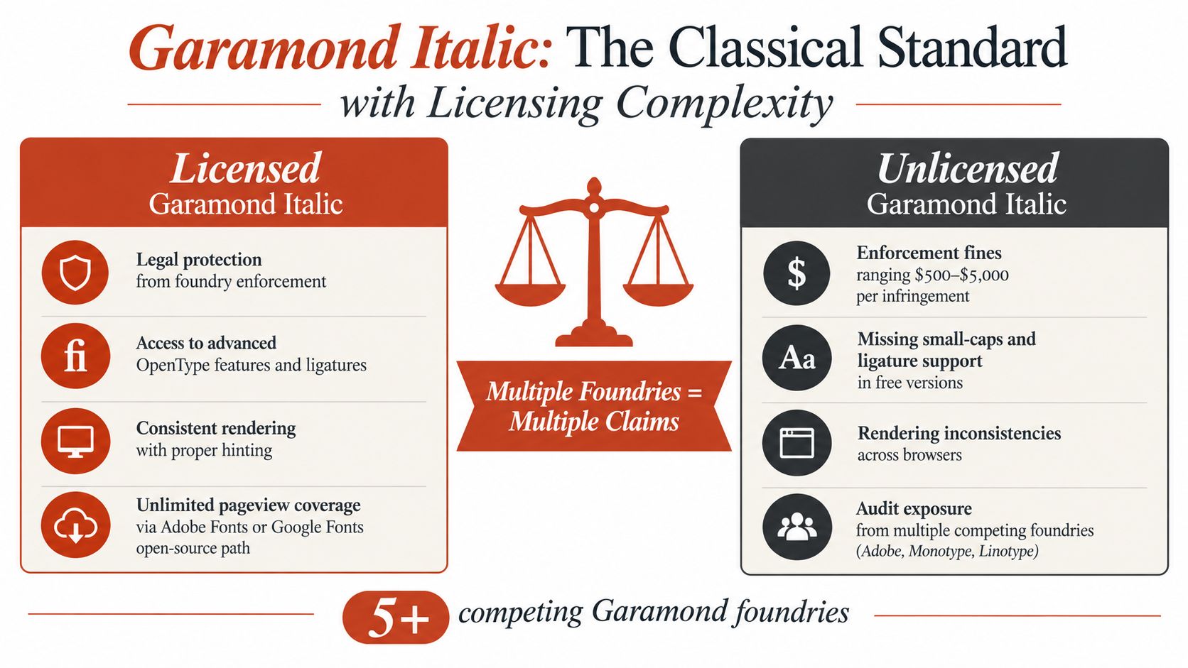
1. Garamond Italic and the Classical Standard with Licensing Complexity
Garamond italic carries the authority of old-style book typography. Its forms descend from 16th-century French typeface designs, and the italic companion usually brings a calligraphic rhythm, moderate contrast, and compact proportions to editorial pages, books, and luxury-facing identity work. It feels literary without becoming theatrical, which is why it can support long-form reading as well as restrained display text.
The design character changes substantially from one digital interpretation to another. Adobe Garamond, Monotype and Linotype versions, and open-source Garamond-related families aren't interchangeable products. A familiar name can conceal different glyph construction, metrics, file formats, and licensing obligations.
Best-fit use cases
Garamond italic works particularly well for bookish editorial systems, literary brands, academic material, pull quotes, captions, and restrained luxury packaging. It can also provide a useful contrast against a neutral roman face, but continuous body text needs testing at the actual reading size. Italic letterforms are often narrower and more connected, so generous spacing, adequate contrast, and a reliable fallback matter.
Practical rule: Treat “Garamond” as a family name that still requires identification. Confirm the foundry and exact files before you approve the design.
For agencies, the audit question is not just whether Garamond appears on a page. It's which Garamond is deployed, whether the site self-hosts it, and whether the license covers the client's domains and functionality. A guide to font licensing and audits can help teams structure that review. FontCheckerPro can also identify the deployed face and organize the evidence, but its output is informational and not legal advice.
2. Baskerville Italic and the Premium Publishing Split
Baskerville italic has a polished, deliberate character. John Baskerville's 18th-century designs are associated with refined publishing, strong vertical structure, and a formal elegance that suits opinion headlines, book interiors, invitations, and high-end editorial work. The italic cut adds movement without abandoning the seriousness of the roman.
The main selection risk is assuming that a visual match equals a licensing match. Commercial Baskerville versions are offered through different foundry and platform arrangements, and teams need to separate desktop installation, web delivery, print output, and application embedding. A desktop license may let a designer create artwork, while a web license governs whether the font files can be served to browsers.
Where Baskerville earns its place
Choose Baskerville italic when the page needs editorial authority, cultivated contrast, or a premium publishing tone. It's a strong candidate for a headline, deck, or selected quotation. For dense interface labels, compact navigation, or small captions, compare it with the fallback stack at realistic sizes rather than relying on a specimen sheet.
A practical CSS stack might include Baskerville followed by Georgia and a generic serif, but that only controls substitution. It doesn't grant permission to self-host Baskerville files. The browser can fall back gracefully while the compliance issue remains unresolved.
Desktop and web rights are separate decisions. Record them separately in the asset register, even when the same family serves both purposes.
Teams should document the foundry, weights and styles, domains, delivery method, and purchase records. FontCheckerPro can scan a website or PDF to identify where Baskerville appears and help distinguish an intended face from a fallback. Its audit result should support a manual review of the governing agreement, not replace that review. For a focused explanation of the distinction, see the differences between web and desktop font licensing.
3. Caslon Italic and the Orphaned Licensing Problem
Caslon italic feels historical, human, and slightly irregular in a way that suits heritage brands and serious publishing. It derives from the work of William Caslon, whose designs belong to the 18th century. The style can give a page warmth and institutional character, but the family name covers many digital revivals and interpretations.
That variety creates a documentation problem. Adobe Caslon, Linotype Caslon, Monotype Caslon, and independent-foundry versions can have different owners and terms. A file downloaded from an informal archive may retain a recognizable name while lacking reliable metadata, a clear license, or permission for commercial use.
The design filter
Use Caslon italic for historical content, literary publishing, cultural institutions, packaging, and brands that want a crafted rather than engineered voice. Test punctuation, numerals, accented characters, and bold italic combinations if the design supports international or data-heavy content. Revivals can differ noticeably in spacing and italic details, so approving “Caslon” without approving the exact cut is poor practice.
A useful audit separates three questions:
- Identity: Which Caslon files are present, and which foundry produced them?
- Use: Are they installed on a designer's workstation, embedded in a PDF, or served from a website?
- Permission: Does the documented license cover that use, audience, and delivery method?
Never label Caslon “free” or “safe” solely because the historical design is old. A modern digitization can carry its own rights and contractual restrictions. FontCheckerPro can help locate Caslon instances in websites, PDFs, images, or font packages, including versions that need manual attribution research. That makes it useful for finding orphaned assets, while the final licensing interpretation belongs with the organization's legal or compliance team.
4. Minion Pro Italic and Subscription-Based Operations
Minion Pro italic offers a more contemporary answer to the classical serif problem. Designed by Robert Slimbach and released by Adobe in 1990, it combines traditional proportions with extensive digital typography features. The result is controlled and versatile, with enough refinement for scholarly publishing but enough clarity for captions, footnotes, and structured editorial systems.
Its design character makes it a good fit for books, academic publications, reports, editorial interfaces, captions, and brand systems that need a serious serif without a strongly historic surface. The italic can establish emphasis while remaining related to the roman, provided the implementation loads the intended style rather than synthesizing a slant.
What the subscription changes
Minion Pro often enters a project through Adobe's ecosystem, which means the operational question extends beyond the designer's workstation. Teams need to know whether the subscription remains active, which delivery method is authorized, whether the relevant domains are covered, and whether font files are being redistributed outside the permitted workflow.
A web project can fail its audit even when the Creative Cloud user who designed it is properly licensed. Self-hosted files, application packaging, customer-controlled exports, and downloadable templates can introduce separate rights questions. Adobe's font licensing guidance explains that desktop installation, web delivery, and application embedding are distinct use cases.
Operational insight: A subscription is an ongoing dependency, not a permanent clearance certificate.
Maintain a record of the family, italic files, domains, embed method, subscription owner, and renewal status. This explanation of Adobe Fonts licensing can help teams frame the review. FontCheckerPro may then monitor live pages and identify whether the intended italic remains in use, but it cannot rewrite contract terms or provide legal advice.
5. Perpetua Italic and the System-Font Paradox
Perpetua italic has a distinctive humanist character shaped by Eric Gill's design work and its release by Monotype in 1928. It can give formal documents, heritage projects, and literary layouts a more individual voice than a generic system serif. Its sloped forms are expressive, so it's usually most effective in headings, selected passages, invitations, and print-oriented editorial work rather than dense interface copy.
The risk comes from its availability. A font that appears on a workstation or inside office software can feel like a system resource, but local availability doesn't automatically grant permission to copy the files to a server. Desktop use and web embedding are separate rights questions.
Keep the delivery method visible
For a print-only workflow, the relevant desktop terms may cover the designer's use and the production output. A website is different. Serving Perpetua through @font-face may require a separate web license, and a locally installed copy shouldn't be uploaded just because a browser can render it.
The same distinction applies to client handoff. Sending a document that uses an installed font isn't the same as distributing the font files themselves. Packaging those files for a web project, app, template library, or customer editor creates a new compliance review.
- For websites: Verify explicit web-embedding permission before self-hosting.
- For desktop production: Retain the system or desktop licensing documentation and avoid redistributing the font files.
- For audits: Scan both office documents and live URLs because the same family may appear under different permissions.
FontCheckerPro can identify Perpetua italic in uploaded documents and web assets, helping teams find places where a system font has crossed into web delivery. Its report is a practical inventory, not a legal opinion. If the license is unclear, pause deployment and ask the foundry, reseller, or qualified counsel for a written interpretation.
6. Sabon Italic and the Foundry Fragmentation Trap
Sabon italic is a useful example of why visual consistency doesn't prove legal consistency. Jan Tschichold designed Sabon in 1964 for Linotype, Monotype, and Stempel, and the resulting versions can look close enough that a team may mix them without noticing. The design character is elegant, bookish, and controlled, making it suitable for literary publishing, premium magazines, institutional reports, and print-led identity systems.
The best-fit use case depends on the exact cut. One version may have metrics that suit a book workflow, while another behaves differently on a responsive page. The same family name can therefore create both a design-management issue and a licensing issue.
Standardize the source
A brand team should select one foundry version, record it in the type system, and prevent accidental substitution during production. That means naming the exact family, style, file format, weights, approved environments, and license owner. A designer who installs one version while an agency's web developer selects another has created a traceability gap even if the screenshots look consistent.
A shared font name isn't a shared license.
Web embedding deserves particular care. Don't assume an ordinary desktop purchase permits self-hosting, and don't assume an aggregator provides the required web rights. Ask the selected foundry or authorized reseller to confirm the scope in writing. For desktop production, keep receipts and seat records with the project documentation.
FontCheckerPro can scan live URLs, PDFs, and uploaded font sets to expose mixed Sabon instances and style differences. That's especially useful when an enterprise has inherited files from several agencies. The scan supports remediation by showing what is present, but compliance teams still need to match each asset to the applicable contract.
7. Jenson Italic and the Revival-Font Attribution Risk
Jenson italic draws on the Venetian type tradition associated with Nicolas Jenson and has a warm, early-humanist character. It works well when a design needs historical resonance without the darker density of blackletter. Fine press projects, scholarly books, museum materials, and carefully paced editorial systems can all benefit from its old-style rhythm.
The difficulty is that digital Jenson revivals aren't one legally unified product. Adobe Jenson Pro, Linotype Jenson, Monotype Jenson, Storm Type interpretations, Emigre versions, and informal downloads may each involve different authorship and licensing records. The historical source doesn't eliminate rights attached to a modern drawing or digital font file.
Don't confuse historical age with modern permission
A “free” Jenson download may be legitimate, open source, incomplete, mislabeled, or missing the documentation a commercial team needs. Designers should inspect the license text, copyright notices, metadata, permitted modification terms, and redistribution conditions before placing the file in a client project.
Use Jenson italic when the brief calls for humanist history, fine publishing, cultural authority, or an intentionally traditional reading voice. It's less suitable when the interface needs compact controls, dense data, or highly predictable metrics. Test the italic at small sizes and check the fallback behavior across the supported browsers.
A disciplined asset record should include:
- Foundry and version: Record the exact digital revival, not only “Jenson.”
- Permission scope: Separate desktop, web, application, and redistribution rights.
- Evidence: Keep purchase records, license text, and the date of approval.
- Implementation: Note whether the browser receives a true italic face or a synthetic slant.
For questions about typeface ownership and digital font rights, consult this discussion of typeface copyrightability. FontCheckerPro can identify likely Jenson instances and flag unclear files for human review. It can't establish ownership on its own, and its output remains informational rather than legal advice.
8. Times New Roman Italic and Assumed Safety
Times New Roman italic is familiar because Stanley Morison's design, released by Monotype in 1932, became embedded in office, academic, and legal workflows. That familiarity gives it a practical advantage for documents, but it also creates one of the most persistent licensing misconceptions in typography. A font's presence on a computer doesn't mean the user can redistribute its files or serve them from a website.
Its design character is conventional, compact, and institutionally recognizable. Use it for formal documents, academic materials, court-related print workflows, and contexts where readers expect a standard serif. For a new brand identity, it may communicate compliance and tradition more than distinction.
Separate document creation from web serving
A locally installed Times New Roman italic can be appropriate for creating a document under the applicable system terms. Exporting that document to PDF is not the same operation as uploading the font files to a web server. A website that uses @font-face needs a separate review of web-embedding permission, and a customer-facing editor may require additional rights because users create content with the font.
The fallback decision should be made alongside the licensing decision. If the project can use a web-authorized alternative, define it deliberately and test its metrics rather than quietly relying on Times New Roman. That protects layout stability when the licensed face isn't available.
System availability is evidence of access, not proof of web permission.
Audit websites, PDFs, and design packages separately. FontCheckerPro can flag Times New Roman italic on live URLs and help teams trace where the face is being loaded, referenced, or substituted. For a practical review process, use this guide to checking a web font license, then compare the findings with the actual Monotype or platform agreement. Any potential enforcement exposure should be assessed with qualified legal advice, not with a font scanner alone.
Serif Italic Fonts: 8-Point Licensing Comparison
| Typeface (Italic) | Licensing & Implementation Complexity | Resource Requirements | Expected Outcomes | Ideal Use Cases | Key Advantages |
|---|---|---|---|---|---|
| Garamond Italic | High, multiple foundries (Adobe, Monotype, Linotype) with fragmented licenses; must verify foundry/version before deployment. | Font audits (e.g., Font Checker Pro), per‑seat or subscription licenses, or Google/Adobe Fonts for web. | Excellent readability and small file sizes when licensed; high audit/enforcement risk if mixed/unlicensed. | Editorial, academic publishing, luxury print where classic serif is desired. | Trusted historical look; consistent rendering; free/open variants available. |
| Baskerville Italic | Moderate‑high, consolidated foundries but strict desktop vs web split and changing terms. | Separate web and desktop licenses, domain/pageview tracking, periodic compliance checks. | Prestigious editorial appearance with excellent print results; potential layout shifts between formats. | High‑end magazines, book design, editorial headlines and body text. | Prestige association; strong print quality; robust OpenType features in premium versions. |
| Caslon Italic | High, many orphaned/digitized versions with inconsistent or missing license attribution. | Thorough auditing, purchase from established foundries (Adobe/Monotype/Linotype), license receipts. | Authentic historical feel if properly licensed; significant legal risk with free/orphaned copies. | Heritage branding, museums, academic and period publications. | Historical credibility; good legibility at small sizes; affordable licensed options exist. |
| Minion Pro Italic | Moderate, subscription‑dependent (Adobe Fonts/Creative Cloud), must maintain active subscription. | Adobe subscription or licensed package, ongoing budget for renewal, monitoring of subscription status. | Consistent rendering and rich OpenType support while subscription is active; service interruption risk if subscription lapses. | Enterprise publishing, multi‑domain web deployments within Adobe ecosystem. | Extensive glyph set and optical sizes; reliable updates and cross‑platform consistency. |
| Perpetua Italic | Moderate, system‑installed but embedded license restricts redistribution and web embedding. | Audit local/system use, purchase separate web license from Monotype for embedding. | Low cost for local/desktop use; high legal risk for web embedding without license. | Print, internal documents, Windows‑based desktop publishing. | Distinctive Art Deco aesthetic; preinstalled on many Windows systems for easy desktop use. |
| Sabon Italic | High, three‑foundry model (Linotype, Monotype, Stempel) creates unique fragmentation and strict non‑mixing requirements. | Select and license single foundry version, enterprise audits, negotiate web rights directly with foundry. | Excellent print/editorial results when standardized; compounded fines and audit complexity if mixed. | Book publishing, academic presses, premium editorial projects. | Exceptional print quality; multiple vendor options for negotiation and procurement. |
| Jenson Italic | High, multiple revivals and free variants with unclear copyright attribution and orphaned versions. | Prefer paid foundry versions, run provenance audits, retain license documentation. | Strong historical authenticity and typographic richness if licensed; high enforcement risk with ambiguous copies. | Fine press, scholarly books, heritage branding where Renaissance authenticity is desired. | Historical authenticity; large Pro glyph sets and advanced OpenType in commercial versions. |
| Times New Roman Italic | Moderate, ubiquitous system font but system license forbids web redistribution; Monotype commercial rights apply. | Audit websites/documents, obtain Monotype web license for embedding, monitor high‑traffic use. | Reliable cross‑platform rendering for desktop/print; legal exposure if embedded on web without license. | Legal documents, academic papers, desktop publishing where ubiquity and legibility matter. | Ubiquity and consistency across platforms; excellent legibility and zero desktop deployment cost. |
Choosing a Serif Italic You Can Defend
The strongest choice is rarely the most decorative italic. It's the face whose character, role, implementation, and license scope remain aligned after the design leaves the mockup. Garamond and Caslon can bring historical warmth, Baskerville and Sabon can support polished publishing systems, Minion Pro can fit a modern editorial workflow, and Perpetua or Times New Roman can make sense when an established document environment matters. Jenson offers humanist heritage, but its revival history demands careful source verification.
Start with the job the italic must perform. If it marks a short quotation or publication title, expressive details may be valuable. If it appears in captions, navigation, data labels, or low-vision contexts, test the actual size, contrast, spacing, and fallback behavior. A serif isn't automatically easier to read, and an italic isn't automatically unsuitable. Evidence summarized in an NIH-indexed study found only a small legibility benefit from serifs at small or distant viewing sizes, with no reading-speed difference between serif and sans-serif typefaces for the participant groups studied. A systematic review likewise treats readability as conditional, with familiarity, spacing, contrast, size, and visual ability often more important than the simple presence of serifs. See the NIH-indexed review of serif and sans-serif legibility for the research context.
Then verify what the browser receives. A true italic design may use alternate glyphs, different proportions, and different spacing from the roman. Variable-font workflows can expose an ital axis for an italic design and a slnt axis for slant, and those axes shouldn't be treated as interchangeable. If the requested face is missing, the browser may synthesize an oblique effect instead. Inspect the CSS, font metadata, loaded resources, and screenshots across the supported environments.
Licensing deserves its own approval path:
- Web use: Confirm whether the font can be served from the chosen host, domains, and delivery method.
- Desktop use: Confirm workstation or seat coverage and avoid distributing font files with project assets unless permitted.
- Applications and editors: Check embedding and user-generated-content rights separately.
- Audit records: Store the family, foundry, styles, files, license source, delivery method, and approval evidence.
Adobe's guidance makes the web versus desktop distinction explicit. A font installed under desktop terms may not be self-hosted, and a web arrangement may not cover application embedding or customer-generated exports. Those boundaries matter for agencies, SaaS teams, brand systems, and anyone distributing templates.
FontCheckerPro can support the operational side by scanning live URLs, PDFs, images, and zipped font sets, identifying likely families and styles, and helping teams document what is deployed. It can also provide a report for design, engineering, or compliance workflows. Treat that report as an inventory and diagnostic aid, not legal advice. The final decision should come from the applicable license text and, where necessary, a qualified professional.
Choose the italic for its design voice, assign it a specific role, test its usability in context, and record the permission that covers every output. That process gives you a serif italic font you can explain to a designer, defend to an engineer, and document for compliance.
FontCheckerPro can scan live URLs, PDFs, images, and zipped font sets to identify serif italic faces, styles, likely foundries, and licensing gaps in your typography assets. Use Font Checker Pro to build an exportable audit record before a font reaches production, then invite your design, development, and compliance teams to review the findings together.