Web fonts appear on roughly 88% of websites, making an image font finder online a high-value way to identify typography, but a visual match is only a lead, not proof that you can legally use the font. The practical workflow is simple: upload a clean crop, review several ranked candidates, verify the actual font files and foundry, then check the applicable license before deployment.
You've probably been handed a logo without the original artwork, found a compelling typeface in a competitor screenshot, or inherited a website where nobody knows which font files are loaded. The image can look obvious to a trained eye, yet manual comparison becomes slow when the family has multiple weights, optical sizes, alternates, or custom lettering. Worse, a confident-looking match can send a team toward the wrong file and the wrong license.
An image font finder online solves the identification problem, not the clearance problem. That distinction matters for designers selecting a replacement, developers auditing assets, agencies preparing client handoffs, and compliance teams building evidence that can survive review. This guide focuses on the part most tool roundups skip, namely how to make visual matching useful without treating automated output as legal permission.
Why Image Font Finders Matter Now
Typography increasingly reaches users through digital assets rather than through a designer's neatly organized source folder. A screenshot may preserve only rendered pixels. A scanned brochure may contain outlined lettering. A photograph of packaging may show a modified wordmark that never existed as an installable font. In each case, the person responsible for the next design decision starts with appearance, not metadata.
That makes visual matching a practical research step. A useful finder can analyze the crop, detect text, and return a ranked shortlist of likely families. The shortlist gives a designer something concrete to validate against distinctive glyphs, weights, and available files instead of relying on memory or browsing an unstructured catalog.
The scale of the web reinforces this need. The 2025 HTTP Archive Web Almanac font report found web fonts on roughly 88% of websites, up from about 87% in 2024. It also reported that approximately 72% of websites served at least one font file from their own origin, so typography often sits inside a site's own assets rather than coming only from a centralized provider.
From visual clue to audit evidence
Self-hosted files create a recurring problem during redesigns and acquisitions. The original CSS may be incomplete, the asset repository may contain trial files, and a brand team may know the font by appearance but not by the exact licensed variant. An image font finder helps connect a visible expression of the brand to files that need inspection.
That connection also explains why font usage can represent a business risk, not only a creative choice. Identification can support a brand audit, a migration plan, or a client handoff, but it shouldn't be recorded as definitive unless someone validates the evidence.
Practical rule: Treat the result as a research hypothesis. Preserve the original image, crop, detected text, candidate list, and follow-up verification.
The best use of an image font finder online is therefore not instant certainty. It's a faster route from an unidentified visual asset to a documented decision about what the typeface might be, where the files came from, and what must happen before anyone ships it.
Comparing Accuracy and Confidence Metrics
A single prediction creates a false sense of precision. Fonts that share proportions, terminals, apertures, and stroke contrast can look almost identical in a compressed screenshot, especially when the sample contains only a few letters. A professional image font finder should expose uncertainty instead of hiding it behind one family name.
The most useful distinction is between top-1 identification and ranked retrieval. Top-1 asks whether the first result is correct. Ranked retrieval asks whether the correct family appears within a useful shortlist. DeepFont reported greater than 80% top-5 accuracy on its collected dataset, which supports the practical value of checking several candidates rather than accepting the first suggestion as final. The DeepFont research is useful precisely because it frames recognition as retrieval under visual ambiguity.
What a meaningful result should show
A result page should answer more than “what font is this?” It should help a human decide whether the match is strong enough to investigate.
- Family confidence: Does the system believe the candidate belongs to the exact family, or is it returning a visual near-match?
- Variant distinction: Is the match regular, medium, bold, condensed, italic, or an adjacent weight that merely resembles the sample?
- Evidence visibility: Can you see the crop and detected text that influenced the result?
- Candidate depth: Are there several plausible families to compare, or only one opaque answer?
- Failure handling: Does low confidence trigger review, or does the interface present every output with equal certainty?
This distinction matters in production. Returning the right family in the wrong weight may still help a designer recreate a layout, but it isn't the same as identifying the exact file used in the source asset. A similar display face may be acceptable for a moodboard and unacceptable for a regulated brand system.
How to test an online finder
A credible evaluation set should include clean screenshots, photographed signage, compressed social images, outlined lettering, mixed-font layouts, and low-contrast samples. It should separate serif, sans-serif, display, weight, and image-quality conditions rather than blend them into one headline number.
Latency matters too. A technically strong system that forces repeated manual cropping may be less useful than a slightly less accurate system that returns stable candidates quickly. For a defensible workflow, record top-1, top-5, and top-20 family recall, plus latency and failure rates. The font identification process and its practical limits are easier to understand when the tool shows confidence and supporting evidence instead of pretending that visual recognition is deterministic.
Optimizing Your Uploads for Reliable Results
The upload controls the quality of the answer. A finder can't recover letter details that compression has erased, and it can't reliably separate a font from a logo modification when the crop contains only fragments. Most poor results begin with an image that was never prepared for recognition.
Start with the cleanest source available. Use the original screenshot, scan, photograph, or export rather than a screen capture of a screen capture. Crop tightly around one text treatment, remove unrelated artwork where possible, and retain enough characters to expose repeated shapes. A short wordmark can still work, but it gives the system less evidence than a line containing varied uppercase and lowercase forms.
A practical upload sequence
- Choose a representative crop. Include distinctive letters, not just repeated vertical strokes. A crop containing several glyph structures gives the finder more to compare.
- Separate treatments. If a layout uses a headline and a caption in different typefaces, upload them separately. Mixed text can produce a misleading compromise.
- Preserve contrast. Avoid adding aggressive sharpening or filters that create artificial edges. Improve legibility without changing the shape of the strokes.
- Try multiple crops. Use one crop from the beginning of the line and another from a different word. Consistent candidates across crops deserve more attention.
- Keep the original. Store the unedited image alongside the processed upload. The original is part of the audit trail if someone later challenges the result.
Resolution deserves special attention. One 2025 OCR evaluation reports that recognition accuracy can fall by as much as 35% at 72 DPI, particularly with small text, artifacts, or heavy compression. The OCR evaluation source supports a simple operational conclusion: a tiny, blurry crop isn't a neutral input. It changes the recognition task.
Don't optimize for a prettier image
Upscaling a low-resolution sample may make it easier for a person to inspect, but it doesn't recreate missing glyph information. Perspective correction can help with photographed signage, yet overcorrection can distort proportions. If the text is embedded in a textured background, test a clean crop and a lightly processed crop, then compare whether the candidate families remain stable.
The explanation of image text recognition from OCR to AI is useful when choosing preprocessing steps because detection and font matching are related but distinct tasks. A system can read the word correctly and still misidentify the typeface. Confidence should rise when separate crops produce the same family and fall when results change dramatically after minor edits.
Handling Challenging Visual Interference
A photographed poster, a skewed storefront sign, or a social image with heavy compression is not equivalent to a clean specimen. Background texture, glare, perspective, shadows, distressed edges, animation frames, and decorative effects all alter the visible outline of a glyph. The tool is matching rendered evidence, not inspecting the original Bézier curves.
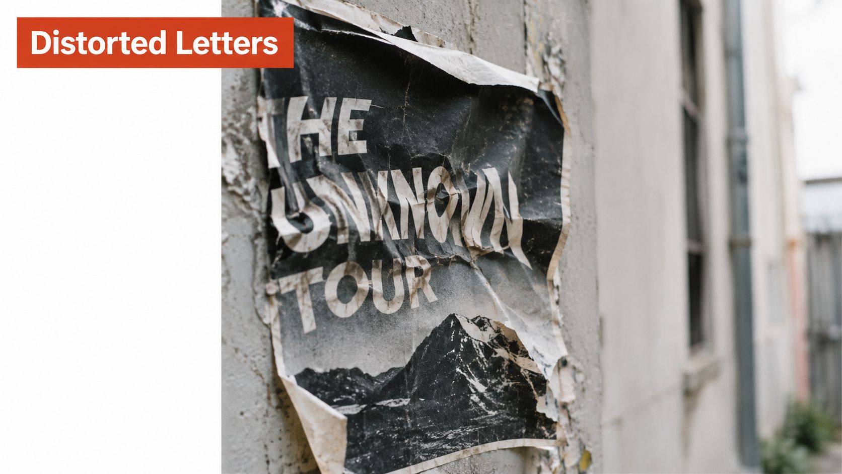
A peer-reviewed IEEE study tested optical font recognition on 280 fonts and reported approximately 97% accuracy for high-quality images. That result is valuable, but the condition matters. Clean, high-quality input doesn't represent a crinkled poster, a low-resolution screenshot, or lettering altered by perspective. The IEEE font-recognition study also illustrates why text length and image quality should appear in any serious evaluation.
Why general vision isn't enough
General-purpose multimodal systems can describe an image impressively while remaining unreliable at specialized font retrieval. A benchmark reported about 30% accuracy on an easier font task and approximately 15% on a harder version, so a fluent explanation of a typeface shouldn't be confused with dependable identification. The task requires fine-grained comparison among families that may differ in only a few glyph details.
Animated, transformed, or highly stylized lettering creates another boundary. If you're studying motion-based treatments, resources on examples of kinetic typography can help separate animation effects from the underlying type design. A frame from moving text may show blur, interpolation, or distortion that isn't part of the font itself.
A verification workflow for difficult samples
Use distinctive glyphs as checkpoints. Compare the lowercase “a,” “g,” “e,” and “r” where available, then inspect numerals, punctuation, terminals, and the relationship between thick and thin strokes. Logos require extra caution because custom joins, modified counters, and hand-drawn corrections can make a standard family look like the source.
If the candidates disagree, don't force a decision. Upload a cleaner crop, find another instance of the same type treatment, or request the original asset from the brand or client. The methods for extracting text and font evidence from PDFs can help when a PDF retains usable font metadata, but a visual match should remain a ranked hypothesis until the underlying file is verified.
Distinguishing Identification from Legal Licensing
Finding a likely family answers a design question. It doesn't answer whether the team can install the file, embed it on a website, place it in an app, modify it, or use it for a client logo. Those are separate decisions governed by the applicable foundry or reseller agreement.
The licensing problem is widespread. A 2025 survey of more than 1,300 font users found that nearly three-quarters considered unclear or buried usage rights their biggest frustration, according to the font licensing survey. That frustration is understandable because a family name can map to multiple files, distributors, subscriptions, versions, and permission models.
Web and desktop rights are different
A desktop license generally covers installation for specified users or workstations and the creation of static materials such as print work, social graphics, or logos. A web license generally covers hosting font files for live HTML and CSS rendering, commonly through WOFF or WOFF2 assets. The pricing metric can differ as well, with desktop rights tied to users or workstations and web rights sometimes calculated using monthly page views.
Some foundries prohibit converting desktop OTF or TTF files for web embedding. A desktop purchase therefore doesn't automatically authorize self-hosting, and a file format doesn't prove that the intended use is licensed. Adobe also explains that fonts installed through its library are governed by applicable end-user agreements, and that self-hosting, mobile-app embedding, and other custom uses may require licensing from the foundry or an authorized reseller. Its font licensing guidance also notes that subscription-based library rights depend on the relevant subscription remaining active.
Compliance habit: Record the exact family, file, foundry, acquisition source, permitted media, authorized domains or users, and review date. Don't record only the visual name.
Build an evidence trail
After identification, locate the authoritative product or foundry record and compare the actual file against the candidate. Save the EULA, invoice or subscription evidence, version information, and a screenshot of the asset where the font appeared. If a client asks whether the same type can move from a brochure to a website, review those uses independently rather than treating the original purchase as transferable.
This is also where broader web governance intersects with typography. Teams preparing a release may need to review accessibility and cookie consent alongside font assets, because a compliant typeface doesn't make an otherwise incomplete website compliance process acceptable.
For a practical checklist covering commercial deployment, see this guide to font licenses for commercial use. The guidance here is informational, not legal advice. If the license language is ambiguous, involve qualified counsel or contact the rights holder before launch.
Scaling Compliance with Professional Auditing Tools
A single unidentified logo is manageable. A large site portfolio is different. An agency may inherit screenshots, PDFs, design exports, and live pages from several clients, while an enterprise team may have multiple domains, regional sites, product interfaces, and old asset repositories. Manual comparison and spreadsheet updates become fragile when nobody can connect the visual candidate to the file actually delivered in production.
A workable audit joins two evidence streams. Image matching identifies what a designer or stakeholder sees. Live URL, PDF, image, and font-set analysis identifies what the organization distributes. The value comes from comparing those records, not from treating either one as complete on its own.
A defensible team workflow
Consider a brand refresh where the reference material includes a campaign poster, a website screenshot, and a compressed archive of inherited assets. The designer begins with image crops and records the candidate families. The developer checks the live pages and hosted files, while compliance reviews the foundry records and license scope.
The team should then:
- Preserve source evidence: Keep the original images, processed crops, detected text, and candidate rankings.
- Cross-check deployed assets: Compare likely families with fonts detected in live URLs, PDFs, and packaged files.
- Separate findings by risk: Mark unidentified custom lettering, trial copies, missing EULAs, and desktop-only purchases used for web delivery.
- Assign ownership: Give design, engineering, procurement, and legal clear actions rather than one ambiguous “font issue.”
- Retain the decision: Store the report, license documents, and review date so the next redesign doesn't restart the investigation.
Font Checker Pro can support this workflow by scanning live URLs, PDFs, images, and zipped font sets, returning exportable reports with detected typefaces, foundry and license details, and image-based candidate matches with confidence scores. It also provides recurring scans, alerts, audit history, and report formats suited to legal, operational, and CI workflows. These features don't replace foundry verification, but they reduce the gap between what a screenshot suggests and what a site or asset package actually contains.
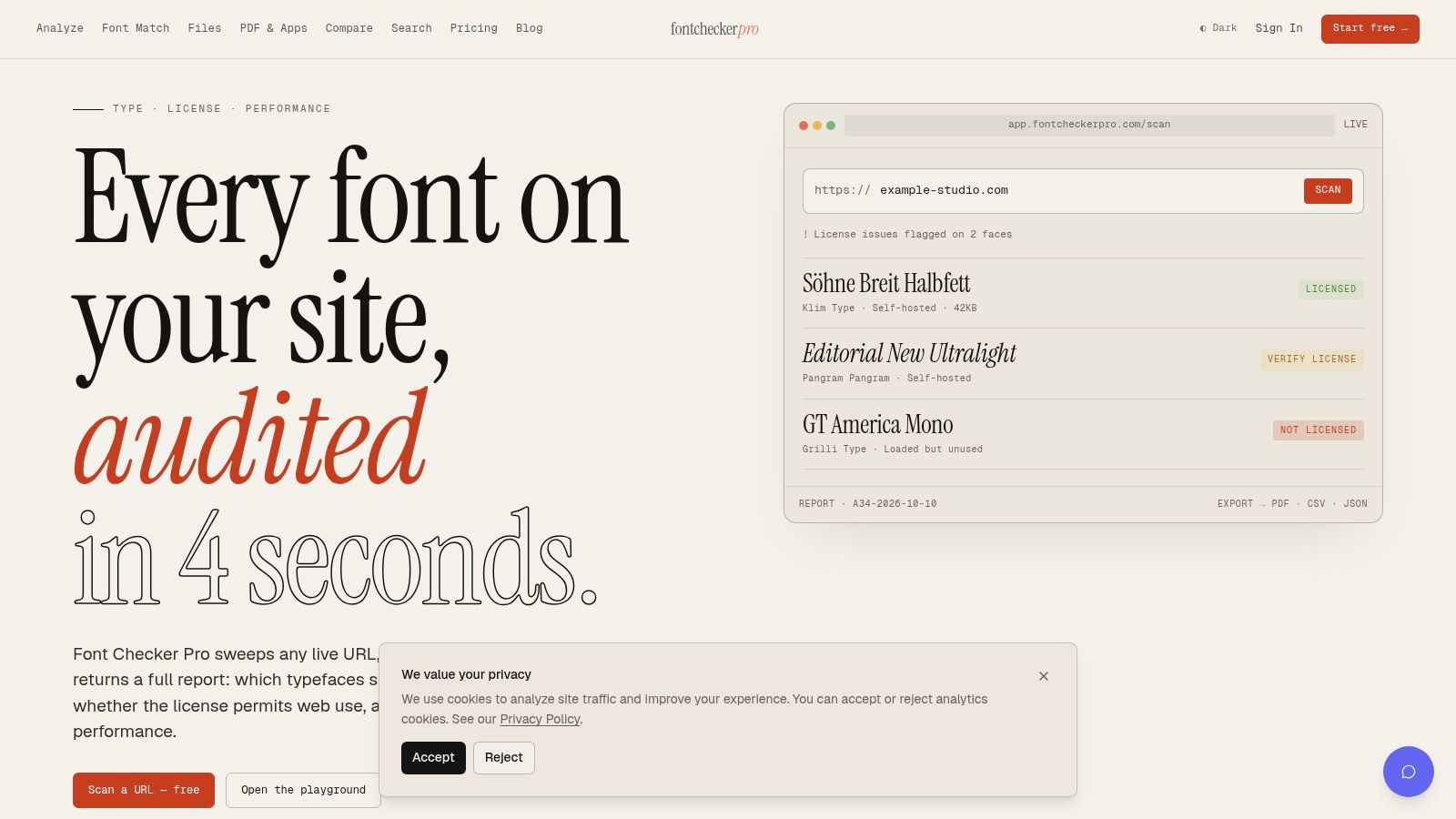
The strongest process is deliberately conservative. Use visual identification to generate candidates, use asset auditing to locate deployed files, and use authoritative licensing records to decide what can remain. That sequence gives designers speed without asking compliance teams to trust a black box.
Use Font Checker Pro to compare image-based font candidates with typography detected across live URLs, PDFs, images, and font packages. Start with a clean crop, preserve the resulting evidence, and use the audit reports to give design, engineering, and compliance teams a shared record before the next font reaches production.