Most advice about the Charlotte's Web font starts in the wrong place. It sends designers hunting for a single official download, as if the original book cover were built with a standard digital typeface waiting to be installed. That search is usually unproductive, and it can lead teams toward misnamed files, unclear ownership, personal-use copies, or assets that were never authorized for web deployment.
A better approach treats the lettering as a design reference, not a guaranteed font file. Match the hand-drawn character with a properly licensed typeface, then validate its technical performance and permitted use before it reaches a public site. That workflow protects the visual idea while giving design, engineering, procurement, and legal teams something they can document.
The Myth of the Official Charlottes Web Font
The original lettering is the important clue
The lettering associated with the original Charlotte's Web book isn't generally documented as a commercially released, named typeface. Typography analysis identifies the title as carefully hand-drawn lettering with consistent serif construction, which is a very different thing from a packaged font software file. The distinction matters because a title can look systematic and repeatable without ever having been produced from a font.
Several details create the lettering's recognizable personality. Rounded terminals, sometimes described as ball terminals, appear on characters such as the capital C, lowercase a and r, and the apostrophe. Ascenders in letters including h, l, t, and b receive consistent treatment, while the characters share uniform bottoms. Together, those choices form a cohesive display-lettering system, but they don't prove that a downloadable font named after the book exists.
The serif structure also has historical context. Serif forms developed from Roman monumental lettering and were later formalized by printers, so the title's visual language sits within a long typographic tradition. Its charm comes from how that tradition was interpreted by hand, not just from the presence of serifs. The typography analysis of the original lettering supports that distinction.
Practical rule: Treat a digital match as an approximation unless the lettering has been directly documented as font software.
Why random downloads create avoidable problems
A file labeled with the book's title may be an imitation, a personal-use font, a renamed family, or an asset distributed without clear permission. The filename doesn't establish who created it, which foundry controls it, or whether you can embed it in a website. It also doesn't tell you whether the file is a trial copy or whether its terms permit client work, advertising, applications, or redistribution.
That uncertainty creates two separate risks. The first is creative: the file may reproduce the general mood while missing the specific proportions and irregularities that make the lettering distinctive. The second is operational: a team may place an undocumented font in a design system, then discover during handoff that nobody can prove the right to use it.
Start with an image, screenshot, or known title sample instead of assuming the answer is a file named Charlotte's Web. A font identification workflow for designers can help generate likely visual directions, but identification is not the same as licensing. The final selection still needs a rights review and a technical check.
Deconstructing the Hand-Drawn Serif Aesthetic
Read the forms before choosing a substitute
A useful substitute begins with anatomy, not a vague label such as whimsical serif. Examine how the letters behave as a group. The original title's rounded terminals soften the serif structure, giving the forms a storybook quality without removing their historical reference. Look for terminals that end with controlled curves rather than sharp, mechanical cuts.
Ascenders are another meaningful signal. The repeated treatment of h, l, t, and b gives the lettering a shared rhythm, so a candidate typeface with unrelated ascender shapes can feel wrong even when its overall category appears close. Uniform bottoms also matter. They help the title sit as a deliberate display line instead of looking like ordinary text set in a conventional book face.
The apostrophe and lowercase forms deserve special attention during testing. A typeface can look convincing in uppercase samples and then lose the character in words containing a, r, or a curved apostrophe. Test the actual title, supporting words, and any brand phrases that will appear beside it. Don't judge a substitute from an alphabet specimen alone.
What standard serif fonts can and can't do
Times New Roman and New Century Schoolbook can reproduce broad serif characteristics, but they aren't the original lettering. Their proportions, terminal construction, and digital regularity lack the hand-drawn charm and historical fit identified in the analysis. They may work for body copy or a deliberately restrained interpretation, but they won't automatically recreate the cover's display personality.
That doesn't make them useless. A design system might use a conventional serif for readable paragraphs and reserve a more expressive licensed face for a short title. Separating display use from text use often produces a stronger result than forcing one decorative substitute across navigation, headings, captions, and long-form content.
Build a comparison set, not an exact-match promise
Create a small comparison set of legally available candidates and score each against the same criteria:
- Terminal shape: Does the softness come from rounded details, or does the face merely look decorative?
- Ascender rhythm: Do h, l, t, and b share a compatible vertical logic?
- Lowercase personality: Do a, r, and the apostrophe retain the intended warmth at the required size?
- Display behavior: Does the face hold together in a short title without becoming noisy?
- Rights clarity: Can the foundry or distributor document the permitted web, desktop, and static-output uses?
A structured workflow for finding fonts from images helps separate visual discovery from final approval. Label the result as inspired by or compatible with the lettering, not as the authenticated original, unless reliable documentation supports that claim.
Navigating Desktop Versus Web Font Licensing
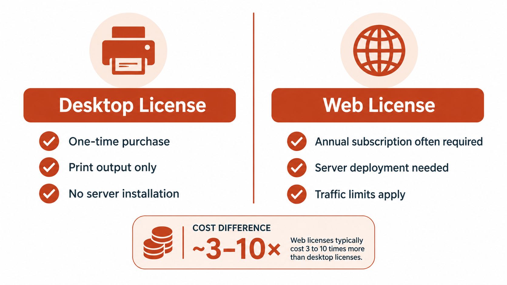
A font purchased for a design application is not automatically cleared for a live website. Desktop terms commonly cover installing font software on specified computers and producing static materials such as logos, packaging, print pieces, images, and presentations. Web licensing covers a separate technical use: delivering live text to browsers through CSS @font-face. Before purchasing, review our guide to the licensing differences between web and desktop fonts.
Map the use before you buy
Start with the intended output, not the file extension. One typeface may appear in several parts of a project, with each use requiring a different permission:
- Desktop design work: Installation on licensed computers for creating static materials.
- Live website text: Browser delivery through a hosted or self-hosted webfont arrangement.
- Hero artwork: A raster or vector image generated from the typeface.
- Application interface: Font delivery inside a mobile, desktop, or web application.
- Client handoff: Transfer of editable files or font software to another organization.
A desktop license may cover static outputs while excluding web embedding. A web license may permit live text through CSS while limiting image generation, application embedding, or other reuse. One foundry's end-user license terms separate desktop formats from live web rendering and prohibit converting OTF or TTF files into WOFF, WOFF2, or EOT web formats. Another font licensing policy distinguishes web hosting for HTML and @font-face from desktop use and static assets.
Record these distinctions before a designer exports files or engineering adds them to a repository. The approval should cover the actual deployment method, not merely the family name.
Why converting the file isn't a workaround
A frequent implementation error is purchasing an OTF or TTF desktop file, converting it to WOFF2, and uploading the result to a website. Conversion changes the container and delivery format, not the underlying authorization. If the license does not grant web use, the converted file remains outside the permitted scope.
Self-hosting adds a practical exposure that teams often miss. A browser can request a WOFF or WOFF2 asset, and the file may be discoverable through public code or network activity. That does not make every webfont license unsuitable. It means the contract should clearly address web deployment, approved domains, file formats, and usage limits.
Record the rights in a deployment register
For each candidate, record the exact family name, foundry or distributor, purchase record, license tier, permitted domains, embedding rights, and whether the file is a trial or personal-use asset. Store the EULA beside the design source instead of burying it in a separate procurement folder. Engineering should identify the approved file from the same record used during legal review.
A similar name is not proof of shared licensing. “Charlotte” may describe files with different owners, terms, and permitted uses. Treat any downloadable personal-use or trial file as unapproved for commercial web deployment until its specific license authorizes that use. Visual resemblance, file availability, and the family name alone do not establish permission.
The Financial Reality of Typography Compliance
Font compliance isn't administrative polish. It is a form of project risk management, especially when an agency delivers a site, a brand team publishes across many properties, or a developer carries old assets into a new repository. A personal-use or trial file can move from a mockup into production without anyone making a deliberate decision to violate its terms.
The exposure goes beyond the purchase price
A licensing-industry summary describes potential statutory copyright damages in the United States ranging from $750 to $30,000 per infringed work, with willful infringement potentially reaching $150,000 per work under U.S. copyright law. Those figures come from an enterprise font licensing compliance summary, and they aren't a prediction of any particular dispute.
The same source describes practical outcomes that may arise before or alongside litigation, including retroactive fees for unauthorized use, demands to stop using the font, and reputational harm if a dispute becomes public. The precise remedy depends on the font software, contract, jurisdiction, registration status, conduct, and litigation facts. This information is not legal advice, so a rights holder or qualified counsel should assess an actual notice.
The important operational point is that a missing invoice is only one symptom. A team might possess a desktop license but lack web rights, exceed permitted domains or users, or expose an unlicensed self-hosted asset in a public repository. Each problem requires a different remediation decision.
Make compliance cheaper than remediation
A defensible process catches the mismatch before launch:
- Assign ownership. Name the person responsible for approving the typeface and retaining the license record.
- Verify the exact asset. Match the file in the repository to the family name, foundry, version, and purchase record.
- Classify each use. Separate live text, static artwork, editable files, PDFs, applications, and client handoff.
- Review the contract. Check formats, domains, users, traffic terms, modification rights, and distribution restrictions.
- Remove ambiguity. Replace an undocumented file or obtain written confirmation from the rights holder.
A visual audit can surface suspected mismatches before they become formal demands, but the output should support human review rather than replace it. Keep an approval trail that shows what was checked, who made the decision, and which use cases the decision covers.
Balancing Visual Similarity with Web Performance
A licensed substitute can still be a poor production choice if it ships unnecessary glyphs, loads too late, or causes the fallback text to reflow when the expressive face arrives. The design review should therefore include a browser test, not just a specimen sheet. Visual similarity and delivery efficiency need to be evaluated together.
Compare static and variable delivery
A static WOFF2 subset can be the practical choice when the interface needs only a small number of styles and a defined character range. A variable font can consolidate multiple axes into one file, but one variable file may be larger than one static style. The 2025 Web Almanac font analysis reports variable fonts on 39.4% of desktop websites and 41.3% of mobile websites, up from approximately 33% and 34% in 2024. Those adoption figures don't mean variable delivery is automatically faster.
Use the smallest asset that supports the interface:
- Static WOFF2: Test when the design uses only a few weights or styles.
- Variable WOFF2: Consider when several axes are genuinely needed across the system.
- Latin-only subset: Use when the product's content requirements permit it.
- Broader coverage: Retain additional scripts or glyph ranges when the audience and content demand them.
WOFF2 remains the practical baseline because it compresses better than WOFF. File choice alone won't solve a poor loading strategy, though. A compact file can still create visible instability if the browser swaps from a fallback with very different metrics.
Test the fallback behavior
Set a deliberate font-display policy and compare the fallback face with the final face in real templates. Check headings, buttons, navigation, and title artwork separately. A fallback that looks acceptable in a paragraph may produce a noticeably different line break in a short display heading.
Review the following during implementation:
- Payload: Measure the selected subset and remove unused ranges.
- Preload decisions: Preload only a critical face that appears immediately in the initial view.
- Fallback metrics: Compare width, ascent, descent, and line height to reduce layout movement.
- Critical variants: Don't ship a complete variable file when the page uses only a narrow portion of its capability.
- Failure mode: Confirm that text remains readable if the custom face is delayed or unavailable.
The guide to font subsetting for faster, safer websites is useful when turning a visual choice into a controlled delivery plan. The strongest implementation isn't the one that resembles the cover most closely in a static mockup. It's the one that preserves the mood while remaining resilient under real loading conditions.
Auditing Your Typography Stack for Hidden Risks
Unapproved fonts often enter a codebase indirectly. A third-party theme may include a font folder, a legacy template may reference an old hosted asset, or a developer may test a typeface and forget to remove it. A typography audit needs to inspect both the visible page and the places where files and references hide.
Start with an inventory
Collect every active font reference from production pages, design repositories, build artifacts, content systems, and shared asset folders. Include CSS declarations, local font files, CDN references, package dependencies, and images that contain rendered lettering. Don't limit the audit to the font files a designer remembers approving.
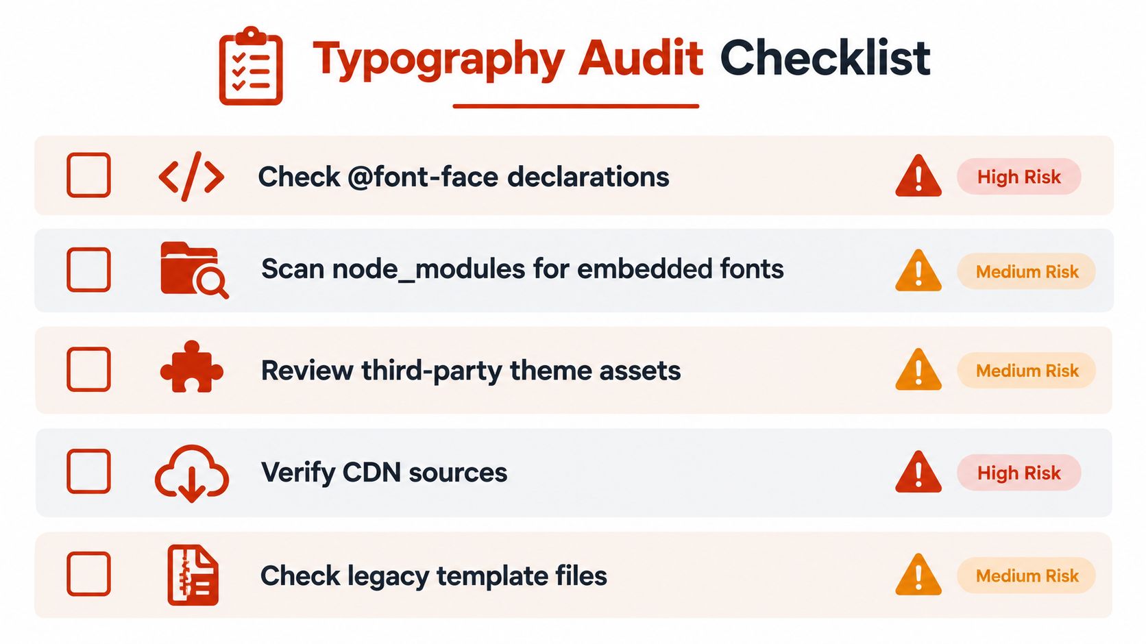
A useful inventory record includes the asset path, family name, format, source, first known use, current use, owner, and license evidence. If the team can't identify where a file came from, mark it as unresolved rather than assuming that a familiar filename means approval.
Trace each file to an actual use
Map the file against what the browser or design tool does with it. Live HTML text delivered through CSS is not the same use as a PNG title image. A PDF export, editable design file, mobile interface, and client handoff may each require separate permission under the applicable EULA.
Use a review sequence that follows the asset through the stack:
- Inspect declarations: Check every
@font-facerule, including unused or commented references that may return during a build. - Search dependencies: Scan package folders and bundled assets for embedded font files.
- Review inherited assets: Examine themes, templates, component libraries, and campaign folders.
- Validate delivery sources: Confirm that hosted files come from an approved location and match the recorded family.
- Compare environments: Check development, staging, production, and archived builds for drift.
The practical guide to checking fonts on a website can help structure that review. Automated scanning is useful for repeating the mechanical work and producing exportable evidence, while a human still needs to interpret the EULA and decide whether a use is authorized.
Close the gaps and keep the record current
Remove rogue files from the build, replace them with approved assets, or obtain the missing license before deployment. Preserve the old record so the organization can explain what changed and why. For an agency, attach the approval to the client handoff. For an enterprise, connect it to the design system release and repository ownership.
Schedule recurring checks after the initial cleanup. New templates, redesigns, acquisitions, and vendor changes can reintroduce fonts that the main site no longer uses. A clean report should identify current files, unresolved sources, license status, deployment locations, and remediation owners.
Building a Sustainable and Compliant Design System
A reliable typography system doesn't begin with a perfect replica. It begins with a decision that everyone can understand: which visual qualities matter, which typeface is approved, where it may be used, and how the organization will detect drift.
Turn a creative choice into a governed asset
A practical design system entry should include the approved family, permitted formats, use cases, fallback stack, subset strategy, repository location, purchase evidence, EULA, and review owner. Store the license record with the asset metadata so a future engineer doesn't have to reconstruct the decision from email threads.
Designers should document the intended mood and the features that made the substitute acceptable. Developers should document loading behavior and fallback choices. Legal or procurement teams should confirm the rights scope. That shared record prevents a later team from treating a desktop license as permission to self-host the same files.
Governance principle: A typeface isn't fully approved until its visual role, technical delivery, and contractual permission are recorded together.
Use a controlled handoff
Consider a project where the design team selects a hand-drawn serif substitute for a campaign title, engineering needs live text on the landing page, and marketing also wants downloadable social artwork. Those outputs shouldn't be treated as one generic font use. The team should map each one to the relevant license category, test the web asset separately, and document whether the artwork requires a different authorization.
A governance framework can help teams apply that discipline beyond typography. The Kogifi governance playbook for Sitecore and SharePoint offers useful context for assigning ownership, managing standards, and keeping digital systems consistent across teams.
The result can be both expressive and defensible. You don't need to claim that a substitute is the official Charlotte's Web font, and you don't need to sacrifice the nostalgic serif mood. Select a documented approximation, license it for every actual use, optimize the delivery, and review the live implementation as part of normal design-system maintenance.
Font Checker Pro can identify likely typeface matches from images, screenshots, logos, and uploaded font sets, then scan live URLs, PDFs, and assets for usage, licensing, and performance issues. Visit Font Checker Pro to check a Charlotte's Web-inspired implementation before handoff and create a report your design, engineering, and compliance teams can act on.