A brand team launches a polished landing page with dotted dividers, a dotted “Sign here” line, and a tracing-style accent in the campaign artwork. Weeks later, an accessibility review flags the form treatment, while compliance asks whether the font license covers the website, the exported PDF, and the client's design files. The visual decision looked small. The consequences weren't.
A font dotted line can be decorative, instructional, structural, or interactive. Those jobs aren't interchangeable. A dedicated dotted typeface may be ideal for a handwriting worksheet, while CSS is usually more practical for a small underline and SVG may offer better control for a scalable brand divider.
The choice also affects accessibility, page performance, and rights management. This guide treats dotted-line typography as an implementation decision, not just an aesthetic preference. It's informational rather than legal advice, and every font must be checked against its own license terms before production use. For broader typography system principles, the design system typography guide offers useful context.
When a Dotted Line Became a Design Decision
The design lead initially defended the dotted treatment because it matched the brand's playful identity. The divider separated content without competing with the headline, and the signature line looked familiar from printed forms. During the audit, however, reviewers questioned whether the fine dots remained visible at increased zoom, whether the line communicated an actionable field clearly, and whether the browser would preserve it in forced-colors settings.
That conversation exposed three different jobs hiding behind one visual style:
- Separation: A dotted rule can divide content while feeling lighter than a solid border.
- Incomplete information: A dotted underline can suggest a missing value, a draft state, or a place where a user should write.
- Interaction: A line beneath text may imply a link, input, signature field, or other action.
Each purpose needs a different test. A decorative divider can be judged mainly by visual balance. A form indicator must also survive zoom, contrast changes, keyboard focus, touch interaction, and assistive technology. A worksheet needs predictable letterforms and a license that permits reproduction and distribution.
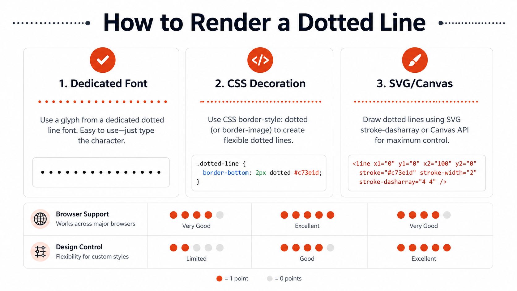
Three rendering paths usually appear in the implementation review. A dedicated dotted font builds the effect into the glyphs themselves. CSS decoration creates a dotted underline or rule without loading a special typeface. SVG draws a line or path with explicit geometry, often using stroke-dasharray for a controlled pattern.
The most attractive option in a mockup may create unnecessary requests, confusing fallback behavior, or licensing exposure in production. The right decision depends on where the line lives, who must interpret it, how precisely it needs to scale, and which rights cover the final output.
What a Font Dotted Line Is
A dotted-line font is a typeface in which dots replace some or all of the strokes that form letters, numbers, or decorative characters. In a tracing family, the dots outline each glyph so a learner can follow its shape. In a display face, they can create an LED, bead, perforation, or marquee effect. The dotted appearance belongs to the character design itself, rather than being added beneath ordinary text.
That distinction affects more than appearance. A tracing worksheet needs repeatable letterforms, clear spacing, and permission to reproduce and distribute the font. A branded title needs consistent rendering across the intended outputs. A web interface may need only a visual separator, making a dedicated font unnecessary overhead.
The idea has a long history. Around the 3rd century BCE, Aristophanes of Byzantium proposed dots at three vertical positions to mark short, medium, and long pauses in speech. Isidore of Seville later summarized the system in the 7th century. Dot-based pause marks continued as a structured reading aid for roughly 1,000 years, before modern punctuation settled on more familiar marks. The history is documented in the BBC's history of punctuation.
Dots still suggest separation, uncertainty, incompleteness, and secondary information. Readers meet these signals in signature rules, dotted dividers, tracing worksheets, and underlines that imply an unfinished action. Their meaning comes from context, so a dotted treatment should not carry an important instruction by itself.
Three layers that search results often combine
A search for “font dotted line” can refer to three technical layers:
- Dedicated typeface: Dots belong to the font's glyph outlines. Text remains text, while the font determines each character's construction.
- CSS decoration: Ordinary text receives a dotted underline, border, or background pattern. The typeface remains unchanged.
- Vector rule: SVG or Canvas draws a separate line or path. Its geometry can remain independent of text and follow a custom route.
Commercial type catalogs show that dotted styles remain a recognizable category. Neville Brody's FF Pop included a dotted LED version released in 1992, and FF Beadmap followed in 2002, with circular dots arranged on a grid. A font directory lists the dotted “Dotted Lined” entry with 200.4k downloads. These examples appear in FontShop's grid-and-dots font list.
For the surrounding type system, best fonts for brand design offers guidance on conventional display and text pairings. Before using a downloaded font, inspect its file and metadata with a font file analysis workflow, then read the license governing web embedding, modification, and distribution.
Comparing the Three Ways to Render a Dotted Line
The best method depends on four questions: How exact must the appearance be? How should it behave for users? What does it add to the page? Which rights apply?
A dedicated font provides the strongest typographic identity. Because the dots are built into the glyphs, the designer can control spacing, rhythm, stroke character, and the relationship between the dots and the letterforms. That precision is valuable in a tracing worksheet or a branded title. It also introduces font loading, fallback, subsetting, and web embedding concerns. At small sizes, individual dots can merge or disappear, especially when the font's intended size differs from the rendered size.
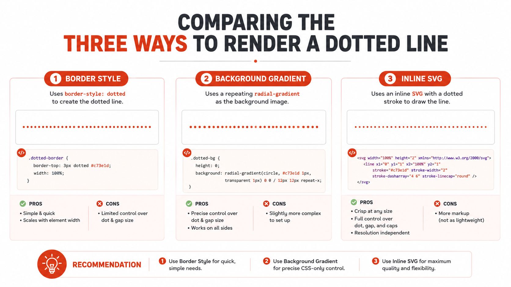
CSS has a smaller footprint when the requirement is a dotted underline or horizontal rule. text-decoration-style: dotted stays attached to text and can respond naturally to font size changes. A border or gradient can align with a layout box instead. CSS can be less expressive than a custom font or SVG, though browser rendering may vary in dot spacing, thickness, and antialiasing.
SVG gives the designer explicit control over line length, dash pattern, stroke width, joins, and paths. It works well for a large decorative divider, an illustration, or an animated reveal. That control comes with markup and maintenance overhead. An SVG also needs an appropriate text alternative or decorative treatment when it conveys meaning, and it shouldn't become a visual-only substitute for an actual form control or label.
Dotted-Line Rendering Methods at a Glance
| Method | Visual Control | Accessibility | Performance | Licensing |
|---|---|---|---|---|
| Dedicated dotted font | Highest control over glyph construction and style | Requires testing at small sizes, zoom, contrast, and fallback states | Adds font loading and possible FOUT or FOIT exposure | Requires rights for the actual deployment, especially web embedding |
| CSS decoration | Practical control over underlines, borders, and simple patterns | Often easier to preserve as text and adapt to user styles, but still needs contrast and focus testing | Usually avoids an additional font request | No special font license for the line itself |
| SVG or Canvas | Strong control over geometry, scale, and custom paths | Needs deliberate semantic handling and forced-colors testing | Adds markup or drawing work, but avoids a font payload | Vector usage is separate from font licensing, although any embedded font still has its own terms |
A tracing worksheet can justify the dedicated font because the dotted construction is the content. A footnote underline usually doesn't. A brand divider may benefit from SVG when its geometry must remain consistent across widths.
Once the project ships, the implementation can differ from the design file. A live-page audit can reveal whether the dotted treatment is a font, CSS rule, or vector asset, which matters when the team inherits an undocumented system.
Implementing Dotted Lines in CSS and SVG
Start with the simplest layer that can produce the required result. If the line belongs to text, use a text decoration. If it belongs to a layout region, use a border. If it follows a custom path or needs illustration-level control, use SVG.
Use text decoration for text-bound underlines
.dotted-link {
 text-decoration-line: underline;
 text-decoration-style: dotted;
 text-decoration-thickness: 0.12em;
 text-underline-offset: 0.2em;
}
This treatment remains associated with the text as it reflows. It can also respect user stylesheets more naturally than a decorative image. Don't use the underline as the only indication of focus or state. The link still needs a clear interaction model, sufficient contrast, and a visible focus treatment.
For a divider that must follow a layout grid, a border is often more predictable:
.section-divider {
 border-bottom: 1px dotted currentColor;
}
A border belongs to the element's box, so it won't change length when the text wraps. That makes it suitable for a short rule beneath a heading or a separator inside a card. If dot spacing needs more art direction, a repeating radial gradient can create a custom pattern, but test it across device pixel densities and forced-colors behavior.
Use SVG when geometry matters
<svg
 class="brand-divider"
 viewBox="0 0 600 8"
 role="img"
 aria-label="Decorative dotted divider">
 <path
 d="M4 4 H596"
 fill="none"
 stroke="currentColor"
 stroke-width="2"
 stroke-linecap="round"
 stroke-dasharray="1 9" />
</svg>
For a purely decorative line, remove it from the accessibility tree rather than adding an unnecessary announcement. For a meaningful diagram or process indicator, provide an accurate accessible name and explain the information elsewhere in the interface.
Self-host a dedicated webfont only when permitted
A dedicated font needs a web license that explicitly allows the planned delivery method. Use @font-face, limit the character set to what the page needs, and define a sensible fallback:
@font-face {
 font-family: "Worksheet Dots";
 src: url("/fonts/worksheet-dots.woff2") format("woff2");
 font-display: swap;
 font-weight: 400;
 font-style: normal;
}

.tracing-text {
 font-family: "Worksheet Dots", sans-serif;
}
Subsetting can reduce unnecessary glyph data, but it doesn't change the license. The font subsetting guide is useful for planning the technical side. A desktop file converted into a webfont isn't automatically authorized for website delivery.
Licensing Mechanics That Catch Teams Off Guard
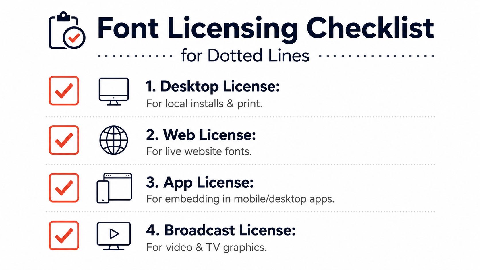
A desktop font license and a webfont license cover different activities. A desktop license generally permits local installation for creating print layouts, mockups, presentations, and other static assets. A web license covers serving the font to site visitors through CSS @font-face or another web delivery method. Paying for one category doesn't automatically grant the other.
That distinction becomes important when a team downloads a dotted typeface for a worksheet, then reuses it in a hosted landing page. The original purchase may cover the local design workflow while excluding web embedding, app distribution, or other forms of delivery. The rights belong to the specific font and agreement, not to the visual category.
Read the operational limits
Web agreements can contain technical and commercial restrictions that desktop agreements don't. Some prohibit generating a webfont from a desktop file. Others require self-hosting on the licensee's servers, limit the domains where the font may appear, or price access by monthly page views. One example license model starts at 10K views per website title and requires a separate web license for each distinct URL, as described in the published webfont agreement.
A practical review should record:
- Deployment type: Is the font used in print, a website, a PDF, an app, or broadcast graphics?
- Delivery method: Is it embedded, self-hosted, served through a hosted service, or packaged with files?
- Scope: Which domains, users, machines, or client organizations are covered?
- Modification rights: Does the agreement permit subsetting, conversion, or file-format changes?
- Distribution rights: Can the exported document or template be handed to a client or learner?
Practical rule: Treat “free” as a pricing description, not a permission statement.
Unauthorized use can create significant exposure. A reported settlement between a major foundry and a global publisher resulted in a $10 million payment over repeated unlicensed use of one font, according to FontCheckerPro's licensing compliance overview. The example doesn't determine the outcome of every dispute, but it shows why teams should preserve license records and audit inherited assets.
For a focused explanation of the two main license categories, use this web and desktop font licensing guide. This article is informational, not legal advice. A specific dotted-line font must be checked against its own terms before deployment.
Accessibility Trade-offs Most Dotted-Line Pages Miss
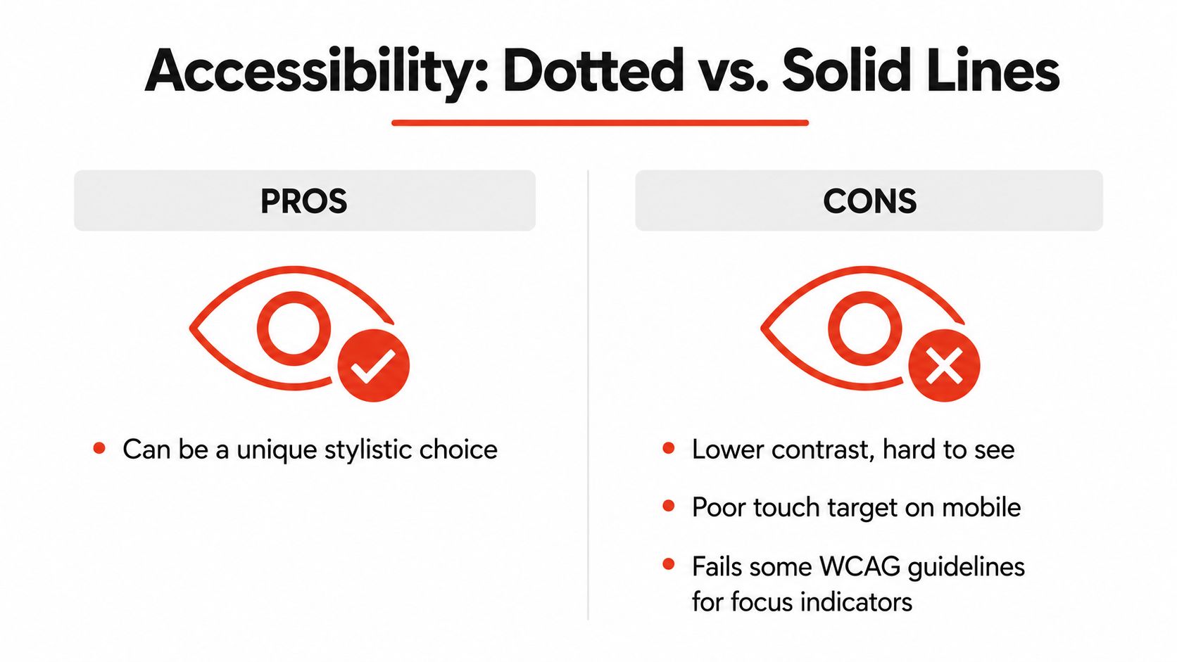
Dotted lines are visually distinctive, but distinction isn't the same as clarity. Independent accessibility guidance recommends using solid lines instead of dotted lines, particularly where the line communicates structure or interaction. Fine dots can blur at small sizes, lose contrast against a busy background, and demand more visual interpretation from people with low vision or cognitive load sensitivities.
That makes dotted styling a poor default for navigation, forms, focus indicators, and compliance-sensitive documents. A dotted line beneath “Sign here” may look familiar to a designer but fail to communicate the field's purpose clearly. A dotted separator between navigation items can also be mistaken for an inactive state or decorative texture.
Where dots help
Dotted construction has legitimate uses when the visual pattern is part of the task:
- Tracing worksheets: Dots can show the path a learner should follow.
- Handwriting practice: A dedicated family can distinguish instructional letterforms from finished text.
- Decorative dividers: A brand can use dots as a secondary visual rhythm when content remains understandable without them.
- Brand embellishment: A controlled accent can support identity without carrying essential meaning.
In these cases, provide supporting context. A worksheet should include instructions in readable text. A decorative divider should not be the only boundary between content groups. A brand treatment should remain optional rather than becoming the sole state indicator.
Where solid treatment wins
Use a solid rule when the line carries essential structure. For a form field, pair the visual line with a real label and a programmatic input. For keyboard focus, use a clear, sufficiently strong indicator that remains visible under user settings. For a legal signature field, don't rely on a fine dotted line to communicate where a person must act.
Test every treatment at the smallest intended size, at 200% zoom, and in forced-colors mode. Check whether the line remains visible when background images disappear, whether focus is distinguishable from the resting state, and whether touch users can identify the associated control. A redundant solid treatment is often the safest upgrade when the dotted style is part of the brand.
Choosing the Right Method for Each Use Case
A useful decision starts with the job, not the visual sample. Ask whether the dots form part of the content, decorate a region, or signal an action. Then select the rendering layer and verify the license category before the design is distributed.
Children's tracing worksheet
Choose a dedicated dotted font when the dots need to construct the letterforms themselves. Look for a license that covers local production, printing, and distribution of the completed worksheet. If the worksheet is delivered through a website, confirm that web use is permitted too.
The accessibility guardrail is separation between instruction and practice. Use a conventional readable face for directions, and don't force children to decode essential information through the dotted family.
Brand divider on a marketing page
Choose SVG with stroke-dasharray when the divider needs a carefully controlled length, stroke, or path. SVG scales independently from the text system and can preserve a brand-specific rhythm across responsive layouts.
Mark it decorative when it conveys no information. If it separates meaningful regions, keep the structure available through headings, grouping, and spacing rather than relying on the line alone.
Footnote underline in editorial content
Choose CSS text-decoration-style: dotted when the underline belongs to a short text run. It avoids loading a special display font and follows the text as it changes size or wraps.
Check the link or annotation's color, focus state, and hover state separately. The dotted underline should reinforce meaning, not carry the entire meaning.
Signature line in a generated PDF
Use a CSS border-bottom in the document-generation system, or choose a solid redundant treatment when the signature area has legal or operational importance. Confirm that the output preserves line weight and contrast in print and on screen.
A desktop license may cover the font used to create the PDF, but it doesn't automatically cover a website preview or an embedded application. The PDF's destination and distribution model matter.
Navigation separator
A solid separator is usually the clearest choice. If the design system requires dots, use a carefully weighted CSS treatment with sufficient contrast, and ensure that the separator doesn't resemble a focus indicator or disabled state.
The same dotted family may be labeled personal-use free, donationware, public-domain, GPL, OFL, or commercial. Those labels describe different rights and obligations. A team should scan the live URL, PDF, or zipped font set and document whether the actual deployment matches the selected license tier, rather than assuming the marketplace label settles the question.
Verifying Your Dotted-Line Choices Before They Ship
A dotted treatment needs a release check that covers appearance, behavior, delivery, and rights. Design approval alone won't reveal a missing web license, an unreadable focus state, or a font file that slipped into a client package.
Check the visual result
Review the smallest intended size first. Then test at 200% zoom, with text resized, and on a display where fine dots may lose definition. Inspect the line against every background it can encounter, including images, gradients, dark mode, and reduced-motion or high-contrast configurations.
Ask a second reviewer what the line means without seeing the design specification. If one person reads it as a divider and another reads it as a field or disabled state, the visual language needs reinforcement.
Check accessibility behavior
Validate default colors and forced-colors mode. Confirm that a dotted line never substitutes for a label, focus indicator, error message, or semantic grouping. For decorative SVG, verify that it doesn't create unnecessary announcements. For a dotted font, check the fallback state while the font loads and after it fails.
Check performance and delivery
Record whether the implementation adds a font request, how much font data ships, and whether unused glyph ranges can be removed. Confirm that font-display produces an acceptable loading experience and that the fallback doesn't change the meaning of the content.
Finally, verify the license against the actual deployment. A webfont must be authorized for the domain and delivery method, while a printed worksheet or PDF may require a different permission set. Keep the agreement, invoice, file version, and approved use documented together.
A live audit can support this process. The complete website font checker audit guide explains how to inspect typography across shipped pages and inherited assets. Font Checker Pro can scan a live URL, PDF, image, or zipped font set in about four seconds per page and return an exportable report covering typography, license tiers, and performance metrics. This content remains informational, not legal advice. Check the specific font's terms before production use.
Font Checker Pro helps designers, developers, agencies, and compliance teams identify dotted-line fonts across live pages, PDFs, images, and font packages, then organize findings into an exportable audit trail. Visit Font Checker Pro to verify rendering choices, licensing scope, and performance before your next dotted-line asset ships.