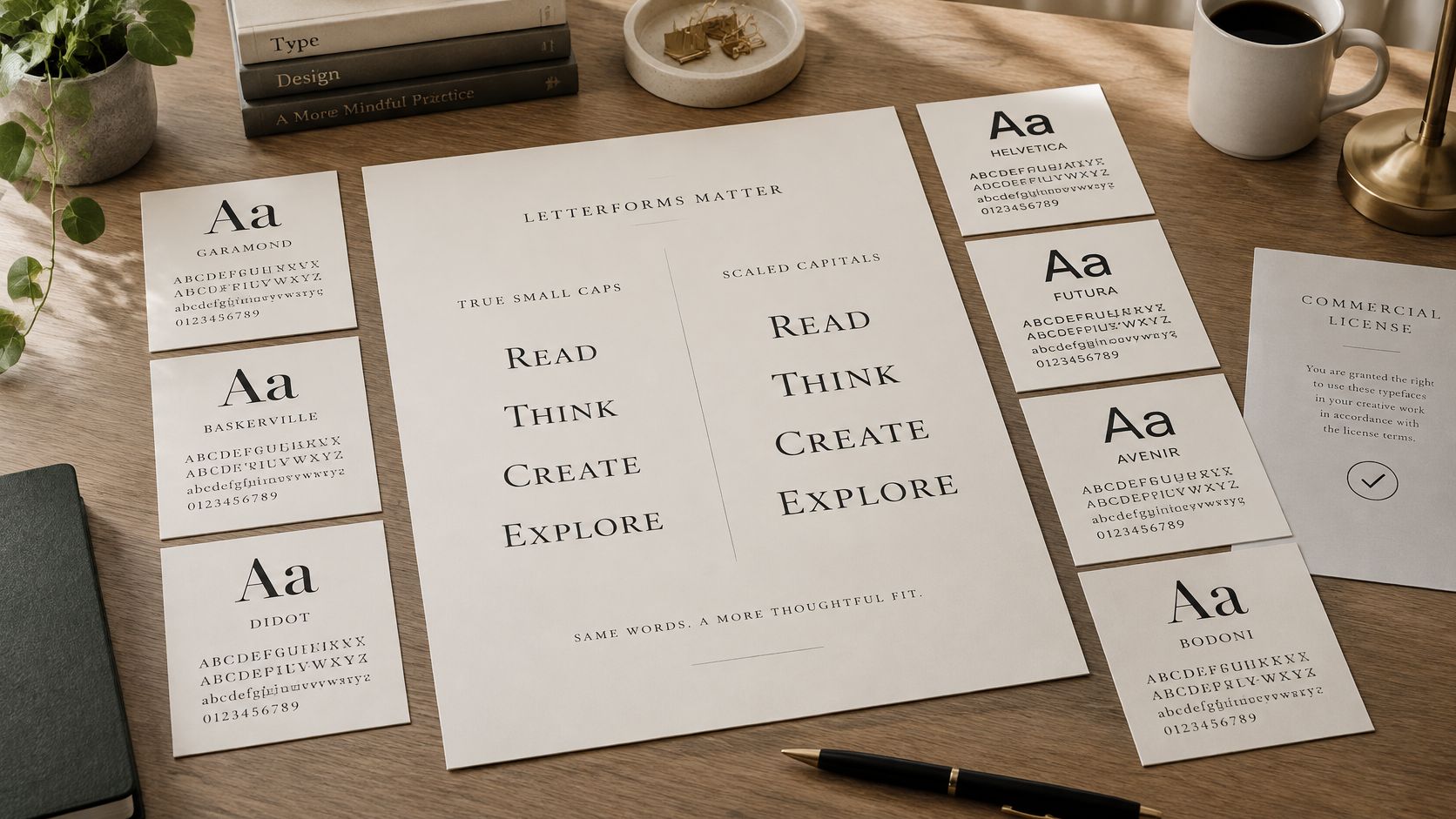
A brand team ships a style guide that specifies small caps for section labels and bylines. Six months later someone screenshots the live site. The labels render as shrunken capitals, thinner in the stroke than the body text and sitting slightly high against the baseline. The CSS says font-variant-caps: small-caps. The font contains no small-cap glyphs at all, so the browser scaled full capitals down and faked the rest.
That gap between intent and output is the reason to audit. True small caps are drawn characters, reached through OpenType features such as smcp and c2sc. Synthetic small caps are a rendering trick. They space differently, they sit differently, and they raise licensing questions, because the file being served may not be the file the brand paid for.
This list covers seven families and libraries, and each one gets the same three checks: does it ship real small caps, how do its web and desktop rights differ, and how do you confirm in production that the correct file is being served. If the layout around your type needs attention too, this design guide for DTC Shopify brands covers the wider page-level decisions.
Everything here is informational, not legal advice. Identifying a typeface in a report grants no right to use it, and only the foundry's licence terms and your own counsel can settle what you're allowed to deploy.
1. Adobe Fonts (formerly Typekit) Small Caps Families
A magazine site sets its bylines and section labels in a hosted serif, calls for small caps in the style guide, and never checks whether the family contains the glyphs. That is the common failure pattern with Adobe Fonts, still called Typekit by plenty of working designers. One subscription covers hosted web delivery and desktop activation through Creative Cloud, so the same family appears in mockups and production CSS with no second purchase and, too often, no second look.
Many of its serif and display families ship true small caps, and the activation path is documented in Adobe's OpenType feature syntax reference. Request the feature with font-variant or font-variant-caps and the font's own GSUB substitution does the work. The load-bearing word there is "its". A family without an smcp lookup leaves the browser to synthesise scaled capitals, which come out uneven in weight beside the lowercase. Toggle the feature on in a type tester and inspect the glyphs before you specify. Eyeballing a specimen at 40px proves nothing.
Where the subscription model bites
Rights follow the subscription. Let it lapse, or push a site onto a plan tier it does not cover, and the hosted files stop being licensed even though the CSS keeps working until something breaks. The confusion is widespread enough to measure: 47% of respondents said managing font licensing was challenging in Monotype's 2024 Global Font Use & Forecasting Survey. A retired kit produces the same failure without warning. The Adobe Fonts licensing explainer covers how kits map to plan scope.
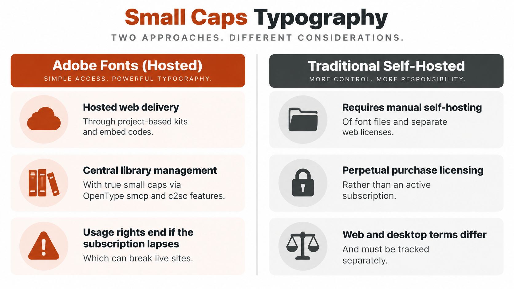
Back to that magazine site. Two records close the loop before publish: which subscription and kit the live site depends on, and which file the server delivers for the byline style. The first turns a lapse into a calendar event rather than a surprise. The second confirms the served font still carries smcp, since kits can swap files when families update.
2. Google Fonts Small Caps Families (e.g., Cormorant SC, EB Garamond)
Google Fonts is where many designers start, because the entry cost is nothing and the catalogue is enormous. Cormorant SC is a dedicated small-caps companion to Cormorant, drawn for display work. EB Garamond carries small caps through OpenType features inside the main family, so a single file covers both settings.
That split decides which check comes first. A dedicated SC family only ever draws small-cap glyphs, so the feature is guaranteed. A family that packs small caps into one file needs proof: open the glyph table and confirm smcp is there before the design gets approved, because the browser will scale down full capitals if the feature is missing.
Nothing in the catalogue is free of obligations. The SIL Open Font License generally permits web embedding, desktop installation and modification under one grant, which makes the licensing simpler than a hosted subscription. Each family's own license file still governs, and a Reserved Font Name restricts what you can call a modified version you redistribute. Zero cost settles the price. The permissions come from the license.
Three characters is the practical minimum
MyFonts' type anatomy material on small caps puts the sensible threshold at three or more characters. UNESCO reads well in small caps. A two-letter state abbreviation doesn't. Short strings give the eye too little material to establish a pattern, so the treatment reads as a rendering error rather than a style choice.
Practical rule: if the string is shorter than three characters, use full caps or sentence case. Small caps work through contrast with the lowercase around them, not on their own.
- Keep the license file. Download it for every family and store it with the project assets, next to the version number you deployed.
- Read the glyph table. Confirm smcp exists before the design gets approved. If the copy arrives already capitalised, check for c2sc as well.
- Check what production serves. A self-hosted upload and a CDN copy of the same family can diverge, so confirm the file being served is the version you licensed. Our Google Fonts license guide covers formats and compliance in more depth.
3. Alegreya SC
Faked small caps fail at text sizes, and Alegreya SC exists so you never have to ship them. Juan Pablo del Peral drew it and Huerta Tipografica published it under the SIL Open Font License as the dedicated small-caps cut of Alegreya, carrying the same warm, calligraphic, humanist temperament. It suits literary and academic settings, where capitals shouldn't shout over the text.
That character is also the trap. Because Alegreya SC ships as a separate file, teams sometimes fake small caps in body copy by dropping the font size on regular capitals, then wonder why the page reads mottled. Designed small-cap glyphs are optically corrected for stroke weight and spacing beside lowercase. Reduced capitals are not, and the difference is obvious on a decent screen.
What the CSS asks for
MDN's guide to OpenType fonts in CSS is direct about this: font-variant-caps: small-caps requests the smcp feature, and browsers may synthesise the appearance by scaling capitals when the font lacks it. It also separates small-caps from all-small-caps. The first converts lowercase and leaves existing capitals alone. The second treats both, which is what you want when text arrives already capitalised, and c2sc is the feature doing that work.
The consequence for QA is straightforward. Identical CSS across two fonts produces materially different output, so a screenshot proves nothing about support. Our practical guide to small caps in CSS walks through the feature settings and the fallback behaviour. With Alegreya SC you are loading the feature inside a purpose-drawn file rather than asking the renderer to improvise, which is the whole reason the companion cut exists.
- Use the SC file on purpose. For all-caps headings, set the companion file rather than shrinking a heading.
- Match the feature to the input. Reach for all-small-caps when the source text arrives capitalised, small-caps when it is mixed case.
- Audit what the page serves. Font Checker Pro shows which font files a live page loads and classifies each face by the domain it loaded from, the Google or Adobe catalogue, or a self-hosted origin. The verdict follows the serving source, not the declared font-family name, so a renamed file does not pass as the genuine release.
4. Spectral SC
A documentation site setting its navigation labels in Spectral SC gets compact, even-colour lines without the visual weight of full capitals. Production Type drew the family for screen and print reading, and the SIL Open Font License covers web embedding and desktop use under defined conditions. Interface headings, metadata labels and running heads are its natural habitat.
That compactness has a floor. Small caps at 14px can look elegant in a mockup and fragile on a phone in daylight, and a design built to stay tight at small sizes leaves little stroke weight to spare when rendering gets rough. Treat the minimum legible size as something to test on real devices, not something the family name guarantees.
Where small caps stop helping
MDN's reference for font-variant-caps warns that long passages set in all-small-caps or all-petite-caps can be difficult for readers with cognitive concerns such as dyslexia. The sensible response is to scope the feature: labels, abbreviations, running heads, metadata, never paragraphs.
Small caps do preserve the underlying characters for assistive technology, because CSS changes presentation rather than the text itself. That solves the semantic problem and leaves the visual one exactly where it was.
A digital reading platform setting section labels in Spectral SC is using the feature correctly. The same platform setting a full article that way is creating an accessibility review it will lose.
Accessibility review and typography QA are the same conversation. A treatment you can't defend at 200% zoom and with custom text spacing isn't finished.
- Subset the file. Trim to the character ranges you use and cut the payload.
- Test at body sizes. Check legibility on the devices your readers hold, at 200% zoom and with increased text spacing as well as at default settings.
- Verify what's served. Font Checker Pro classifies a typeface by the origin it loaded from and by visual identification, not only by the declared font-family, so a scan shows whether production returns the SC file or a different face answering to "Spectral."
5. Adobe Caslon Pro
A book studio licenses Carol Twombly's revival of William Caslon's eighteenth-century types for a jacket, then a developer self-hosts the same file on the client's site to match it. That one deployment is now outside the licence, and nobody acted in bad faith. The OpenType release ships true small caps through smcp, plus old-style figures, and book typography, front matter, running heads and heritage brand identities are its home ground. For a commercial family, the questions worth asking are which licence covers which use and who keeps the paperwork.
Desktop and web are separate purchases
A desktop licence generally does not authorise hosting the file in website CSS. Foundry Types' licensing FAQ states that desktop fonts can't be used on the web and that a separate Web Font Licence is required. It does permit desktop fonts in static images such as JPEG or PNG files, because the font file never reaches the browser. Monotype's wider guidance describes webfont licences as website-specific and annual, and says one licence ordinarily can't be shared across multiple client sites.
The image exception has limits of its own. A JPEG of a Caslon-set cover on a homepage is permitted. The same headline rendered live from the desktop file is not, because the font file itself crosses the wire.
An open antique volume of Natural History is the sort of project where this family earns its keep.

- Buy the web licence before publishing. Confirm it exists as a separate line, not just the desktop seats.
- Track seats and environments. Keep a register of who installs what, on which machine, for which client.
- Compare terms across revivals. The same desktop-versus-web split governs other classical revivals, and this Baskerville licensing breakdown shows how much the terms vary.
6. Minion Pro
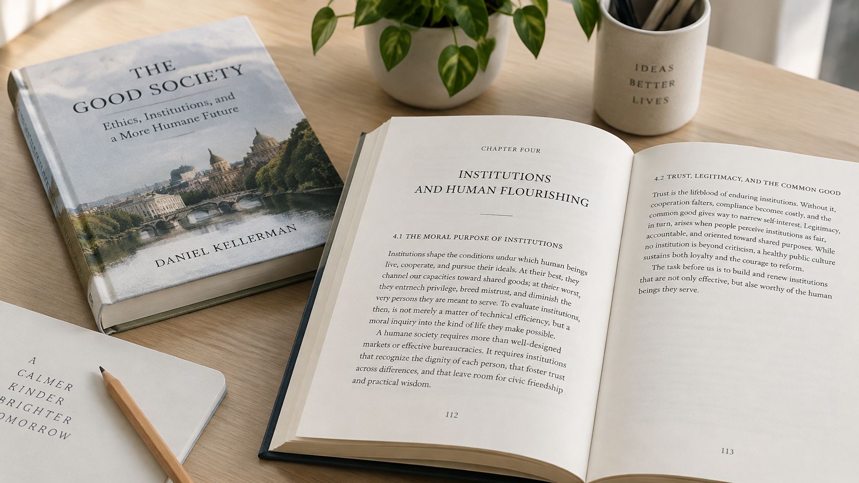
Set a chapter heading containing an acronym in Minion Pro small caps, and one of two things happens. If the font and CSS fire c2sc alongside smcp, the acronym converts with everything around it. If only smcp runs, the acronym sits at full cap height while the surrounding words shrink, and the line goes lumpy. That failure is the quickest way to see what this family does well and what the stylesheet has to request explicitly.
Robert Slimbach drew the OpenType family from late Renaissance models and shipped it with true small caps across multiple weights and widths. University presses and academic journals rely on it for exactly this reason: a monograph series running thousands of pages needs small caps that survive acronyms, running heads and footnotes without a compositor hand-fixing lines. Corporate reports reach for it for the same long-document endurance at small print sizes.
Why smcp alone isn't enough
The Microsoft OpenType feature specification defines smcp as a substitution of lowercase characters with purpose-built small-cap glyphs, and c2sc as the conversion of existing capitals. It recommends implementing both through GSUB lookups and says fonts supporting smcp should also support c2sc.
The fix in CSS is all-small-caps, which activates both features and produces the consistent treatment people assumed they were getting. Without it, any capitalised string typed directly into the text skips the substitution entirely.
A university press setting a chapter opener with an acronym in the title hits this within one line. Half the heading shifts, half doesn't, and the proof comes back marked.
- Verify the hosted version. Specify small-caps in CSS only after confirming the served file carries smcp.
- Map entitlements per environment. Record which machines hold desktop licences and which pages serve webfonts.
- Watch scope drift. Check published pages periodically for webfont usage that exceeds the licensed scope.
7. Garamond Premier Pro
A luxury lookbook sets its captions in Garamond Premier Pro small caps while headings run in a modern sans. It's a common brief, and the family earns the assignment. Slimbach's revival of the Garamond tradition ships a refined set of weights, display variants and true small caps, so elegant capitals carry real design load in the layout.
Its lineage explains why small caps feel inevitable in this family. Printer Johann Froben helped popularise small capitals from around 1516, during the early sixteenth-century Renaissance printing period, as the documented history of small caps records. Printers including Simon de Colines, Robert Estienne and Claude Garamond later carried the convention through France.
History has an audit consequence
Advertised small caps split into two different assets: alternates drawn for the purpose, and capitals shrunk at display time. Scaled capitals pass a casual glance and fail a real one. Stroke weight drops, spacing loosens, and the support gap hides behind a plausible-looking page.
Small caps are the cheapest way to make a page look expensive, and the quickest way to inherit a licensing problem nobody budgeted for.
Back to the lookbook. The usual failure is a self-hosted file lifted from a desktop install. Garamond Premier Pro's desktop licence and web licence are separate entitlements, and the file shipping true small caps on a designer's machine may not be the file your pages are cleared to serve. The guide to old-style serif fonts and web licensing covers that wider family context.
- Set the feature, not the size. Keep abbreviations and running heads in the font's small caps glyphs so weight and spacing stay consistent.
- Maintain a licence register. Map each web property and desktop installation to the entitlement that covers it.
- Confirm scope per URL. Check that each live page serves a file covered by your web licence instead of a copied desktop file.
How the seven small caps font options compare
Licence terms and use cases sit in the per-family sections above, so the table skips them. What it adds is the single check most likely to catch a failure for each family, whether that is a missing smcp feature, a companion file that was never requested, or the wrong variant reaching the page.
| Family | Small caps type | Check before shipping |
|---|---|---|
| Adobe Fonts small caps families | OpenType small caps in selected families | Coverage varies by family, so confirm the specific face ships smcp and that the kit delivers it to every domain in scope |
| Google Fonts small caps families (Cormorant SC, EB Garamond) | Dedicated SC families plus OpenType features in others | Two delivery modes: SC siblings need no CSS feature, while feature-based families need "smcp" declared explicitly |
| Alegreya SC | Dedicated small-caps companion family | The SC file carries small caps only, so lowercase strings still need the base Alegreya loaded alongside |
| Spectral SC | Dedicated small-caps companion family | Request the companion file itself; applying a small-caps style to base Spectral yields scaled capitals |
| Adobe Caslon Pro | True OpenType small caps | Confirm smcp and c2sc in the glyph table, then confirm the web licence covers the domain serving the file |
| Minion Pro | True OpenType small caps | Desktop installs and webfonts are separate deliveries; check which format your entitlement actually supplies |
| Garamond Premier Pro | True small caps and display variants | The family ships more than one variant, so verify the CSS calls the one the served file contains |
Whatever the family, the audit target is the file served on the live URL, not the name in font-family. Font Checker Pro classifies each face by where it loads from, which is how a self-hosted file or a missing SC companion surfaces before publication.
Verify Small Caps and Licenses Before You Publish
Three checks cover most of the risk, and they take less time than arguing about a rendering bug you can't reproduce.
- Confirm true small caps. Inspect the glyph table or a type tester for smcp and c2sc before a family enters the style guide. Then request the feature in CSS, view the result at 200% zoom, and look for stroke weight that thins as the letters get smaller. Thinning strokes are the signature of synthesis.
- Split the inventory. Record which domains each licence covers, the pageview allowances, the seat counts, and which subscription applies to which URL. A redesign that adds a domain, a template or a language version can leave the purchased scope behind without anyone noticing.
- Re-check after every release. Deployments change what loads. Treat the live page, not the design file, as the source of truth.
The accounting rules are more granular than people often expect. Monotype's published webfont licence terms specify annual licensing, single-domain use and pageview accounting, where each page load that invokes the kit's @font-face CSS counts as one pageview for each webfont in that kit, against a prepaid allowance. MyFonts sells desktop, webfont, mobile-app, digital-ad and electronic-document licences separately, so a desktop purchase doesn't cover app embedding or advertising.
Set expectations clearly, too. A controlled study with 20 college participants found no reliable difference in reading speed or comprehension between documents set with OpenType features, including small caps, and documents without: 194.73 versus 195.89 words per minute, with p-values of 0.84 and 0.86, plus a NASA Task Load Index workload score of 48.9 versus 37.7 with p = 0.01, as reported in Microsoft Research's study of reading aesthetics. Small caps earn their place on hierarchy and polish; the comprehension case is weak.
Any audit report feeds into a licence review rather than replacing one, and no identification method comes with a guarantee of accuracy. If the drift started in the style guide itself, these steps to writing brand guidelines help you write type rules a developer can follow.
Font Checker Pro scans any live URL, PDF, image or zipped font set and returns an exportable report in about four seconds per page, so you can see which small caps families are loading, where each file came from, and whether a self-hosted copy sits outside your licence scope. It classifies each face by the domain it loaded from, the Google or Adobe catalogue, or a self-hosted origin, shows the evidence behind each verdict, and flags rogue or expired fonts. Pick the production page where your brand type matters most, run it through Font Checker Pro, and compare the served files against the families you thought you'd licensed.