What does “geometric” really mean when the same clean visual language must work in a logo, a responsive interface, a multilingual product, and a licensing audit? A circle-based lowercase a may look simple, but the typeface behind it is a carefully engineered digital asset. Its outlines, spacing, rendering behavior, file formats, fallback strategy, and usage rights all affect whether the design succeeds.
Geometric font design has traveled from Bauhaus-era modernism to contemporary brand systems, but its central promise remains recognizable: clarity through structure. The challenge in 2026 is that visual purity alone isn't enough. Designers need to balance geometry with personality, developers need to protect rendering quality and performance, and legal or compliance teams need to verify that the chosen files are licensed for their actual deployment.
This lifecycle guide treats geometric type as both a creative system and an operational responsibility. It covers the history behind the forms, the anatomy of the letters, the shift toward softer geometrics, the practicalities of screen rendering and accessibility, and the distinction between desktop and web font rights. For a useful foundation in the wider discipline, see this simple guide to what typography means.
What Is Geometric Font Design in 2026
A geometric font constructs letterforms around visual principles associated with circles, squares, triangles, straight lines, and consistent proportions. The category usually belongs to sans-serif typography, but the label describes more than the absence of serifs. It describes the logic used to shape counters, terminals, bowls, joins, widths, and stroke relationships.
In practice, no successful typeface is made by placing perfect shapes side by side and stopping there. Pure mathematical construction often produces optical problems. A circular o can appear smaller than a square H even when both share the same measured height. A diagonal A may need to extend beyond adjacent flat letters to look equal in size. Designers compensate for these effects through optical adjustment, so a geometric face is usually a negotiation between mathematical order and human perception.
A century-old idea with a modern job
Geometric typography became a recognizable modernist movement in 1920s Germany. Paul Renner's Futura, begun in 1924 and released by the Bauer Type Foundry in 1927, became one of its defining milestones. Its construction was explicitly based on elemental circles, squares, and triangles rather than handwritten forms, which made it a clear expression of geometric sans-serif design. The historical account is documented in this overview of Futura's development and influence).
That origin still matters because it explains the style's emotional signal. Geometry suggests order, efficiency, industry, and a break with ornamental tradition. Brands may choose it to communicate technological confidence, editorial discipline, or institutional clarity.
Geometry is now a system, not just a look
A contemporary geometric font may serve as a logo foundation, a headline face, a user-interface family, or a variable font with adjustable axes. Its value depends on how consistently it performs across screen sizes, languages, browsers, and content types.
The practical question isn't solely whether the letters look modern. It's whether the family offers enough weights, widths, characters, alternates, and spacing control for the brand's real needs. Teams should also ask who owns the files, where those files will be used, and whether the license covers browser delivery.
Practical rule: Treat a geometric typeface as part of your product infrastructure. Approve its appearance and its deployment conditions at the same time.
The Origins of Geometric Typography
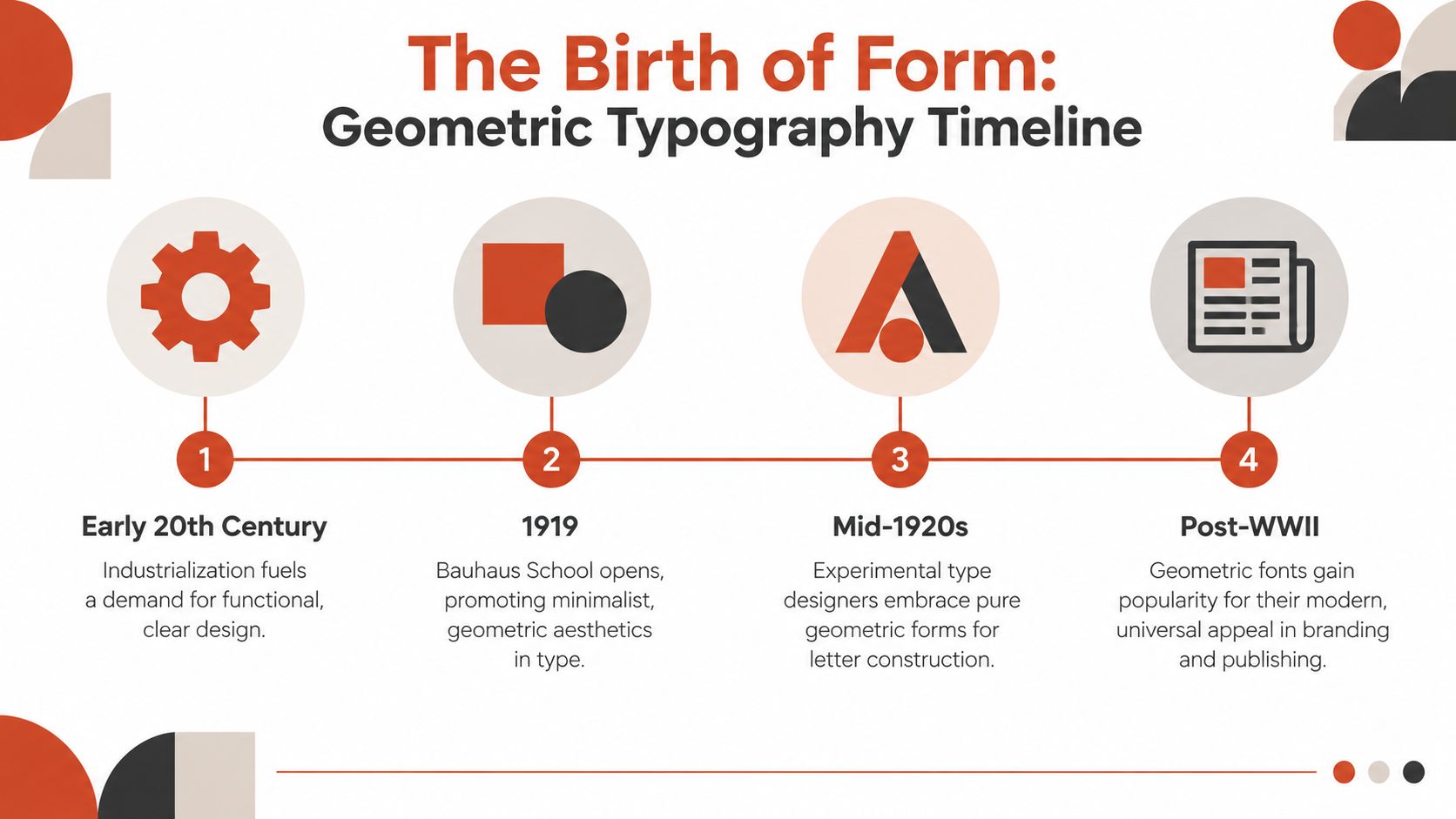
Geometric typography emerged from a period when designers were questioning inherited visual conventions. Industrial production, new communications media, architecture, and mass publishing all created pressure for a more direct visual language. Calligraphic references could communicate tradition, but modernist designers wanted type that reflected machines, systems, construction, and rational planning.
The Bauhaus and related design circles helped establish this attitude. Geometry offered an apparently universal vocabulary. A circle didn't depend on a particular handwriting tradition, and a square seemed to belong to engineering as much as to visual composition. Designers used these forms ideologically, not merely decoratively. They wanted to reject calligraphic tradition and emphasize efficiency, clarity, and modern industry.
Futura as the defining case
Paul Renner's Futura shows how that philosophy became a commercial alphabet. Renner began the design in 1924, and the Bauer Type Foundry released it in 1927. Rather than imitating handwritten movement, Futura used elemental circles, squares, and triangles as the basis for its construction, making it a defining example of geometric sans-serif design. The historical record of Futura) describes its deliberate relationship to these elemental forms.
The timing placed Futura alongside other important early geometric faces. Jakob Erbar's Erbar Grotesk appeared in 1926, while Rudolf Koch's Kabel followed in 1927. These releases placed geometric typography at the center of interwar design innovation rather than treating it as a minor stylistic variation.
Futura's ambition was larger than visual novelty. It was promoted as a “font of the future,” a phrase that captured its relationship to Bauhaus-era ideals of function, simplicity, and machine-age modernity. The typeface translated an abstract design program into a product that could be used by publishers, advertisers, institutions, and brands.
From avant-garde to public infrastructure
Geometric typography didn't remain confined to European modernist circles. One historical account notes that within a few years of release, Futura had become the most popular sans-serif in Europe and was rapidly gaining ground in the United States. Its influence spread across decades, and later typefaces borrowed its proportions and visual logic.
That influence also reached symbolic public milestones. Futura became associated with the commemorative plaque connected to the 1969 Apollo 11 Moon landing, demonstrating how geometric typography moved from avant-garde experimentation into high-visibility institutional use. The history of Futura's international adoption connects its commercial spread with this broader cultural role.
Its long commercial life matters for today's practitioners. Sources describe Futura as remaining in production for nearly a century, and it became one of the most copied fonts in history. The lesson isn't that every modern geometric face should imitate Futura. It's that a strong geometric system can survive because it offers both a recognizable worldview and a flexible practical foundation.
Anatomy of a Geometric Font
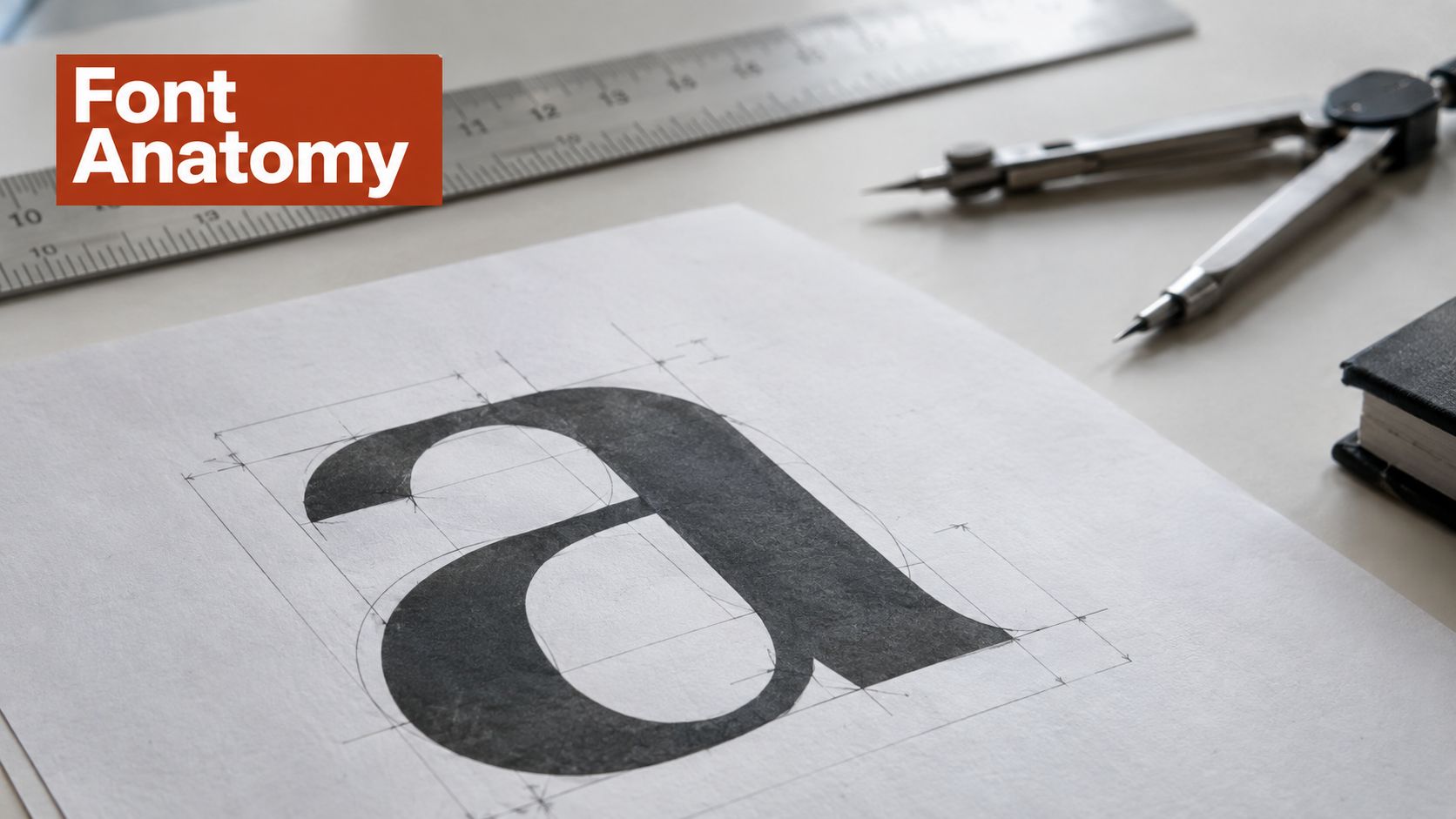
Start with the letters, but don't stop at the obvious shapes. A geometric typeface often includes circular bowls, simplified terminals, relatively uniform strokes, carefully controlled angles, and counters that appear regular. A lowercase a may be single-story, while an o may approach a circle. These features help identify the category, but they don't define quality by themselves.
The designer's real work begins when the forms interact. A circle, square, and triangle can share a construction grid, yet they won't automatically appear balanced when placed in a word. The typeface needs optical corrections that preserve the impression of order without allowing the underlying mathematics to become distracting.
What to inspect in the glyphs
A useful inspection starts with repeated structural questions:
- Counters: Check whether internal spaces remain open and recognizable at the sizes where people will read the type.
- Stroke rhythm: Look for consistency, but also watch for optical weight differences between vertical, horizontal, and diagonal elements.
- Apertures: Examine openings in letters such as c, e, and s. Tight apertures can make a face feel compact but may reduce clarity in small text.
- Terminals: Decide whether cuts feel neutral, sharp, mechanical, or expressive. Terminals often determine whether a geometric face feels rigid or warm.
- Proportions: Compare wide letters such as o and m with narrow letters such as i and l. A strict construction can produce dramatic width variation, while a more practical family may bring widths closer together.
- Distinctive forms: Inspect a, g, R, G, Q, and numerals. These glyphs often separate a memorable family from a generic one.
A family can look geometric in a specimen and still fail in running text. Test real words, interface labels, prices, navigation items, and long paragraphs. Display geometry and text geometry have different priorities.
How digital production preserves the illusion
Digital font production doesn't consist of circles and squares drawn by eye. Geometric fonts are commonly encoded as spline curves, alongside kerning and hinting data. Splines let designers describe smooth outlines with controlled points and handles, while kerning adjusts problematic letter pairs such as To, AV, or Ta.
Rasterization creates the central technical tension. An outline can look mathematically clean at its design size but blur or distort when a device turns it into pixels at a smaller size. Hinting helps align important features with the pixel grid, preserving stroke consistency and legibility. The technical explanation of font outlines, kerning, and hinting makes clear why automated or semi-automated hinting matters in real rendering environments.
Spacing deserves the same attention as outline construction. Tracking changes the overall rhythm of a word or text block, while kerning corrects specific pair relationships. This practical guide to tracking in typography is useful when a geometric face feels either too compressed or too dispersed.
Geometry gives the alphabet a framework. Spacing and rendering determine whether readers experience that framework as clarity or friction.
Modern Geometric Fonts in Practice
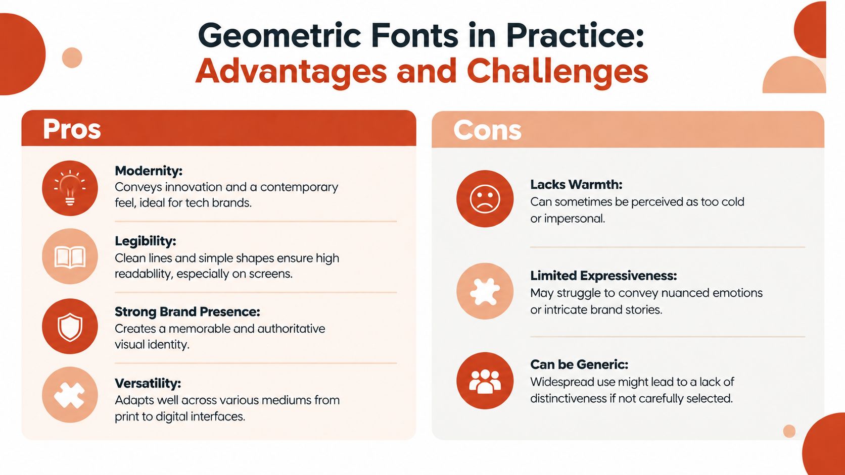
A rigid geometric face can make a brand feel precise, progressive, and self-contained. That's useful for technology products, architecture, finance, industrial services, and identity systems that need a controlled visual voice. Large headlines benefit from strong circles, clean diagonals, and a stable baseline because these features create immediate recognition.
The same qualities can create distance. Uniform strokes may feel impersonal, while highly predictable proportions can make a brand resemble many others using the same modernist shorthand. The design decision therefore depends on the role the typeface must play, not on whether geometric fonts are fashionable.
Choosing between rigid and soft geometry
Recent 2026 typography coverage describes a market shift toward softer, personality-driven geometric faces. Designers are moving from rigid geometric sans-serifs toward neo-grotesques or “soft geometric sans with personality,” partly because the older template-like look associated with families such as Montserrat and Poppins can feel generic in premium branding work. The trend coverage on contemporary typography documents this movement.
A soft geometric face doesn't abandon structure. It may open the apertures, vary the terminals, adjust the curve tension, introduce more generous proportions, or use subtle contrast to create a less mechanical voice. The result can preserve modernity while adding approachability.
Use a more rigid construction when:
- The identity needs authority: A disciplined alphabet can support a formal, system-oriented brand.
- The type is mostly display-sized: Large applications give distinctive geometry room to show itself.
- The visual system is highly modular: Consistent shapes can reinforce grids, icons, packaging, and motion principles.
Consider softer geometry when:
- The brand depends on trust and warmth: Human details can reduce the emotional distance of a strict sans-serif.
- The family must carry longer text: Open forms and moderated proportions can support sustained reading.
- The market is visually crowded: Unusual terminals, alternates, or width decisions can create distinction without sacrificing structure.
Avoiding the generic geometric shortcut
A familiar geometric family may be convenient, but convenience can become a brand liability. If the same letterforms appear across many unrelated products, the typeface may communicate category membership more strongly than brand personality. A design team should test whether the chosen family has a memorable feature, not merely a clean appearance.
Start with a functional brief. Define the desired temperature, authority, pace, and reading environment before selecting a family. Then compare uppercase and lowercase behavior in actual brand phrases rather than relying on specimen words.
Building a useful type system
A geometric font should earn its place across the full identity system. Test it in:
- Logo and wordmark work: Look for distinctive joins, spacing opportunities, and letter combinations that can survive reduction.
- Headlines: Evaluate weight, width, line breaks, and how large counters behave at display sizes.
- Interface labels: Check short labels, buttons, forms, and navigation where cramped spacing quickly becomes visible.
- Long-form content: Test paragraphs with realistic language, punctuation, numerals, and hierarchy.
- Localization: Confirm that the family supports the scripts and diacritics the product requires.
A typeface that succeeds in a logo but fails in a form field isn't a complete solution. The strongest systems use geometry as a foundation, then select weights, widths, spacing, and alternates according to context.
Performance and Accessibility Concerns
A geometric font can be visually efficient while remaining technically expensive or difficult to read. Developers need to evaluate the files and delivery strategy, not just the specimen sheet. A family with many styles, broad character coverage, or variable functionality may offer flexibility, but that flexibility can affect payload, caching, and rendering behavior.
Variable fonts are becoming a baseline expectation in 2026 trend coverage, and newer geometric families are increasingly designed for screens. Some trend commentary also anticipates experimental axes such as SOFT, WONK, and CASUAL becoming more common. These claims are projections from recent trend coverage, not guaranteed outcomes, as described in this 2026 overview of geometric sans-serif directions.
Variable versus static delivery
A variable font can consolidate multiple design dimensions into a flexible file. That can simplify a responsive type system and let a team tune weight or width more precisely. It doesn't automatically guarantee a faster page, though. A variable file may contain a broad range of glyphs and axes that a particular page never uses.
Static files can be easier to reason about. A project may load only the weights required for its interface, while a variable setup may provide more control at the cost of a larger or more complex asset. The correct choice depends on the family, subset strategy, caching model, and actual content.
Use a testable process:
- Measure the delivered files: Record payload and identify unused styles or glyph ranges.
- Subset carefully: Remove characters the product does not require, while preserving localization requirements.
- Limit active variants: Don't load every weight because the family offers them.
- Check fallback behavior: Observe how text changes before the webfont arrives.
- Test real devices: Compare low-resolution screens, mobile connections, and operating-system rendering.
A font that produces a flash of invisible text or a disruptive layout shift can undermine an otherwise polished interface. Performance decisions should be validated in the browser, not inferred from the font's visual simplicity.
Accessibility is part of the type decision
Uniform strokes and low contrast can support recognition, but some geometric designs become cramped or ambiguous at small sizes. Tight apertures, similar letterforms, narrow spacing, and low-quality rasterization can create problems for readers with visual impairments or for anyone viewing text under difficult conditions.
Accessibility review should include body copy, labels, error messages, controls, and disabled states. Don't approve a family solely because its headline specimen looks crisp. Verify that users can distinguish characters, follow line rhythm, and identify interactive states without relying on color or extreme weight changes.
Teams building a broader compliance process can consult guidance on implementing website accessibility standards. That resource should complement, not replace, hands-on testing with actual content and assistive technology.
A typeface passes the design review only when it remains readable under the least favorable realistic conditions.
For web delivery, subsetting and fallback planning deserve their own review. This font subsetting guide for faster, safer websites can help teams structure that work without treating file reduction as an excuse to remove necessary language support.
Licensing and Auditing Geometric Fonts
A geometric font used in a logo, presentation, or print layout isn't automatically cleared for browser delivery. Desktop font licenses and web font licenses are separate rights, and commercial licenses may price them independently according to deployment scope or usage measures such as pageviews. This distinction is informational, not legal advice, but it's essential for designers, developers, agencies, and compliance teams.
A desktop license generally addresses installation and use in desktop applications. A web license addresses delivery through browser technologies, often with rules about hosting, domains, formats, traffic, or embedding. Buying one does not necessarily grant the other.
Audit the rights before deployment
Before a geometric font reaches production, document four things:
- The asset: Record the exact family, style, file version, foundry, and source.
- The deployment: State whether the font will appear in print, a logo, an app, a website, a campaign, or a productized item.
- The license scope: Check permitted domains, hosting requirements, traffic thresholds, formats, seats, and renewal terms.
- The evidence: Preserve invoices, EULAs, purchase records, approvals, and correspondence in a shared location.
One published EULA states that web fonts must be supplied in WOFF, WOFF2, and EOT formats, self-hosted on the license owner's servers, and licensed starting at 10K monthly views per website title, with a separate license required for each distinct URL. Those terms belong to that specific EULA, so teams must read the agreement for the exact family they're deploying. The published webfont EULA example shows why a general assumption about web rights can fail.
Common compliance failures
The most frequent mistake is treating installation as permission for every use. Other problems include leaving a trial file in production, exceeding a web license's traffic scope, serving a self-hosted copy when the agreement requires another arrangement, or assuming that a logo license covers live text on a website.
Licenses may also restrict derivative or productized letterform goods. A foundry EULA prohibits using the font to create alphabet products for resale, including rubber stamps, die-cut products, stencil products, and adhesive sticker alphabet products where customers can reproduce the font's likeness and create their own typesetting. The foundry EULA example illustrates why downstream use deserves the same attention as web deployment.
The financial exposure can be serious. One legal guide states that willful infringement in the United States can lead to statutory damages of up to $150,000 per work, while another warns that scope violations can trigger lawsuits, cease-and-desist demands, and forced rebrands. The font licensing legal guidance is useful background, but it isn't a substitute for advice from qualified counsel.
Make auditing part of the lifecycle
Manual review often breaks down when a website inherits fonts from several teams, agencies, repositories, or old redesigns. A repeatable audit should identify every font in use, match each file to its license record, flag unclear or expired rights, and produce evidence that legal and technical teams can review.
It should also inspect performance conditions. A font may be properly licensed yet still carry unnecessary glyph ranges, create fallback inconsistencies, or cause avoidable rendering issues. Combining asset inventory, license verification, and delivery checks gives the organization a defensible view of its typography stack.
For a practical framework on documenting ownership and resolving unknown files, use this guide to font licensing and audits. Again, this article provides general information, not legal advice. Where an EULA is ambiguous or the deployment is commercially significant, involve qualified legal counsel before launch.
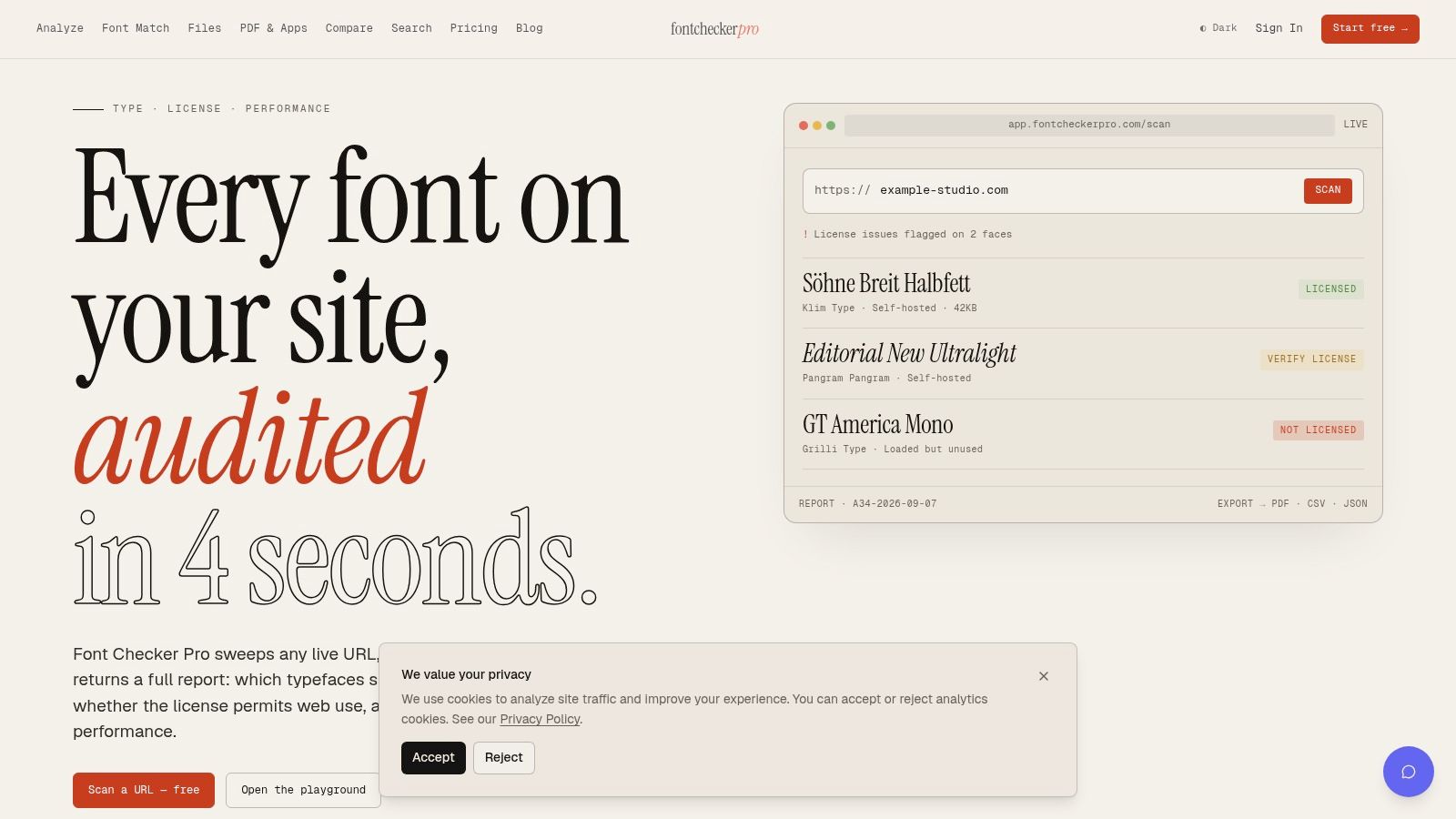
Font Checker Pro scans live URLs, PDFs, images, and zipped font sets to identify typography, review licensing signals, and benchmark delivery issues such as payload, unused glyph ranges, and FOUT or FOIT impact. Use Font Checker Pro to audit a geometric font system before launch, document its rights, and keep recurring checks in place as the site and asset library change.