Most advice on retro futuristic fonts starts and ends with mood boards. You get chrome lettering, neon gradients, arcade references, and a short list of display faces that “look sci-fi.” That's useful for inspiration, but it's not enough for professional work.
A strong retro-futuristic typography decision has to survive three tests. It has to look right, it has to perform well in the medium where it appears, and it has to be licensed correctly. Skip any one of those, and the project gets shaky fast. A poster can become unreadable. A landing page can become slow. A brand rollout can create compliance problems that nobody budgeted for.
That matters because retro futuristic fonts aren't just a style category. They sit at the intersection of design history, interface behavior, and intellectual property. Designers want expressive type. Developers need reliable rendering. Agencies need clean handoff. Legal and compliance teams need proof that the files in use match the rights purchased.
This article is informational, not legal advice. But if you work with expressive typography in commercial environments, you need more than aesthetic taste. You need an operating model.
The Enduring Appeal of Retro Futuristic Fonts
Retro futuristic fonts keep returning because they compress two emotions into one visual move. They feel familiar and speculative at the same time. A good one can suggest optimism, machinery, entertainment, and cultural memory before a reader has processed a single word.
That's also why weak advice about the category spreads so easily. People often reduce the look to 1980s sci-fi posters, game cabinets, or synth-heavy branding. Those references are part of the story, but they're not the whole story. The more useful view is that retro-futuristic typography is a long-running design language that keeps getting reinterpreted by each new medium.
For brand teams, that makes these fonts unusually versatile. They can signal innovation without feeling sterile. They can evoke nostalgia without looking antique. And they can give digital products a distinct voice in a market crowded with neutral geometric sans-serifs.
Practical rule: If a retro futuristic font only works when surrounded by glow effects, lens flares, and metallic textures, the typeface probably isn't doing enough on its own.
A core appeal is control. A sharp headline face can reference space-age optimism. A rounded display face can soften technical messaging. A pixel-influenced cut can make a product launch feel playful rather than corporate. The style lets teams tune tone very precisely.
That's one reason modern designers keep revisiting families in the same visual orbit as Orbitron-inspired futuristic typography choices. The appeal isn't novelty for its own sake. It's the ability to borrow credibility from earlier visions of the future, then adapt that energy to current interfaces, campaigns, and packaging.
Decoding the Retro Futuristic Aesthetic
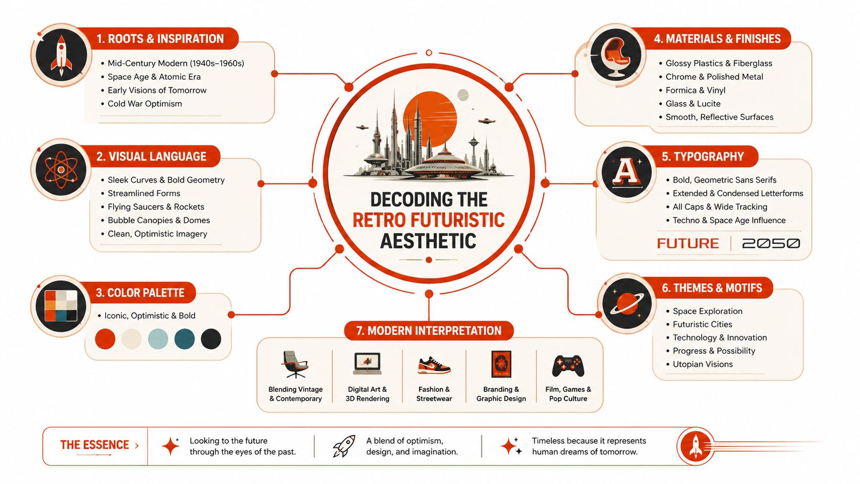
The category makes more sense when you stop treating it as a decade and start treating it as a design tension. Retro futuristic fonts look backward to older visions of tomorrow. They carry the optimism, fear, smoothness, machinery, and display habits of earlier eras that imagined what came next.
The biggest misconception is historical. The first fonts explicitly designed to evoke a futuristic aesthetic emerged in the 1950s, not the 1980s, with Handel Gothic as a defining example created by Aaron Handel while working with Saul Bass's studio during that period of postwar technological optimism, as noted in this discussion of the style's origin. That lineage matters because it changes how you evaluate the style. You're not picking from a niche set of “eighties fonts.” You're working inside a typographic tradition that has been evolving for decades.
What the eye reads as futuristic
Most retro futuristic fonts rely on a few recurring signals:
- Geometric construction draws from circles, squares, and engineered proportions.
- Compressed or extended widths create a sense of speed, machinery, or broadcast graphics.
- Open counters and clean terminals support a polished, manufactured feel.
- Rounded corners or aerodynamic curves hint at jet-age product design.
- Unusual joins, cuts, and inline details suggest technology even when the letterforms stay readable.
These traits don't all need to appear at once. In fact, the best fonts usually avoid stacking every sci-fi cliché together.
Why some fonts feel convincing and others feel costume-like
Authentic retro-futuristic typography usually has a clear historical center of gravity. It borrows from a specific design era, then pushes slightly beyond it. Weak versions often do the opposite. They pile on novelty shapes with no internal logic.
That's why modern families discussed in pieces like this guide to the Exo font style for designers and developers are useful reference points. They show how a typeface can feel futuristic through structure and rhythm, not just effects.
A second factor is restraint. A font feels more “retro futuristic” when it suggests a believable future imagined by a past era. It feels less convincing when it looks like a generic sci-fi prop.
The test is simple. Remove the gradients and the chrome. If the letterforms still imply an era-specific idea of the future, the typeface is doing its job.
Key Categories of Retro Futuristic Fonts
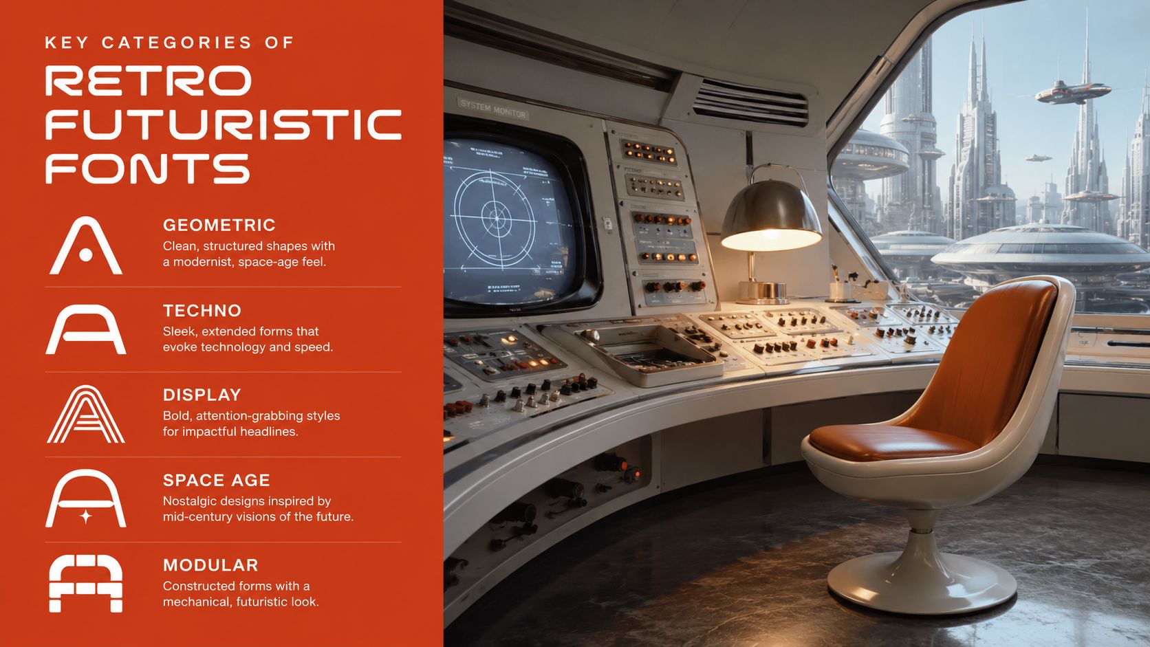
Once you know what to look for, the category gets easier to understand. I usually sort retro futuristic fonts into a handful of practical groups. These aren't legal or foundry classifications. They're working buckets that help teams choose a direction fast.
Names mentioned below are stylistic references only. They do not mean a font is safe for commercial use, properly licensed for the web, or suitable for client handoff without checking terms.
Atomic Age and Space Race styles
This is the cleanest branch of the category. Think geometric sans-serifs, sweeping curves, and letterforms that feel engineered rather than ornamental. Handel Gothic sits near this territory historically, and many later display faces borrow the same promise of progress.
Use this group when the brand needs optimism and clarity. It works well for:
- Tech branding where you want innovation without cyberpunk aggression
- Editorial headlines tied to science, transport, or architecture
- Packaging that needs a mid-century future mood rather than a game aesthetic
These fonts usually pair well with sober body text because the display style already carries enough personality.
Psychedelic and soft-future variants
Some retro futuristic fonts come through the 1960s and 1970s rather than the machine-perfect 1950s. They're rounder, warmer, sometimes inflated, and occasionally eccentric. They can still feel futuristic, but the future they imagine is cultural and expressive, not purely industrial.
This branch is useful for music, events, apparel, and campaigns that want nostalgia with a human pulse. It's less useful for dense UI, dashboards, or technical documentation.
Digital arcade and CRT-inspired pixel fonts
This group is where many teams make avoidable mistakes. They assume any pixel font will produce an authentic retro effect. It won't. For retro-futuristic pixel fonts, more convincing implementations use intentional glyph irregularities, including slight misalignments, uneven stroke weights, and widths that resist perfect grid snapping, because those details better simulate vintage CRT and analog display artifacts, as explained in this analysis of CRT filters and pixel fonts in app design.
That means the “cleanest” pixel font is often the least believable one.
| Category | Best use | Common failure |
|---|---|---|
| Atomic Age | Logos, headlines, product naming | Too cold when used everywhere |
| Psychedelic future | Posters, music, apparel | Poor readability at small sizes |
| Pixel and arcade | Menus, labels, game UI, promos | Over-snapped geometry that looks fake |
| Modern hybrid | Startups, apps, campaigns | Feels generic if historical cues are too weak |
Modern hybrids
Many current retro futuristic fonts blend old references with contemporary spacing, broader language support, and cleaner rendering. That makes them practical. It also makes them easy to overuse.
A hybrid works best when only one layer is nostalgic. If the font is retro, keep the layout disciplined. If the layout is retro, choose a more controlled typeface.
Using Retro Futuristic Fonts in Modern Design
These fonts are strongest when they're treated as accents with strategic authority. They're display tools, not default typography systems. Teams get better results when they assign them a narrow job and let another typeface handle the heavy lifting.
Where they work well
The obvious fit is entertainment. Film posters, festival branding, game launches, and event graphics all benefit from a typeface that carries narrative mood instantly. But the category also works well in places people overlook:
- Product launches for hardware, AI, or mobility brands that need a future-facing tone
- Hero sections where one short line needs to set atmosphere fast
- Packaging and merch where expressive display type helps create collectibility
- UI labels and micro-brand moments when used sparingly inside a broader system
The key is concentration. One strong retro futuristic font in a project often feels intentional. Three usually feel like indecision.
Where they fail
Body copy is the most common misuse. Many retro-futuristic display faces have unusual widths, stylized apertures, or decorative cuts that tire the eye quickly. They may look great in a wordmark and collapse in a product paragraph.
I also see teams force them into every layer of a brand system. Headline, subhead, body, buttons, navigation, captions. That turns a distinctive voice into noise.
Use the expressive font where readers should feel something. Use the plain font where readers need to understand something.
A better approach is to pair a statement face with a quiet companion. The display font handles the emotional cue. The support face handles hierarchy, legibility, and repetition. That balance is the same discipline covered in these design system typography principles.
A simple decision filter
Before approving a font, ask four questions:
- Can it carry a headline without effects? If not, it's too dependent on styling.
- Does it survive small-scale use? Some decorative cuts disappear quickly.
- Does it pair cleanly with neutral text? If every combination clashes, system design gets harder.
- Does it match the brand's version of the future? Space-age optimism, arcade play, luxury tech, and dystopian grit are not interchangeable.
Retro futuristic fonts work best with restraint because restraint makes the reference legible. A single controlled signal of futurism usually lands harder than a full-screen pileup of nostalgia cues.
Web Performance and Technical Best Practices
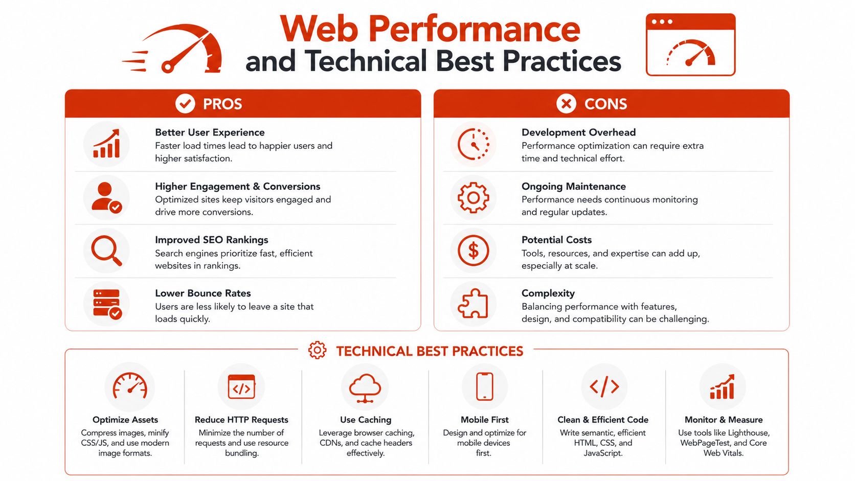
A beautiful font choice can still degrade the site if implementation is sloppy. Retro futuristic fonts often arrive as display families with multiple weights, alternate styles, or expanded character sets. That makes them tempting to load in full. It also makes them expensive if nobody trims the payload.
Start with the file strategy
For web use, modern compressed formats matter. So does only shipping what the interface needs. If the launch page uses uppercase English headlines and a handful of numerals, there's no good reason to serve a broad file with unused glyph ranges.
A practical implementation checklist looks like this:
- Prefer modern web formats that are designed for browser delivery.
- Subset aggressively so the file only includes required characters.
- Limit variants to the weights and styles used on the page.
- Define solid fallbacks so temporary font swaps don't break hierarchy.
- Test rendering on low-bandwidth and lower-power devices, not just on a design machine.
If your team needs a refresher on the trade-offs between formats, hosting, and loading behavior, this guide to font file formats, licensing, and performance is a useful operational reference.
Manage FOUT and FOIT on purpose
Retro display fonts tend to exaggerate loading problems because they look nothing like default system fonts. When a custom headline swaps in late, users notice. When text stays invisible too long, they notice that too.
That means you should make a deliberate choice about loading behavior. For marketing pages, a fast fallback that preserves layout may be the better compromise. For a tightly art-directed campaign page, the team may accept a different behavior to protect the visual reveal. The point is to decide, not drift.
Build with readability in mind
Technical performance and readability overlap more than teams admit. Tight tracking, glowing effects, and all-caps display text can become much harder to read when rendered at smaller sizes or on lower-quality screens.
A good implementation review should include:
| Check | What to look for |
|---|---|
| File payload | Unused styles and oversized character coverage |
| Fallback stack | Similar metrics to reduce layout shift |
| Contrast | Decorative effects that reduce legibility |
| Responsive sizing | Headlines that remain readable on small screens |
A retro futuristic font should create atmosphere, not make the interface feel unstable.
Developers often inherit these decisions late. The safest workflow is to review typography during component design, not after launch prep.
The High Stakes of Font Licensing You Cannot Ignore
The most dangerous sentence in font work is “we downloaded it, so we're covered.” You're not. In commercial projects, the issue isn't whether a font file was easy to obtain. The issue is whether the specific use matches the rights granted by the license.
This section is informational, not legal advice. But the operational point is straightforward. Font licensing needs the same discipline teams already apply to stock imagery, music, code libraries, and brand assets.
Typeface design is not the same as font software
In the United States, copyright law does not protect typefaces themselves, but it does protect the underlying font software, which means using the file without a license can infringe that software even if the visual design of the letters isn't protected in the same way, as explained in this overview of font law and licensing.
That distinction catches people off guard. A team might understand the look of a typeface, redraw a custom logotype, and assume the same rights extend to web deployment. They don't. The logo treatment and the software file used on a website are separate issues.
Desktop and web licenses are different products
Another frequent failure is assuming a purchased desktop font can be moved directly into a web project. It usually can't. Desktop and web font licenses are distinct, with desktop usage commonly limited by installed users or company size, while web usage is commonly measured by pageviews, domain scope, or self-hosting terms. One example cited in this font licensing guide for designers shows an “unlimited” license for a single font style priced at $116,000 based on company size.
That number isn't useful because it is a widely accepted payment. It's useful because it demonstrates how sharply cost and rights can change once the organization and usage scale change.
Here's the practical distinction:
| License type | Typical control point | Common misunderstanding |
|---|---|---|
| Desktop | Seats, computers, company size | “We bought the font, so we can use it anywhere” |
| Web | Pageviews, domains, hosting method | “The designer used it already, so the site is covered” |
Free, trial, and public download are not compliance categories
A font can be easy to find and still be risky to deploy. Existing discussion around retro-futuristic options often glosses over this issue, even though 68% of freelance designers reported confusion over licensing tiers for “free” typefaces in a 2025 Adobe Industry Survey, as summarized in this discussion of font ideas and licensing ambiguity. That confusion is exactly why teams end up shipping trial files, expired rights, or assets copied from old project folders.
The danger increases when developers self-host font files without reading the EULA. A publicly available font file dropped into a site build is still a licensing problem if the terms prohibit that method of distribution, as discussed in this explanation of font licenses and file sharing. Designer rights also don't automatically transfer to the client.
If the client will publish the font, the client needs rights that cover that publication. A designer's local-use license is not a handoff license.
Penalties are not theoretical
Using fonts without a valid license can trigger civil, administrative, or criminal liability, and trial licenses are commonly restricted to unpublished testing only. Publishing client work with a trial font is a breach, and some foundries may charge up to $1 million for unauthorized unlimited corporate use, according to this guide to font licensing for designers and business clients.
That doesn't mean every violation ends in the worst-case number. It means the exposure can be serious enough that “we'll sort it out later” is a poor governance model.
A safer workflow is simple:
- Audit before launch so the live site matches the rights purchased.
- Document license scope for desktop, web, app, and client transfer separately.
- Flag trial files early before they move from mockups into production.
- Review self-hosting terms instead of assuming a file format equals permission.
- Keep an asset trail so legal, procurement, and production can verify what's in use.
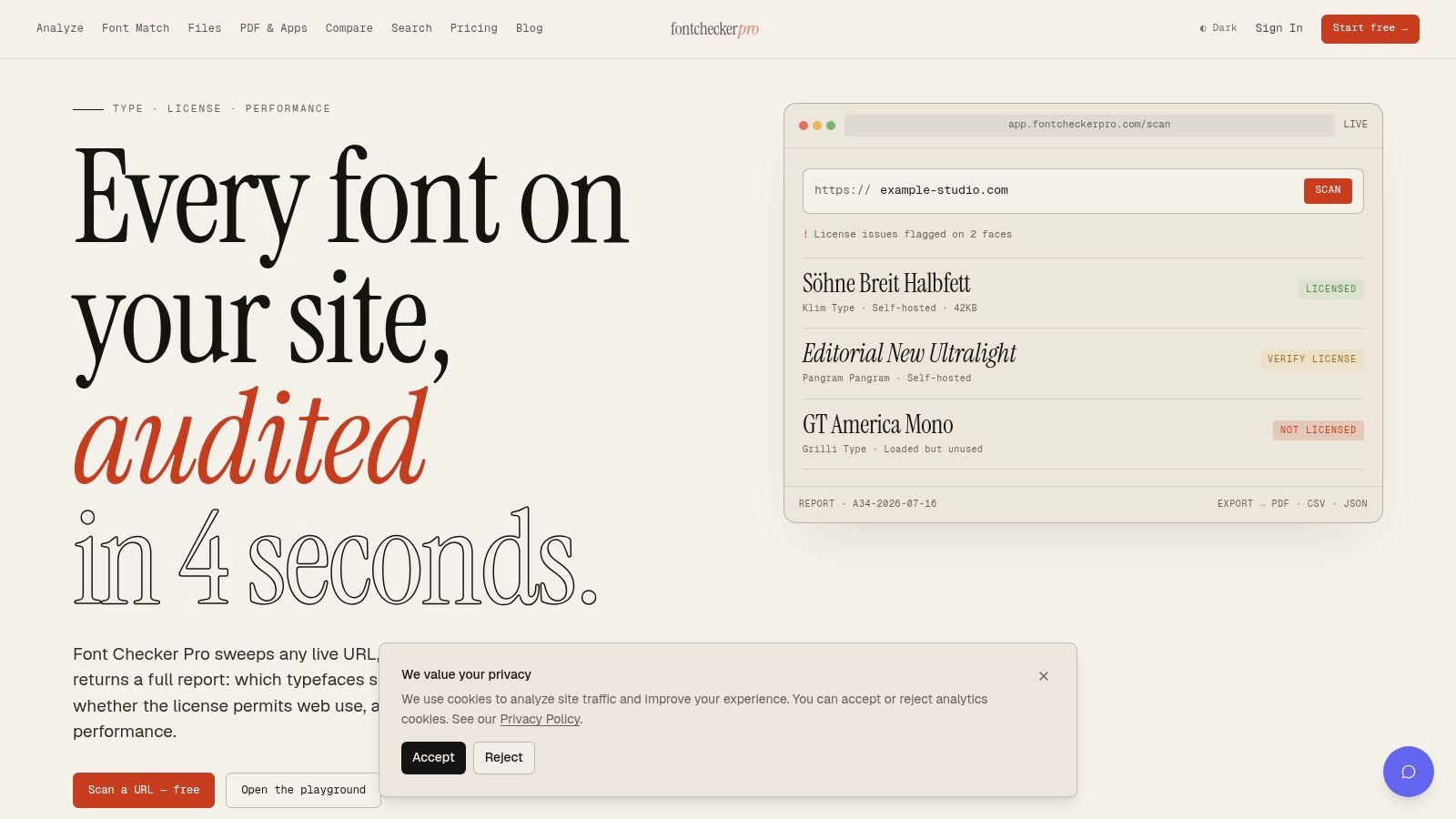
For teams that need a repeatable way to inspect typography across live URLs, PDFs, images, and bundled font assets, this guide to avoiding fines in font license agreements is a practical place to start.
Conclusion Building a Future Proof Typography Workflow
Retro futuristic fonts reward teams that treat typography as both craft and infrastructure. The creative upside is obvious. You get history, atmosphere, and instant character. The operational upside is less glamorous but just as important. You avoid weak implementation, broken hierarchy, and preventable licensing problems.
The most reliable workflow rests on three habits. First, choose the style with historical precision instead of defaulting to generic sci-fi cues. Second, deploy it with restraint so the design stays readable and the web experience stays stable. Third, verify the rights attached to the actual font files in use, especially when projects move from concept to client delivery.
That combination changes the role of typography. It stops being a last-minute decorative layer and becomes a managed brand asset. Designers make sharper choices. Developers ship cleaner builds. Compliance teams get documentation instead of guesswork.
Retro futuristic fonts aren't hard to use well. But they do punish casual workflows. The more expressive the type, the more disciplined the process needs to be.
Font Checker Pro gives teams a practical way to verify that discipline. It scans live URLs, PDFs, images, and font packages, identifies the typefaces in use, flags licensing risks such as trial copies or problematic self-hosting, and surfaces performance issues like payload waste and FOUT or FOIT impact. If you want retro futuristic fonts without compliance surprises, review your stack with Font Checker Pro.