You've just approved a refined interface that uses small caps for navigation labels, metadata, and legal text. The design looks controlled in the mockup, but the live build raises harder questions: does the selected font contain real small-cap glyphs, will the browser synthesize them, and is the font licensed for web deployment rather than only desktop use?
That's the part many guides skip. Small caps in CSS are a typographic decision, a rendering decision, and a compliance decision at the same time. The syntax is simple. The production judgment isn't.
Why Small Caps Deserve Your Attention
Small caps work best when they create hierarchy without shouting. A compact label above an article title, a byline, a date, or a short legal notice can feel more deliberate in small caps than in full uppercase. The letters retain an uppercase character, but their reduced height usually produces a calmer line with less visual weight.
That subtlety makes small caps useful in systems where every typographic choice has a job. They can separate metadata from body copy, give section markers an editorial tone, or add polish to a brand interface without introducing another font weight. The same decision can fail, though, if the typeface lacks designed small-cap glyphs or if the implementation interferes with other font features.
Typography on the web has always involved this kind of negotiation between design intent and technical behavior. For a concise introduction to the broader discipline, this practical guide to what typography means provides useful context.
A foundational CSS feature
Small caps aren't a recent decorative addition. CSS small caps have been part of the language since CSS Level 1, when the font-variant property was originally defined with normal and small-caps. In CSS 2.1, a browser could use a real small-caps face or synthesize the effect by scaling uppercase letters, and the inherited property had an initial value of normal according to the W3C CSS font documentation.
That history explains why older code often uses font-variant: small-caps. It also explains why legacy behavior can be misleading. A line may appear to use small caps while the font is merely being reduced mathematically, with no specially drawn glyphs behind it.
The production questions that matter
Before shipping, check three things:
- Glyph quality: Does the font contain true small-cap forms, or will the browser create a substitute?
- System behavior: Will the declaration preserve numeric, ligature, and alternate-character settings elsewhere in the component?
- Deployment rights: Does the license cover the font file's use on the web, not just design work on a desktop?
The visual result is only one part of the decision. A polished label built with an unauthorized web font can create a larger problem than an imperfect fallback.
Using font-variant-caps Correctly
The cleanest modern implementation starts with the dedicated font-variant-caps property. It targets capitalization features without using the broad font-variant shorthand, which can reset unrelated OpenType settings in the same rule.
For a short metadata label, keep the selector narrow and the declaration explicit:
.article-meta {
  font-variant-caps: small-caps;
  letter-spacing: 0.04em;
}
The letter-spacing value here is a design choice, not a required default. Small caps often benefit from a little breathing room, but spacing should be judged at the actual size, weight, and language used by the interface.
Choose the right caps value
small-caps preserves the distinction between lowercase and uppercase input. Lowercase characters can become smaller uppercase forms, while existing uppercase characters remain uppercase. That behavior suits labels containing normal mixed-case text.
Use all-small-caps when the entire line should share the small-cap treatment:
.section-label {
  font-variant-caps: all-small-caps;
}
Modern CSS treats these choices as OpenType features. font-variant-caps: small-caps maps to the smcp feature tag, while font-feature-settings can activate the same tag directly. The feature is disabled by default and must be explicitly enabled through font-variant, font-variant-caps, or font-feature-settings, as described in the OpenType font guidance.
Modern font systems also expose related values such as petite-caps and titling-caps. They solve different typographic problems, so don't substitute them just because the result looks distinctive.
Avoid the broad shorthand
This is convenient:
.article-meta {
  font-variant: small-caps;
}
It's also broader than most component rules need to be. The longhand keeps the intent visible and reduces the chance that a later audit discovers a numeric or ligature setting was reset elsewhere. For broader guidance on applying typography in code, see this practical website typography guide.
Activating Small Caps with font-feature-settings
A component can look correct in one font and fail in another. font-feature-settings gives you lower-level control by addressing OpenType features through four-character tags. Use it when a font or browser combination does not respond consistently to the higher-level property.
.article-meta {
  font-feature-settings: "smcp";
}
For a layered declaration, state the semantic intent first, then provide the OpenType instruction:
.article-meta {
  font-variant-caps: small-caps;
  font-feature-settings: "smcp";
}
This pairing improves clarity during code review, but it does not guarantee good typography. The result depends on the font's tables, available glyphs, selected weight, and fallback behavior. A valid declaration can still produce uneven or synthetic-looking text.
Understand the feature mapping
The CSS-to-OpenType mapping is specific. small-caps maps to smcp, while all-small-caps combines c2sc and smcp. The first feature converts lowercase forms to small caps, and the second converts existing capitals into small-cap forms.
The CSS Fonts Module specification also describes an important fallback path. If requested glyphs are unavailable, browsers can move from petite caps to small caps and then to synthesized glyphs. The same stylesheet may therefore change appearance when a font file is replaced, a subset omits feature data, or a fallback font loads.
Practical rule: Treat
font-feature-settingsas a controlled fallback, not evidence that the font includes professionally drawn small caps.
Test the failure state
Test the actual component with the intended web font loaded, delayed, and unavailable. Check weights that may lack small-cap glyphs, mixed-case and all-uppercase labels, long words, punctuation, numerals, and accented characters.
For a broader guide to OpenType font features, review how feature tags depend on the font's own data. The tag activates a feature. It cannot replace the typographic decisions behind a well-designed small-cap set, and using a font feature in production also requires a web license that permits the deployed font files.
Real Versus Synthetic Small Caps
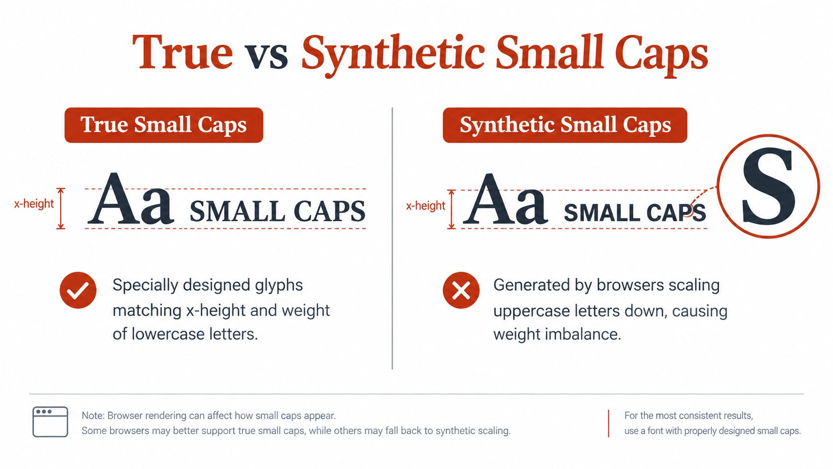
A true small-cap set uses glyphs drawn specifically for the role. The type designer adjusts proportions, stroke weight, spacing, and curves so the letters sit naturally beside lowercase text. A synthetic treatment scales down uppercase glyphs. It retains the original shapes, but not necessarily their optical balance.
The difference may disappear in a design mockup and become obvious in a busy production interface. A synthetic E can look lighter than adjacent lowercase text. Curved letters may appear too thin, while spacing becomes uneven because reduced uppercase forms were never designed to share lowercase rhythm. These defects stand out in navigation, labels, and repeated interface components.
What the browser can and can't guarantee
The CSS Fonts specification defines small caps as uppercase letterforms reduced toward lowercase size and maps the feature to smcp. That mapping does not confirm that a font contains a complete, carefully drawn small-cap set. If the requested glyphs are unavailable, the browser may create small caps from uppercase letters, following the fallback behavior defined by the CSS font-feature rules.
The result may work for a short, low-priority label. It introduces a quality risk in a brand signature, editorial heading, or interface repeated throughout a product. A font-file change, incomplete subset, or fallback face can also alter the result without changing the CSS.
How to inspect the result
Begin with a rendered comparison rather than computed styles alone. Use the intended font and inspect the same sample across the cases your system supports:
- Stroke consistency: Do the small caps match the apparent weight of nearby lowercase text?
- Proportion: Do round letters and diagonals remain optically balanced?
- Spacing: Does the line read as a composed unit, or do reduced forms create gaps?
- Coverage: Do accented characters, punctuation, and numerals behave sensibly?
- Weight behavior: Does the treatment remain credible at every production weight?
A font inspection tool can show whether the face advertises the relevant OpenType feature, but the browser render still decides what users see. The Double Pica small caps reference illustrates the font-level details worth checking before implementation, including whether the face provides dedicated glyphs rather than relying on scaling.
Decide when synthesis is acceptable
Synthetic small caps can serve as a fallback for secondary metadata when the text is short, the size is comfortable, and the treatment will not become a prominent brand element. They perform poorly when the line carries authority, sits beside carefully tuned typography, or must remain consistent across platforms.
If the synthetic result looks weak, stop forcing the feature. Use sentence case, select a face with genuine small caps, or limit the treatment to contexts where its visual compromise will not distract readers. Check the font's web-use terms before deployment as well, because CSS activation does not grant permission to serve the underlying font file.
Licensing Implications of Web Small Caps
The most overlooked fact about small caps is also the one that can create the greatest operational exposure: CSS doesn't change the font license. Activating smcp through font-variant-caps or font-feature-settings still uses the underlying font file, and that file needs authorization for its deployment context.
A desktop license and a web license aren't interchangeable by default. Adobe's CSS and OpenType licensing guidance distinguishes web use from desktop use and makes the practical point clear: enabling a feature in CSS doesn't grant permission to serve the font from a website.
Audit the actual deployment
A responsible review should connect the design decision to the files that reach users. Check:
- Font source: Identify every self-hosted file, hosted package, and fallback declaration.
- License scope: Confirm that web embedding is covered for the intended project and audience.
- Feature coverage: Verify that the licensed face is the same face used in production, including its small-cap support.
- File history: Record purchase details, license terms, renewal dates, and approved domains or projects where applicable.
- Handoff status: Make sure agencies, contractors, and client teams receive the same usage restrictions.
“Free” is not a legal category, and “safe” isn't a reliable licensing conclusion. A font can be available at no purchase price and still restrict embedding, modification, redistribution, or commercial use. This article is informational, not legal advice. For a dispute, audit finding, or contract interpretation, involve qualified legal counsel and consult the typeface owner's current terms.
Make compliance part of typography QA
Teams often inspect visual fidelity and performance while leaving licensing until the end. That order creates avoidable risk. A font selected for elegant small caps can pass design review, enter a shared repository, and later appear on a client site without anyone confirming the web rights.
Font Checker Pro can scan a live URL, PDF, image, or zipped font set, identify typefaces and foundry information, flag licensing risks, and export reports for operational or compliance workflows. For teams formalizing this process, this web font license compliance guide offers a practical framework.
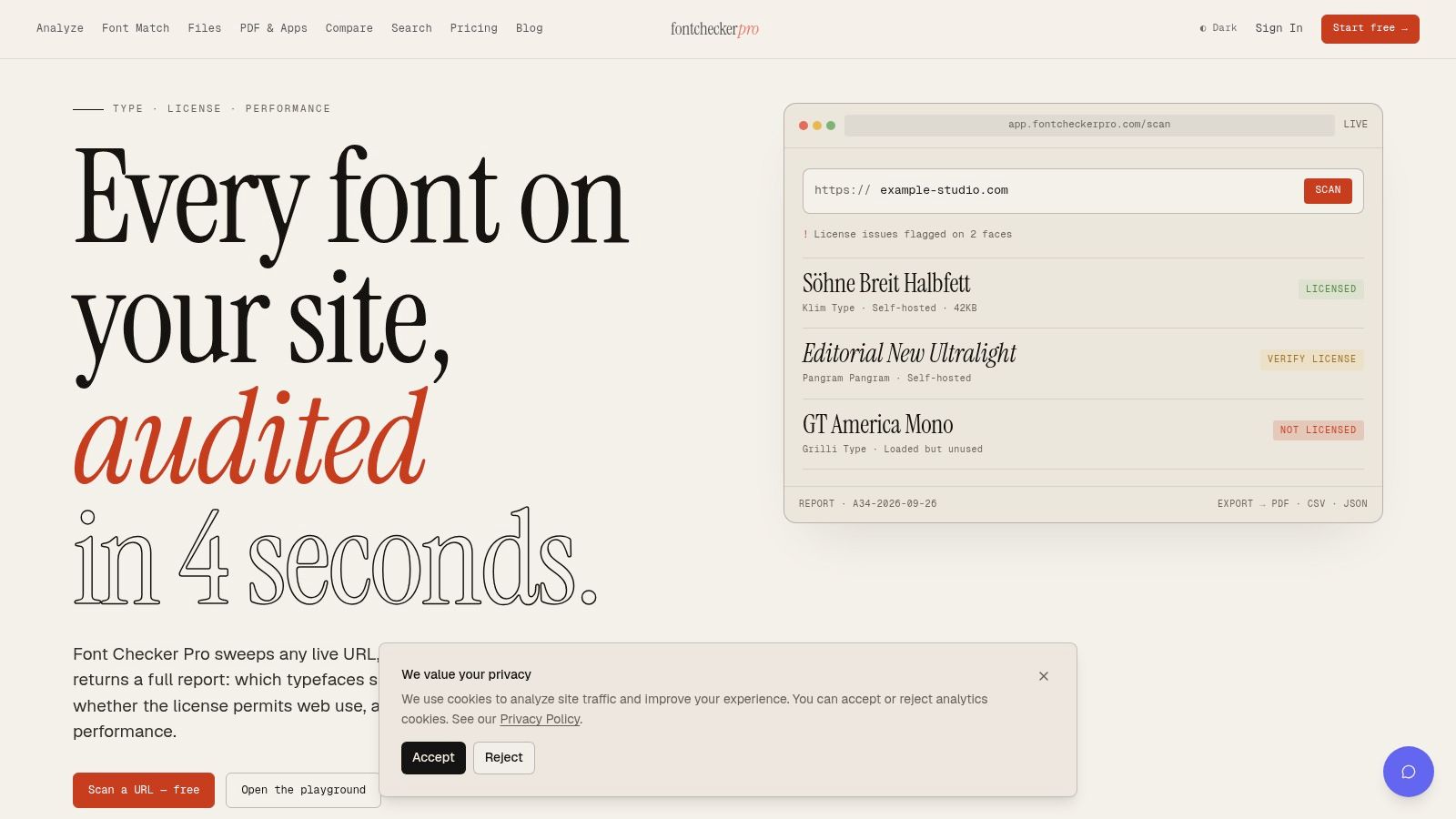
The sensible workflow is to document the font before launch, retain evidence of permission, and rescan after redesigns or vendor changes. A compliance team doesn't need to guess which CSS property was used. It needs to know which file was deployed and whether the license covers that use.
Accessibility and Browser Support Best Practices
Small caps should clarify hierarchy, not become the only way readers identify meaning. A label rendered in small caps may look excellent at one size and become tiring at another, especially when the typeface is narrow, the contrast is weak, or the line is surrounded by other uppercase treatments.
Keep the content semantically normal in the HTML. Apply the visual variant in CSS rather than typing replacement uppercase characters into the source. That preserves copying, search, translation, and assistive technology behavior while allowing the visual layer to degrade gracefully.
Design for scanning and fallback
Use small caps for short labels, metadata, and supporting text. Avoid applying them to long passages or essential instructions where readers need fast, comfortable scanning. Check the result with increased text size, zoom, high-contrast settings, keyboard navigation, and a fallback font.
A useful review asks:
- Can a reader distinguish the label from surrounding text without relying on the cap treatment?
- Does the line remain legible when the intended font fails to load?
- Is the contrast still adequate against its background?
- Does the treatment preserve meaningful text in copied and announced content?
- Can the interface switch to sentence case without losing hierarchy?
A decorative typographic feature should be allowed to fail without taking the information with it.
Preserve the rest of the type system
The narrow property matters for more than code style. Using the font-variant shorthand can reset related settings, including font-variant-numeric, font-variant-ligatures, font-variant-alternates, and font-variant-east-asian to normal. In a data-heavy interface, that can silently disrupt tabular numbers or ligature behavior.
Use font-variant-caps as the primary declaration, then add font-feature-settings only when testing shows a genuine need. The referenced compatibility guidance lists broadly modern support, with Chrome 52 and Firefox 34 shown as baseline support for font-variant-caps in its compatibility data, so teams should still test their supported browser range rather than assume identical rendering everywhere.
Progressive enhancement is the reliable approach. Start with readable sentence case, add the small-cap feature where the font supports it, inspect synthetic fallbacks, and verify that licensing documentation covers the deployed files. Small caps in CSS then become what they should have been from the start, a controlled typographic enhancement rather than a fragile visual shortcut.
Font Checker Pro can audit live pages, PDFs, images, and font packages for typeface usage, licensing signals, and typography implementation risks, producing reports your design, engineering, and compliance teams can review together. If you're validating a small-cap system before launch or checking an existing site, visit Font Checker Pro and run an audit against the actual assets in production.