The most popular advice on this topic fits in one sentence. Set body text to 16 pixels and you're done. It's tidy, it's easy to defend in a review, and it's incomplete.
No accessibility standard hands you one universal pixel value and calls the job finished. The best font size for website readability is a starting floor you test against your actual typeface, your audience, your line length, your contrast, and what happens when a reader enlarges everything. A 16px declaration in CSS tells you almost nothing about the rendered page. Two faces at that size can look visibly different, a fixed height card can clip the second line, and a fallback font can rewrap a button label onto two lines before your webfont even loads.
Treat 16 CSS pixels as the floor for ordinary body copy, not the answer. From there, you pick a size by text role, check how the production font renders, set it in relative units so people can enlarge it, and confirm the layout survives at 200 percent. You also check that you're licensed to serve the font files you're sizing. That's the whole discipline, and none of those steps is optional if readability is the claim you're making.
Recommended Starting Sizes for Every Text Role
Start with sizes you can set today. Then test them. The table below gives you a practical floor for each role and the conditions that should push you to the next step up.
| Text role | Starting size | Use it for | Move larger when |
|---|---|---|---|
| Body copy | 16px (about 12pt, 1rem) | Paragraphs and article text | Small x-height, thin strokes, or older readers |
| Older adults and low vision | 19px (14pt) or larger | Health, public, and long-form reading | Vision difficulty or long sessions |
| Navigation and controls | 16 to 18px | Menus, buttons, and form labels | Labels wrap or targets feel small on a phone |
| Metadata and captions | About 14px after testing | Timestamps, footnotes, helper text | Hard to read on a phone; never use for body copy |
| H2 and section headings | 24 to 28px | Scanning structure | Heading and body look too similar |
| H1 | 32 to 40px (about 2 to 2.5rem) | Page title | The title must stay readable without dominating mobile |
| Large reading text | 20 to 24pt where studied | Emphasis or easier long reading | Audience benefits and layout still reflows |
Picking Your Row
You should start on the first row. The University of Waterloo presentation summarizing web-typography research identifies 16 pixels, approximately 12 points, as a practical minimum for body text and recommends line spacing of at least 1.5 times the type size. That's a floor from research, not a legal rule, and it isn't a ceiling. That same summary reports that legibility increased as font size increased and that 20 and 24 point text did not slow reading in the cited study, so going larger is reasonable when your audience needs it.
Leave the general row when you know who is reading. If you're building health information, public services, or long-form content that older adults rely on, start at 19px instead and don't apologise for it. The extra size buys real comfort over a long session, and the cost is a taller page that scrolls a bit more. That's a good trade.
Practical rule. If you can't name the audience for a row, you aren't ready to defend the size in it.
Navigation labels and form controls belong at 16px or above for a specific reason. Readers don't just read controls, they act on them, often quickly and often on a phone held at arm's length. Small menu text that looks elegant in a design file becomes a guessing game in daylight. Keep form labels at body size too, because a label a person can't read is a field they can't complete.
Captions, timestamps, and metadata are the only roles that may approach 14px, and only after you've checked them on a real phone. They're secondary by design. The moment a timestamp carries information someone needs to act on, it stops being metadata and needs a body size. Never let the caption row become your paragraph size because it made a dense layout fit.
Headings exist so people can scan. An H1 near 32 to 40px and an H2 near 24 to 28px give you a hierarchy a reader can read at a glance, and a guide to building a typography hierarchy that works on every screen can help you space the rest of the scale between them. If your H2 and your body text look like cousins, increase the heading or add weight. Don't shrink the body to manufacture contrast.
One last point before you set anything. A typeface with a small x-height can make the same 16px look undersized next to a face with a tall one, so pick your row and then look at the production font rendered at that size. These ranges are design guidance. They aren't a certificate that your site complies with any law, and this article is informational, not legal advice.
Why the Same 16 Pixels Can Read Differently
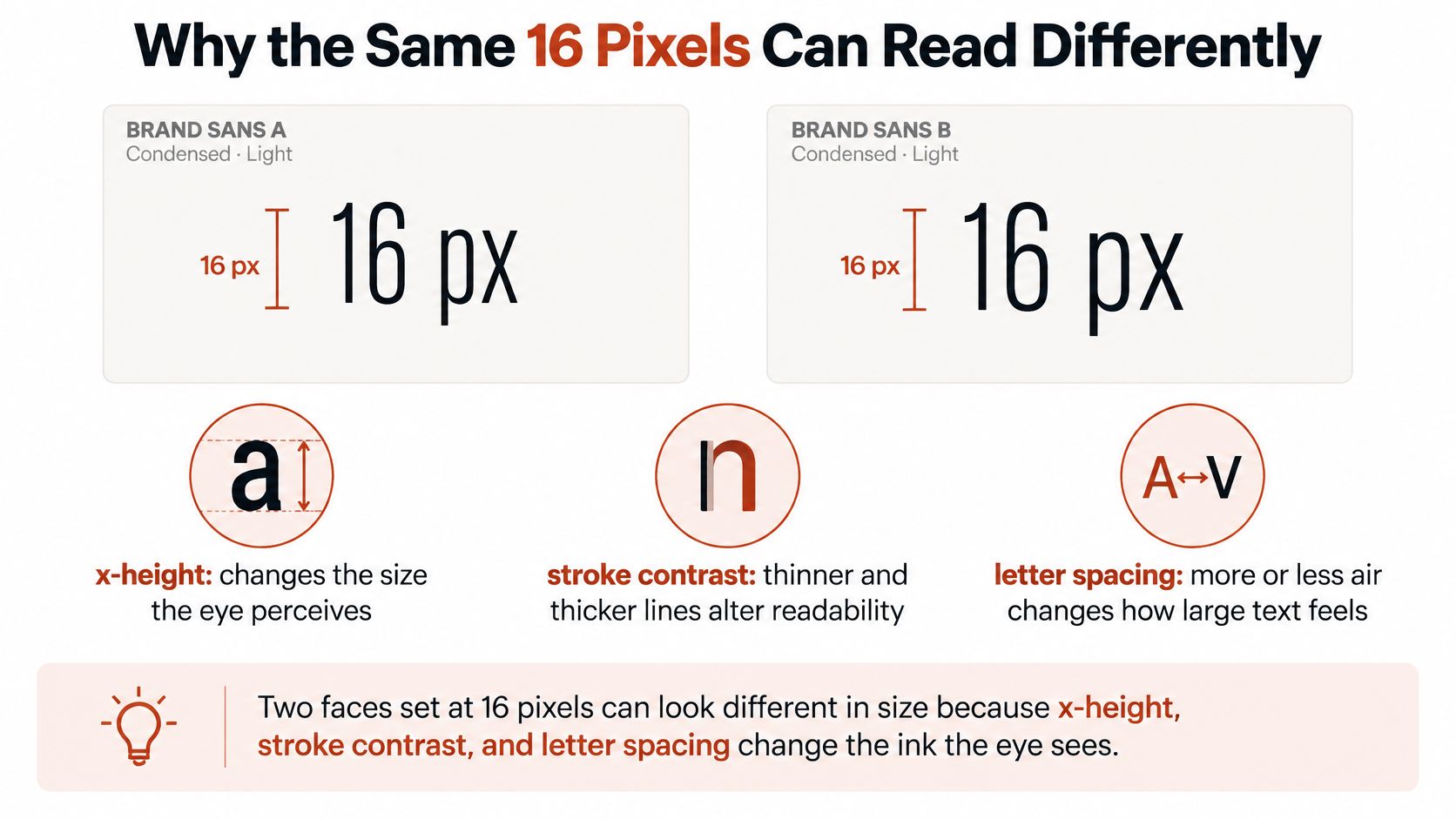
Set Times New Roman and Verdana side by side at 16px and the difference is visible immediately: Verdana's lowercase letters are drawn taller and wider, so they occupy more of the pixel budget and read as bigger. Nothing is wrong with your CSS. x-height, stroke contrast, and letter spacing determine how much ink reaches the eye, and the eye judges size from that ink. Treat 16px as a floor to test against your actual font, rather than a finished decision.
X-Height Is the Size You Perceive
Most of what you read is lowercase, so the height of a lowercase x drives perceived size more than the full em square does. A face with a small x-height spends its pixels on ascenders and descenders and leaves the body of each letter tiny, which is why Times New Roman reads small while Verdana, drawn with a tall x-height for screens, reads large at the same declared size. At 16px a small-x-height face can perform like a larger-x-height face set several pixels smaller. Move that face up a step, or switch to a heavier weight, and recheck with real sentences rather than a pangram.
A brand team picks a condensed, light sans for body copy because it looks refined. In the design file, on a pale background, it reads fine at arm's length on a calibrated monitor. On the live page, on a phone in a bright room, the thin strokes thin out further and the condensed shapes crowd together. The CSS still says 16px. The reader still struggles. The size held. The combination around it failed.
Contrast, Width, and Case Interact With Size
The WCAG guidance on minimum contrast notes that larger text with wider character strokes is easier to read at lower contrast, while normal-sized text requires stronger contrast protection. That relationship matters in practice. If your text sits at the smaller end of a range, you have less contrast margin to spend, so a fashionable mid-grey on white gets risky fast. You can't use a generous size to excuse weak contrast, and you can't use strong contrast to excuse a cramped size. Check both.
Width and case pull in the same direction. Reading studies of mobile typography consistently find that condensed letterforms slow readers down compared with regular-width faces, and that changing the case of a passage changes how quickly people move through it. That doesn't justify setting body copy in capitals, which destroys the word shapes readers rely on for long passages. It means width, case, and size interact rather than operate independently, so a narrow face needs more size or more spacing to reach the same comfort as a regular-width one.
A size that passes in a regular-width face at full contrast hasn't told you anything about a condensed face at reduced contrast.
Audience changes the answer too. The U.S. Office of Disease Prevention and Health Promotion guidance on readable fonts recommends 19px/14pt or larger for older adults and people with vision problems. Health and public sites should treat that as their starting row rather than an upgrade they consider later. High-density phone displays can also make text appear smaller even when the CSS value hasn't changed, which is why you test at realistic reading distances instead of trusting a desktop preview.
Don't forget the font that shows up before your font. A fallback face usually has different metrics, so text can change wrapping and perceived size during loading, then shift again when the webfont arrives. Our Performance audit measures payload, unused glyphs, and FOUT/FOIT impact, which is the technical side of that flicker. Block the webfont, reload, and read the fallback version. If a heading gains a line or a label overflows, your stack needs work.
If you want a more systematic way to score these combined effects, readability scoring formulas and metrics covers how teams quantify them. Whatever method you use, ask one question of every page. Does 16px stay comfortable when the face is condensed, thin, low in contrast, or briefly replaced by a fallback? If it doesn't, adjust the weight, the colour, or the size row.
How to Scale Type with Rem and Fluid Type
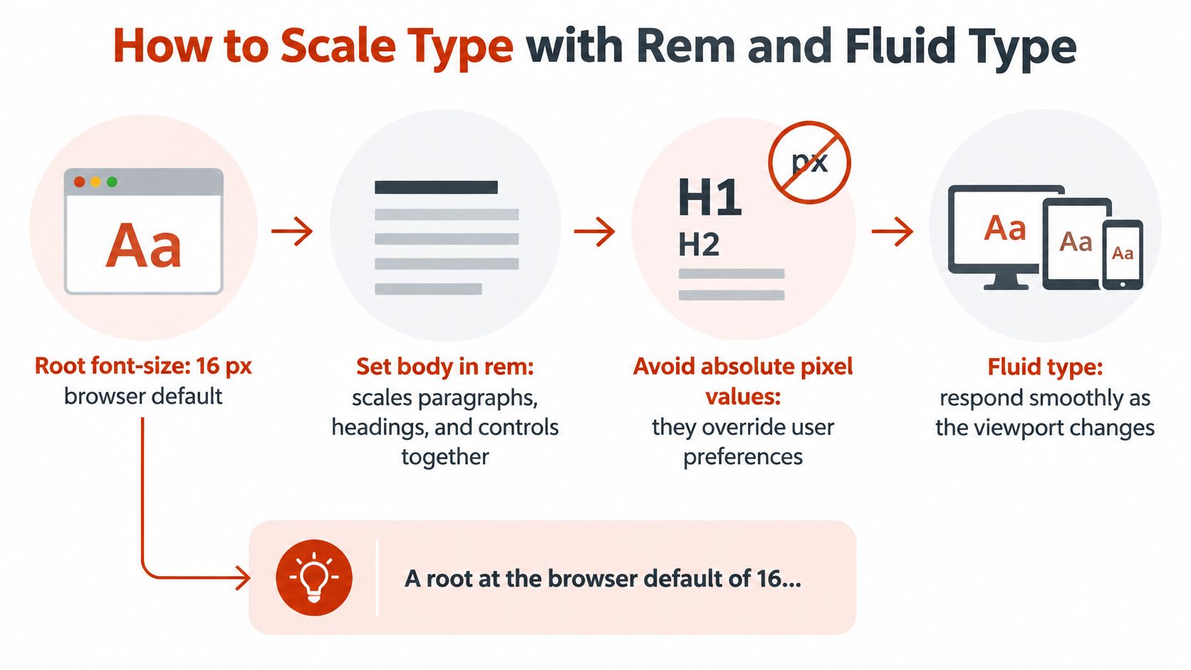
Set your sizes in rem and the whole system can grow together. A rem is relative to the root font size on the html element, so when a reader raises their browser's default text size, your paragraphs, headings, and controls scale in proportion. Absolute pixel values don't do that. They override the preference the reader already set.
One Baseline and a Short Scale
Leave the root at the browser default, which makes 1rem your body floor. The older-adult row becomes 1.1875rem, which works out to about 19px at that default. Headings then come from a short scale, such as 1.5rem and 2rem, instead of unrelated pixel values scattered through components. If you ever need to convert between units while auditing an older stylesheet, a reference on pica and type size across points, pixels, and millimetres keeps the maths straight.
Build your scale like this.
- Set the root once. Use 100% on the html element so you inherit the reader's preference instead of replacing it.
- Size body text in rem. Paragraphs, labels, and controls all reference the same root.
- Derive headings from the scale. Pick a small set of steps and reuse them everywhere.
- Check computed values. Inspect what the browser renders, not just what you wrote.
Fluid Type With Guardrails
Fluid type lets size respond smoothly as the viewport changes, and clamp() is the tool. It takes three values. A minimum that never drops below the floor for that role, a preferred value that grows with viewport width, and a maximum that stops desktop text from ballooning. A reasonable body example is clamp(1rem, 0.9rem + 0.5vw, 1.25rem), which you'd then adjust after viewing your production face. The minimum does the accessibility work. Never let a fluid rule shrink body copy below its floor on a narrow screen just because the viewport term got small.
Relative units alone don't make a page scalable. The WCAG 2.1 understanding document for Success Criterion 1.4.4 Resize Text requires ordinary text to remain usable when enlarged to 200% without loss of content or functionality. Because that scaling doubles both the rendered width and height of text, a nominal 16px body size may effectively render near 32px under the test condition. Your layout has to absorb text that's roughly twice as wide and twice as tall.
That's where implementations break. Fixed-height containers clip the second line of a card. Overflow hidden deletes the rest of a label. Absolutely positioned captions stay put while the text they describe moves. Tightly constrained navigation refuses to wrap and pushes links off screen. None of those failures is a font size problem, and none is fixed by changing a unit.
So build containers that grow vertically, let navigation wrap onto another line, and keep labels attached to their controls in normal flow. Then inspect the computed size in your browser tools for body text, headings, and controls. A framework utility or a late stylesheet can override your careful rem value with something smaller, and you'll never see it by reading your own CSS.
Line Length and Leading for Comfortable Reading
A correct font size in a column that's too wide still exhausts people. Line length, often called the measure, and line-height, often called leading, are the partners that decide whether your chosen size feels easy or tiring. Readers reviewing pages for these qualities will run into the common terms in webpage reviews from PinDrop, which is a handy reference when a review uses words like measure or leading without defining them.
| Context | Line length | Line-height | Watch for |
|---|---|---|---|
| Desktop body | 45 to 75 characters | At least 1.5 | Full-bleed columns that exceed 75 characters |
| Mobile body | 35 to 50 characters | At least 1.5 | Forcing desktop line length onto a phone |
| 19px body for older readers | Same character counts, taller block | At least 1.5 | Cards that clip the extra leading |
| Headings | Short lines; no fixed count | 1.15 to 1.3 | Leading so loose the heading falls apart |
| Zoomed to 200 percent | Let the line wrap; do not add scroll | Keep at least 1.5 | Fixed widths that cause sideways scrolling |
| Captions | Shorter than body | About 1.4 to 1.5 | Caption size used as a substitute for body text |
Measure First, Then Leading
For desktop body copy, aim for about 45 to 75 characters per line, with something near 66 as a comfortable middle. Past that range, the eye has to travel a long way back to find the start of the next line, and it lands in the wrong place often enough to slow people down. Control it with a max-width on the text column, often around 65 to 75 characters using the ch unit, instead of letting a paragraph span a full wide layout.
On a phone, 35 to 50 characters is normal and fine. Don't widen a mobile paragraph or shrink the type just to copy the desktop count. The screen is narrower and held closer, so a shorter measure suits it. A deeper treatment of leading and how to set it in practice is worth reading if your team argues about these values.
Set body line-height to at least 1.5. The arithmetic is worth doing once. A paragraph at 16px with 1.5 leading gives you about a 24px line box. At 19px the line box is about 28.5px. Across a ten-line card, that's roughly 45px of extra height you need to plan for before anyone tests zoom. If your card has a fixed height, that difference is exactly where text gets clipped.
Headings can sit tighter, around 1.15 to 1.3, because they're short and large. Go looser and a two-line heading stops reading as one unit.
Watch three edge cases. Justified text on a narrow measure stretches word spacing unevenly and creates vertical rivers of white that pull the eye downward, so left align body copy. All-caps lines and very bold lines carry more visual weight and usually need slightly more leading to breathe. And a fluid size that grows without a max-width on the column produces enormous desktop lines that nobody can track, which is why size caps and column caps belong together.
At 200 percent, the same character count must wrap into more, shorter lines. If your column has a fixed pixel width, it will force horizontal scrolling instead. Let the measure shrink, keep the leading, and accept a taller page.
Web Licenses Versus Desktop Licenses
Before your team self-hosts the face it just sized, stop and check what you bought. A desktop license and a webfont license generally authorise different technical uses, and confusing them is how careful teams end up with a gap nobody noticed.
Monotype's licensing guidance describes desktop licenses as covering installation on named users' computers and use in applications such as Word, InDesign, and Photoshop, including printed documents and static image files. Its webfont license instead covers serving the font from a website, is annual, and may be limited to one domain. Those are two different permissions for two different acts, even when the typeface name is identical.
Where the Gap Opens
Consider a normal workflow. A designer legitimately buys a desktop license, sets the brand type, exports a logo as a PNG, and hands off the files. A developer then converts that same font to WOFF2 and calls it from @font-face so the website matches. The PNG was static artwork. The WOFF2 is the font software itself, distributed to every visitor's browser. The desktop purchase covered the first act and not necessarily the second.
Several details catch teams out.
- Domain limits. A webfont license may cover one domain, so staging, regional, and client domains can each need their own coverage.
- Agency reuse. One webfont license isn't automatically reusable across multiple client websites.
- Metered pageviews. Each page load that calls the webfont CSS can count a pageview for each font in the kit, and purchased allowances may expire after a year.
- App embedding. Shipping a font inside a mobile or desktop application is a separate use again.
The financial exposure is real. A foundry can invoice retrospectively for unlicensed use, require you to buy the correct license tier, or pursue the matter further, and the outcome depends on the contract you signed and the jurisdiction you're in. This is informational content, not legal advice, and it can't tell you how a specific agreement will be read. For a fuller walkthrough, read up on font licensing for websites and what teams need to know before launch rather than after an enquiry arrives.
Keep the paperwork next to the design decisions. Store invoices, licensed domains, traffic limits, and renewal dates in the same place you record your type scale. Our License forensics classifies each @font-face and image-identified face by the domain it loaded from, the Google/Adobe catalogue, or self-hosted origin, and shows the source of each verdict, which helps you build that inventory from what a page serves. Two limits matter. Font Checker Pro does not license typefaces to customers, and identifying a face in a report does not grant any right to use that face. No font should be called free or safe without checking its license terms, because a file being easy to download says nothing about your right to serve it.
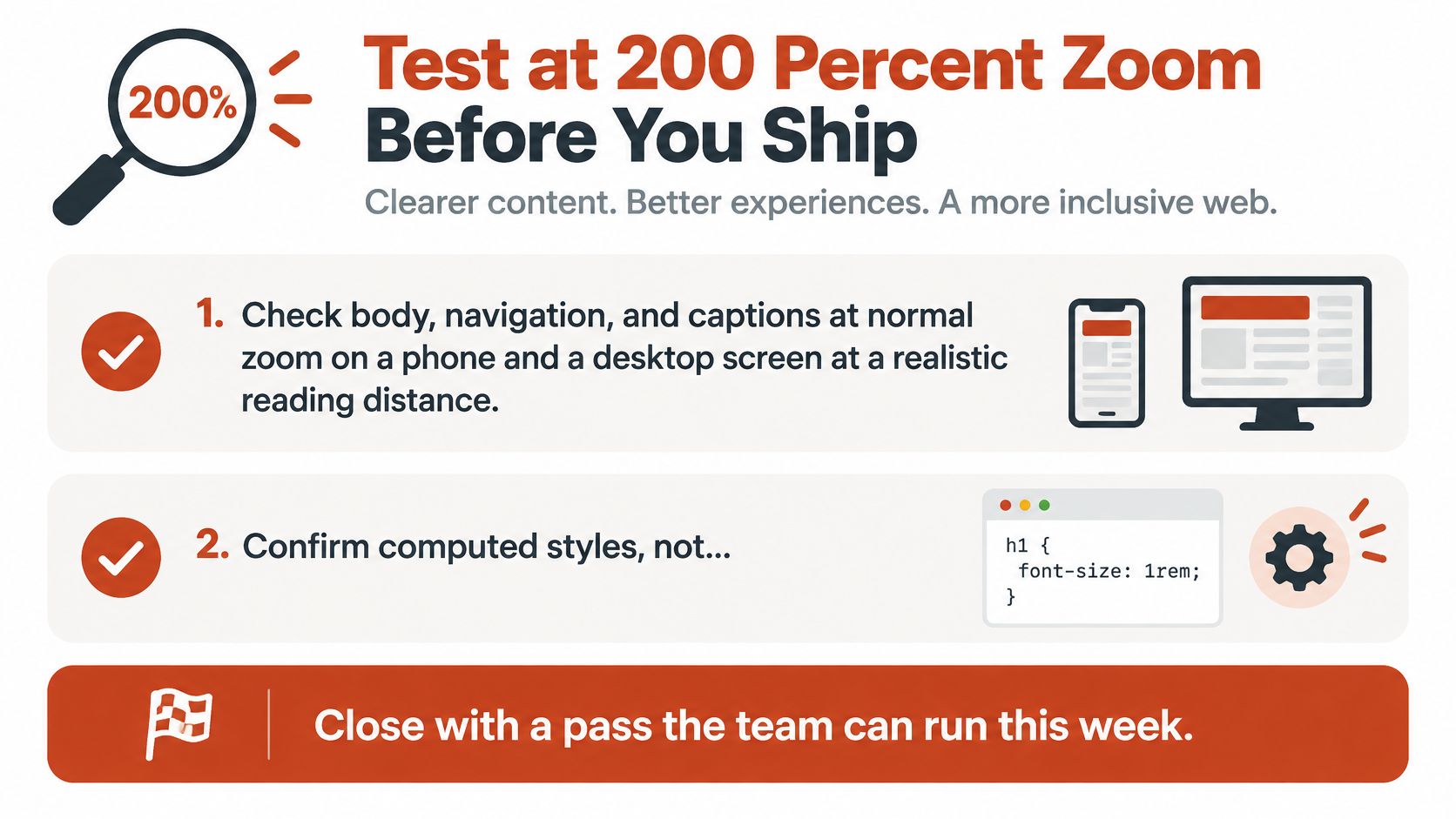
Test at 200 Percent Zoom Before You Ship
Everything above becomes a claim until you run this pass. It takes one sitting, it needs no special equipment, and it will find failures that a stylesheet review never shows you.
The Seven Step Pass
- Check at normal zoom. Read body text, navigation, and captions on a phone and a desktop screen at a realistic reading distance, in ordinary room light.
- Confirm computed styles. Inspect rendered sizes in your browser tools so a framework override isn't hiding a smaller value than the one you wrote.
- Zoom to 200 percent. Use browser zoom, and text-only resizing where your browser offers it.
- Read a full paragraph. It should rewrap without horizontal scrolling, one-word lines, overlap, or clipped descenders.
- Tab through the interface. Work through menus, forms, dialogs, and buttons, and confirm labels stay attached to their controls and everything still operates.
- Block the webfont and reload. Check that the fallback doesn't wreck wrapping, overflow a button, or push content off screen.
- Write it down. Record the typeface, declared size, computed size, line length in characters, and the zoom result for each template.
A larger default size doesn't pass this test by itself. Enlargement has to work, or the size is decoration.
Be honest about what you find. A page set at a generous size still fails if zoom breaks the checkout form. A page at the floor can pass comfortably if it reflows cleanly and every control stays usable. That's why the pass matters more than the number you started with, and it's why you repeat it after any redesign, framework upgrade, or font swap.
Use the inventory step to keep your records honest. Our Single-URL analysis loads the page like a normal browser to read computed styles accurately, so the report reflects what visitors receive rather than what your repository claims. That gives you one record where the typography findings and the license findings sit together, which is exactly what a compliance teammate needs six months later. The Hobbyist Free plan costs $0 forever and includes 5 scans per month, 1 domain, 3 Font Match (image) per month, analysis history, and ticket support, with no card required, so a small team can run this inventory without a procurement cycle.
Two cautions belong in the record. A scan report doesn't replace the foundry contract, it doesn't establish legal compliance, and identification isn't guaranteed error-free. This article is informational, not legal advice, so take jurisdiction-specific questions to counsel.
Ship the size row that survived the pass. File the zoom results and the license documents together, with the date and the person who ran the test. When someone asks why your body text is the size it is, you'll have an answer that's better than a number you copied from an article. You'll have evidence.
Run your live page through Font Checker Pro to record which typefaces it serves, where each file loads from, and how the stack behaves, then pair that report with your 200 percent zoom results and license documents. You'll ship sizes you can defend to designers, developers, and compliance teammates alike, instead of a pixel value nobody tested.