You've probably done this recently. A font in a screenshot, ad, packaging mockup, or social post catches your eye, and the first question is simple: what font is that?
In a personal project, that's usually where the story ends. In a business, it's where the risk starts. The critical questions are harder. Can we use it legally? Is it already approved in our brand system? Does the license cover web use, app use, PDF distribution, or only desktop design work?
That's why a font finder from image matters far beyond creative curiosity. It's not just a convenience for designers. It's the front door to typography governance. Once a team identifies a font from an image, someone still has to verify ownership, confirm usage rights, decide whether it fits the brand system, and make sure the same typeface isn't unintentionally spread across design files, websites, pitch decks, and campaign assets without control.
When teams miss that second layer, they create a familiar operational mess. Design picks a typeface from visual inspiration. Development swaps in a close alternative. Marketing exports PDFs with a different licensed copy. Legal gets involved only after a takedown notice or a contract review. By then, the font name isn't the problem. The absence of process is.
From Inspiration to Implementation
The first use case for a font finder from image is ordinary. Someone sees type in the wild and wants to recreate it. That might be a headline on a landing page, a wordmark in an old campaign asset, or packaging from a legacy product line where nobody documented the original font choice.
In practice, that request rarely stays creative for long. Once the font is identified, the organization has to answer a chain of operational questions. Is this the exact typeface or just a close match? Is it part of the approved brand palette? If the source asset came from an external agency, who bought the license and for what use?
The question behind the question
A lot of teams think they're solving a recognition problem. They're solving a governance problem.
A font isn't just a visual style. It's a licensed digital asset with usage conditions, ownership history, and downstream implementation implications. The moment a team moves from “what is this?” to “let's use it,” they've crossed from inspiration into procurement, compliance, and brand control.
For brand teams, that means avoiding drift. For developers, it means verifying that the live implementation matches what design approved. For legal and procurement, it means making sure a desktop purchase doesn't get treated like a web embedding right.
Operational rule: Identification is only step one. Adoption without verification is where avoidable typography risk enters the system.
A useful way to think about this is as an intake workflow. The image is the intake point. The font match is preliminary classification. Approval, licensing, and deployment are separate decisions.
If you want a concrete example of how image-based font identification ties into brand analysis, this audit of an iconic brand's typography workflow shows why visual recognition is only part of the job.
What teams should do immediately
When a font comes in through an image, the clean process is straightforward:
- Identify the likely typeface from the visual sample.
- Verify whether it's already approved inside the organization.
- Check the intended use case before anyone deploys it.
- Record the decision so the next team doesn't have to guess again.
That last step matters more than people think. Unrecorded font decisions force every future team to reverse-engineer old work from screenshots, exports, and half-renamed files. That's expensive, slow, and entirely preventable.
How a Font Finder From Image Actually Works
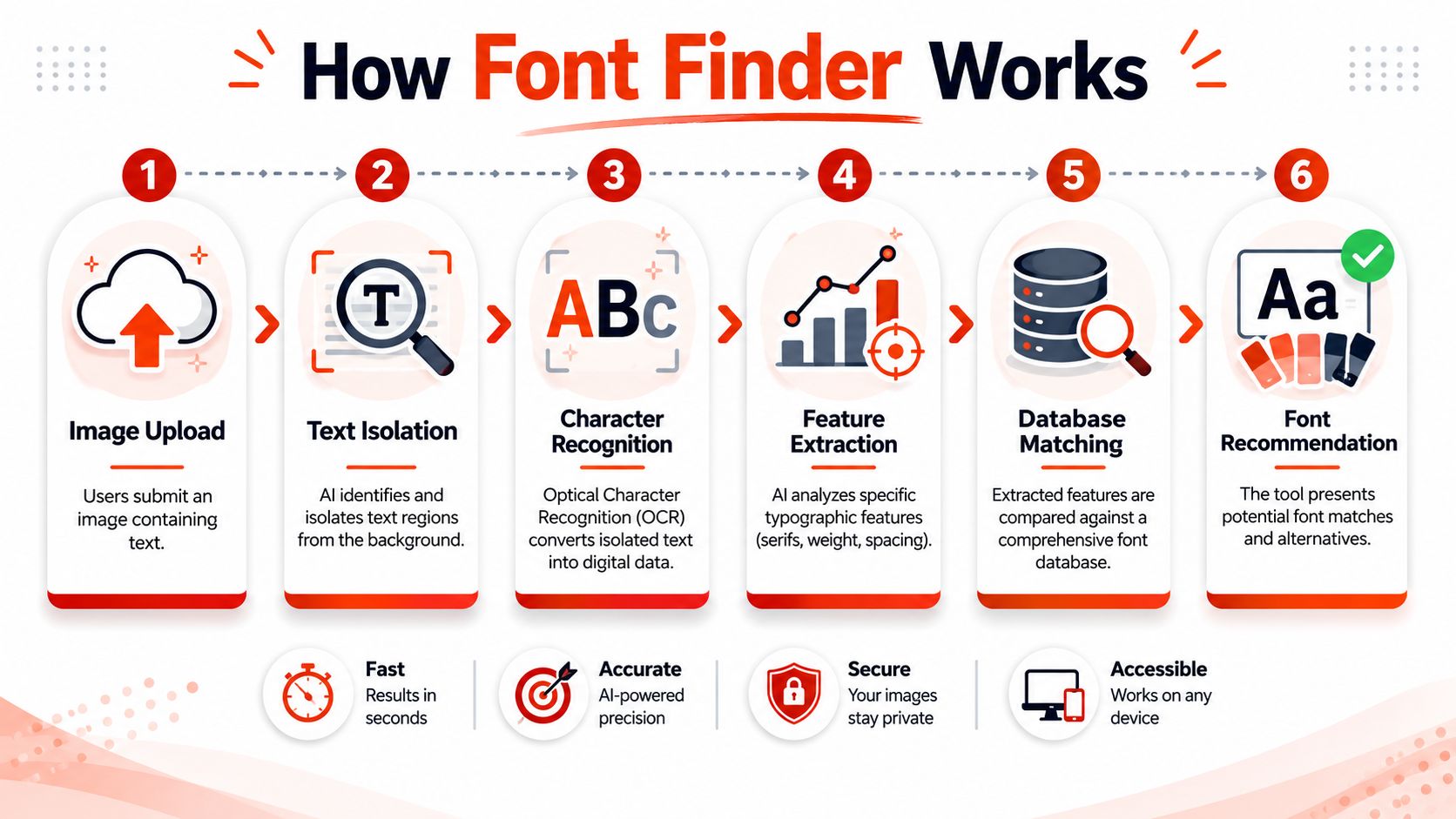
A font finder from image doesn't “read style” the way a person does. It works by isolating visible text, analyzing the shapes of the letters, and comparing those shapes against a reference library of known fonts.
Adobe's visual search workflow shows how this has become part of production work rather than a standalone novelty. Users can upload an image, select a single line of text, review results, and add the chosen font directly to their Creative Cloud “Added Fonts” list, as described in Adobe's visual search documentation. That matters because identification now connects directly to design operations.
What the system looks at
Under the hood, the tool tries to isolate the most informative letterforms. It's looking at visual features such as:
- Counters inside letters like o, e, and a
- Terminals at the ends of strokes
- Stroke contrast between thick and thin sections
- Proportions such as width, height, and spacing rhythm
- Serif or sans structure and other distinguishing shapes
Those features form a kind of typographic fingerprint. The tool then compares that fingerprint against a catalog.
The scale of those catalogs matters. A major example is a system that says it searches over 233,000 fonts, which is why modern matching tools can return plausible results quickly rather than relying on a narrow library, as described on the WhatTheFont page.
Why a shortlist is better than a single answer
A common mistake is expecting one definitive match. In real work, a ranked candidate set is more useful than a binary answer.
That's because source images are often incomplete. You may only have a logo crop, a distorted poster photo, or a screenshot with a few characters. In those conditions, several fonts can be visually close enough that the system should present alternatives instead of pretending certainty.
A top-ranked shortlist is often the right technical outcome. It gives design, production, and legal reviewers enough context to verify the result instead of trusting a single guess.
For practical review, a shortlist lets teams compare signature letters side by side. That's far safer than taking the first suggestion and moving directly into production.
If you need a broader view of how identification, classification, and licensing fit together, this guide on what the font process looks like in practice is a useful companion.
What improves match quality
Input quality is usually the deciding factor. Clean samples produce better results because the tool can isolate the shape information it needs.
A stronger upload usually has these traits:
- One prominent word or short phrase
- High contrast between text and background
- Minimal distortion from angle or perspective
- A single font style in the crop
- Sharp edges instead of blur or heavy effects
What hurts performance is just as predictable. Mixed fonts in one crop, low resolution, warped photography, drop shadows, outlines, and cluttered layouts all reduce the quality of the comparison.
In other words, the machine isn't failing because fonts are mysterious. It's failing because the sample doesn't clearly show the glyphs.
More Than a Tool It Is a Governance Process
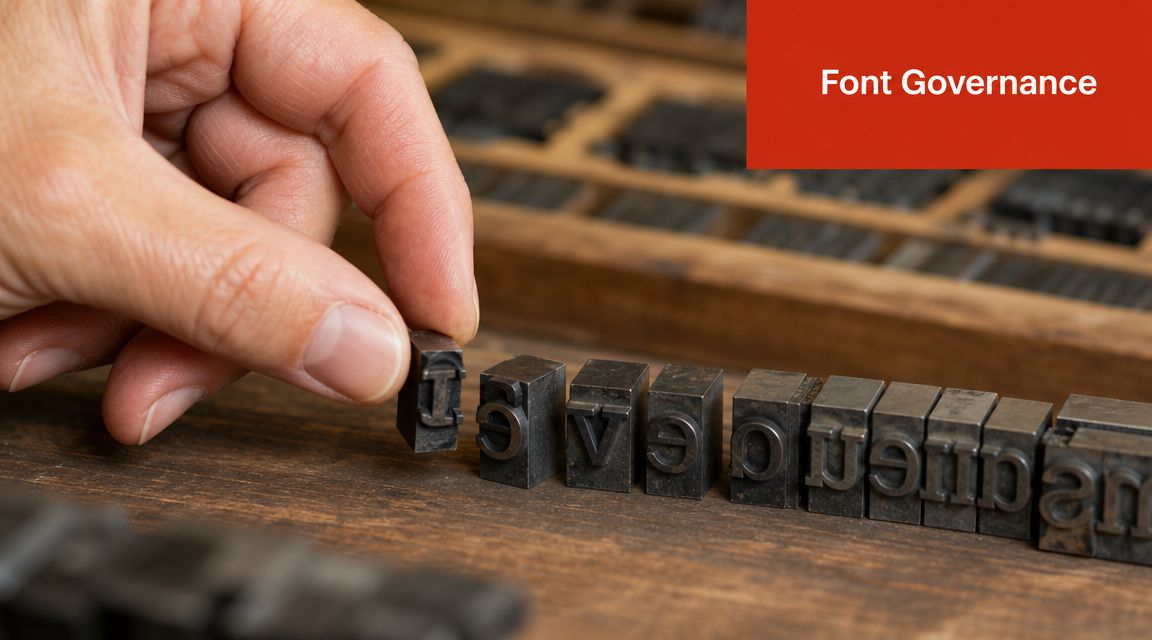
A font finder from image becomes strategically important when you stop treating it as a one-off lookup and start treating it as the first checkpoint in a governed asset system.
That's the shift many organizations still haven't made. Fonts move through design files, websites, presentations, packaging, PDFs, templates, and archived brand materials, yet teams often manage them informally. Someone recognizes a typeface. Someone else downloads a copy. Another team exports an asset. Nobody owns the full record.
Fonts need the same controls as other digital assets
A governed typography system should track the same kinds of information you'd track for any regulated asset:
| Asset field | Why it matters |
|---|---|
| Font name | Prevents duplicate or inconsistent naming across teams |
| Source or foundry | Helps validate origin and procurement trail |
| Version | Avoids mismatch between design and deployed assets |
| License type | Determines where the font can be used |
| Approved status | Tells teams whether it belongs in active brand use |
| Usage history | Supports review, audits, and remediation |
Without that structure, organizations get font sprawl. Similar but not identical typefaces appear across business units. Old campaign fonts re-enter circulation. Vendors hand off files with embedded assets that nobody reviews. Development teams substitute local copies to keep launches moving.
That isn't just messy. It weakens brand consistency and creates legal exposure.
Input quality affects governance too
There's another operational point teams often miss. The quality of the original image affects downstream governance decisions, not just recognition quality.
Image-based systems perform best with clean, high-contrast crops, and the biggest source of error is often the sample itself. Blur, perspective distortion, and mixed fonts reduce useful shape details such as terminals and counters, which makes the resulting shortlist less reliable for production decisions, as noted on Mixfont's font finder page.
That means governance starts before the font is even identified. If someone uploads a skewed conference photo or a compressed social screenshot and treats the top result as settled fact, the organization may end up licensing, approving, or deploying the wrong typeface.
Practical rule: Treat image-based identification as evidence gathering, not final proof, until a human verifies the letterforms and the license path.
The single source of truth problem
Every cross-functional typography issue gets easier once there's one approved record for each font in use.
That record should answer questions like:
- Is this font approved for the brand?
- Who licensed it?
- What uses are covered?
- Where is it currently deployed?
- What should teams use instead if it's restricted?
When those answers live in disconnected folders, email threads, or agency handoff decks, teams improvise. Improvisation is exactly how unauthorized use enters the stack.
For agencies and distributed marketing teams, a disciplined review model matters even more. This guide to font license management for digital agencies captures the operational side well. The central point is simple: if multiple teams can introduce type assets, someone needs to govern them centrally.
The Hidden Legal and Financial Risks in Typography
Typography risk usually arrives without much notice. A designer receives an old packaged file. A developer inherits CSS that references self-hosted fonts. A marketing team republishes a brochure template for a regional campaign. Everyone assumes the font was cleared somewhere upstream.
Sometimes it was. Sometimes it wasn't.
This article is informational, not legal advice, but the core compliance issue is straightforward. A font file is licensed software. The right to use it depends on the specific agreement tied to that file and the way the organization plans to use it.
Desktop rights and web rights are not the same
This is one of the most common failure points in real teams.
A desktop font license usually covers design activity such as creating static graphics, layouts, or local documents on authorized machines. A web font license is a separate question because it governs embedding or serving the typeface on a live site. Those aren't interchangeable rights just because the font name is the same.
A team can therefore be compliant in one context and exposed in another. The design department may have the right to use a font in internal creative files, while the engineering team may not have the right to deploy that same typeface on a public website.
Here's where confusion often starts:
- Design approval isn't license approval. A brand team can like the font and still lack the right usage tier.
- Possession isn't authorization. Having the files in an archive doesn't prove current rights.
- Agency delivery isn't ownership transfer. Client and vendor permissions don't automatically match.
The operational cost of getting it wrong
Legal risk gets attention because it's visible, but the first pain is often operational.
A font problem discovered late can force teams to:
- Replace the typeface across active assets under deadline pressure
- Rebuild web styles and exported PDFs to remove unauthorized files
- Re-review contracts and procurement records to trace license scope
- Explain brand inconsistencies created by emergency substitutions
That kind of rework is expensive because it cuts across departments. Design has to re-spec layouts. Engineering has to update implementation. Marketing has to re-export collateral. Legal has to review the exposure. Operations has to document what changed and why.
If a font enters production without a verified license path, the cleanup rarely stays inside one team.
Foundries and rights holders do enforce their terms, and companies don't need a courtroom outcome to feel the consequences. Demand letters, compliance reviews, vendor disputes, and urgent redesigns all consume time and attention that should have gone into planned work.
For teams that need a clearer picture of how these disputes can escalate, this overview of font licensing lawsuits in Europe and the US and the costs companies face is worth reading.
The safest habit
The safest habit is boring. Every time a team identifies a font from an image, they should ask three separate questions before use:
| Question | Why it matters |
|---|---|
| Is this the exact font or a visually similar alternative? | Similarity doesn't create a license right |
| Do we have rights for the intended channel? | Desktop, web, app, and document use can differ |
| Is this approved under brand policy? | Legal use and brand approval aren't the same decision |
That discipline prevents a very common mistake. Teams assume typography is low-risk because it feels decorative. In compliance terms, it isn't decorative at all. It's software with conditions attached.
Building an Automated Font Auditing Workflow
Manual font checks break down fast. They depend on memory, screenshots, old invoices, and whoever happens to know the history of the brand system. That works for a freelancer managing a handful of files. It doesn't hold up across active websites, campaign PDFs, design repositories, and client handoffs.
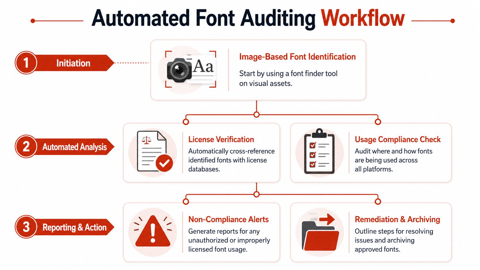
A better model starts with image identification but doesn't stop there. It turns the initial match into a repeatable review process.
A working audit sequence
The most reliable workflow I've seen looks like this:
Capture the strongest sample available
Start with the clearest source, not the most convenient one. A PDF export, original asset, or clean screenshot is better than a compressed chat image.Run image-based identification
Treat the result as a candidate list, not an automatic verdict. Verify letterforms before you label the font as confirmed.Cross-reference the result internally
Check whether the font already exists in the approved typography library. If it does, use the recorded source, version, and allowed usage instead of creating a new ad hoc entry.Validate the license against the intended use
Many teams often make a mistake here. The question isn't “do we own this font?” It's “do we have the right license for this use case?”Scan active environments
Review where the typeface appears across web properties, exported documents, packaged assets, and archived handoffs.Flag exceptions for review
Unauthorized copies, unapproved alternatives, and unclear provenance should all move into a remediation queue.
Real inputs are messy
Most articles about font finder from image workflows assume perfect inputs. Real operations teams don't get perfect inputs. They get screenshots from stakeholders, old logo files, scanned brochures, product packaging photos, and low-quality exports from unknown sources.
That gap matters. Coverage in this category often focuses on clean uploads, while actual work involves screenshots, logos, posters, and low-quality scans, and low resolution or distortion is a common reason for missed matches, as noted on WhatFontIs.
That means your workflow needs triage rules.
- If the sample is distorted, correct the crop or request a better source before escalating.
- If the asset contains multiple type styles, split it into separate review items.
- If the match remains uncertain, classify it as provisional and block automatic approval.
- If the source is a logo, assume customization may be involved and review manually.
What automation should handle
Automation is useful when it removes repetitive checking, not when it replaces judgment.
A strong auditing workflow should automate:
- Detection of fonts across live pages, PDFs, images, and archived files
- Classification of identified fonts into approved, unknown, restricted, or exception states
- Reporting so legal, brand, and operations teams can review the same record
- Alerts when a rogue or expired asset reappears
What it should not automate blindly is final approval from a weak image sample. Human verification still matters when the source is ambiguous.
“Good governance doesn't require zero ambiguity. It requires that ambiguous cases stop moving forward without review.”
If your team is still debating whether manual checks are enough, this breakdown of manual review versus an automatic font scanner gets to the heart of the issue. Manual review can catch nuanced problems. It just doesn't scale well when typography lives in many systems at once.
The handoff that matters
The core value of the workflow isn't the match itself. It's the handoff from recognition to action.
Once the identified font is linked to approval status, license scope, and current usage, the organization finally has a defensible process. That gives design a cleaner palette, development a verified implementation target, and compliance teams an audit trail instead of scattered assumptions.
Evaluating Tools for Your Font Governance Strategy
A common failure starts with a simple request. A designer uploads an image to identify a font, gets a likely match, and the team treats that result as settled. Weeks later, development ships a substitute, legal cannot confirm the license, and brand review catches the inconsistency after the asset is already live.
That is not a tooling problem alone. It is a governance gap.
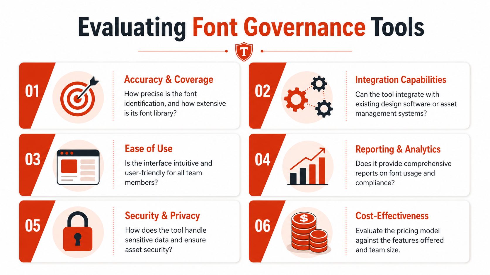
Teams choosing a font finder from image for enterprise use should evaluate it as part of the control system around brand assets. The question is not whether the software can guess a typeface from a screenshot. The question is whether it helps the organization turn that identification into a documented, reviewable, license-aware decision.
The criteria that actually matter
Accuracy and coverage
Start with the asset types your teams handle. Marketing may work from campaign graphics, product teams from UI screenshots, legal from PDFs, and operations from archived brand files inherited through mergers or agency handoffs.
A useful system identifies fonts across those formats and returns a ranked set of likely matches. In practice, that is safer than a tool that presents one answer with more confidence than the source image deserves.
Workflow fit
Identification has to connect to the places where decisions happen. If the result lives in a disconnected interface, teams will copy names into tickets, spreadsheets, and chat threads, and the record will decay almost immediately.
Look for a tool that supports review, escalation, and status tracking inside the broader asset process. That is how a match becomes an approved font, an exception, or a remediation task.
Reporting and audit trails
Operations and legal teams need evidence they can retrieve later.
The record should show what was detected, where it appeared, who reviewed it, whether the font was approved for that use, and what action followed. Without that history, every disputed asset turns into a manual reconstruction exercise.
Questions to ask before adoption
A serious evaluation sounds closer to a risk review than a feature demo.
| Evaluation question | Why it matters |
|---|---|
| Can the tool identify fonts from images and support review across other asset types? | Brand and license exposure rarely sit in one format |
| Does it separate likely matches from verified approvals? | Recognition is not authorization |
| Can design, engineering, brand, and compliance work from the same record? | Typography decisions break down when each team keeps its own version of the truth |
| Does it log findings, reviews, and remediation steps? | Auditability depends on records, not memory |
What “good enough” usually misses
Teams often accept a tool that solves the first question and ignores the rest. That is how duplicate purchases, unlicensed usage, and off-brand substitutions keep resurfacing.
I have seen this pattern in distributed teams. Someone identifies a font for a campaign asset, another team reuses it in product or web content, and no one checks whether the original license covered that channel. The technical match may be correct. The business decision can still be wrong.
For organizations that care about defensibility, the standard is clear. Choose a tool that supports identification, verification, documentation, and follow-up action in one controlled process.
If your team needs more than one-off identification, Font Checker Pro is built for that wider job. It scans live URLs, PDFs, images, and font packages, then turns typography into an exportable audit trail for design, engineering, operations, and compliance teams. That makes it a practical next step when a font finder from image needs to lead into verification, reporting, and license-aware remediation.