A marketing team launches a redesigned landing page built around a display face found on a “free” font site. A few weeks later, the performance dashboard shows slower rendering, legal flags an unclear license, and the accessibility audit identifies readability problems caused by the typeface's proportions and contrast. None of those issues appeared in the Figma file.
That's why fonts for website projects are delivery and compliance decisions before they're aesthetic decisions. Before approving a family, ask four questions: who can use the file, what it costs in bytes, who can read it, and what happens when the custom font fails. Resources on high-converting design elements can help shape the visual system, but the type choice still has to survive performance testing, accessibility review, and license verification. The rest of this guide treats those four questions as operating constraints on every design decision. For a broader risk perspective, see why fonts represent more than a creative choice.
Why Fonts Deserve a Seat at the Strategy Table
Typography now sits on almost every serious website. Web fonts appeared on roughly 88% of websites in 2025, compared with about 87% in 2024, according to the W3C's summary of web font adoption. The same source notes that usage had already passed half of websites by 2015 and reached around three quarters by 2020. Custom typography has moved from a niche enhancement to a near-default layer of web design.
That scale changes the conversation. A font isn't just a visual asset placed into a brand folder. It can add network requests, affect the order in which text becomes visible, change line wrapping, alter perceived layout stability, and create a contract obligation that survives a redesign. Designers, developers, and legal reviewers are managing the same asset from different angles.
The four questions behind a font choice
Who can use it? A font file may be licensed for desktop design work but not for browser delivery. A trial file may be suitable for internal evaluation but not a production property. A family sourced through an agency or reseller may have terms that depend on domains, traffic, formats, or distribution.
What does it cost in bytes? The browser may need to download the face before it can display the intended typography. Unused weights, styles, scripts, and glyphs turn a brand decision into unnecessary delivery work.
Who can read it? Letter shape, x-height, stroke contrast, spacing, and script coverage all affect comprehension. A display face that looks distinctive in a hero banner may become tiring in navigation, forms, or error messages.
What happens when it fails? Network delays, blocked requests, unsupported formats, and misconfigured CSS can leave users with invisible text, an unstyled fallback, or a layout that shifts after the page appears.
Practical rule: Approve the font only after design, engineering, accessibility, and licensing have each answered the question that belongs to them.
A typography review should happen before the font becomes embedded in templates, campaign assets, and component libraries. Changing a family later can alter headings, button widths, navigation density, and translated layouts across the site. Treat the choice as infrastructure, and the team can make a deliberate trade-off instead of discovering the cost after launch.
What Web Fonts Actually Are Under the Hood
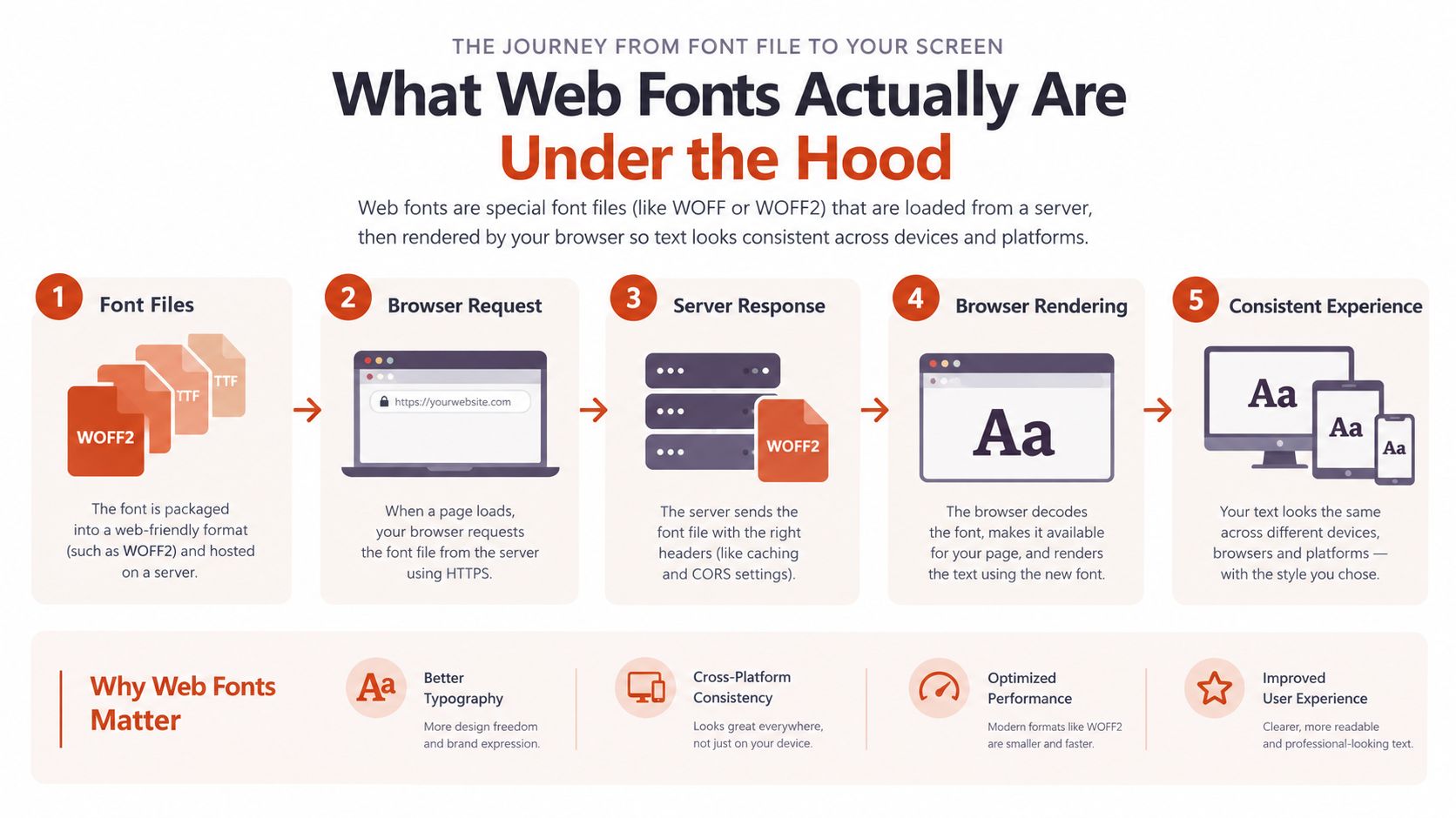
A web font is a delivery pipeline, not merely a file extension. A designer may start with an OpenType source, but the browser needs a web-ready resource, a server response, and CSS instructions that associate the resource with specific text.
The CSS @font-face rule defines that relationship. Its font-family descriptor gives the face a name, while src identifies available resources. The browser then compares those declarations with the requested font-weight, font-style, font-stretch, and language ranges before selecting the face that should paint a DOM element.
The browser's decision chain
The cascade determines which rule wins when several declarations apply. unicode-range can split coverage across resources, so a page may request different files for different character sets. A local() source can allow the browser to use a locally installed face, while a URL points to a downloadable resource.
Those paths have different consequences:
- Installed system font: The browser can use a local resource without downloading that face for the page. The desktop installation still doesn't transfer web rights to the website.
- Downloaded web font: The browser makes a separate request and follows a separate rendering path. The website needs permission to embed the font in browser code.
- Fallback family: The browser uses the next available family when the intended face is unavailable, delayed, or rejected.
The web format also matters. The same type design can be prepared for different delivery formats, but compression behavior and browser acceptance vary by format. WOFF became a shared web delivery format through the standards process, after CSS2 introduced @font-face in May 1998, Safari restored relevant support in March 2008, and the first public WOFF 1.0 working draft appeared on 27 July 2010, as documented in this history of web font evolution.
Why the distinction matters
A locally installed font and a downloaded web font may look identical, but they are not the same operational asset. One is part of a designer's workstation environment. The other is a browser-delivered resource that must be optimized, served, tested, and licensed for that use.
That distinction explains why a font audit should inspect both CSS and the actual files being requested. The visible family name alone doesn't tell you which weight loaded, which format the browser accepted, whether a fallback was painted first, or whether the deployed file matches the license.
Delivery Formats and the Static Versus Variable Trade-Off
Choose a delivery strategy based on the page's content, performance budget, and licensing scope. WOFF2 is the modern baseline because it generally compresses better than legacy formats, reducing transfer size and download time on the critical rendering path. Follow this guide to optimizing web fonts, then verify the result against the site's actual files and browser requirements.
That choice does not settle the static versus variable decision. A static family uses separate files for the faces you select. A variable font packages a range of supported axes, such as weight or width, into one resource that the browser can interpolate. A subset removes characters or features the page does not need. The font file formats, licensing, and performance guide provides a useful framework for checking these decisions together rather than treating format selection as a design-only task.
Compare the strategies against the actual workload
| Strategy | Average Payload | Design Flexibility | Maintenance Cost | Best Fit |
|---|---|---|---|---|
| WOFF2 static files | Predictable and compact when limited to required faces | Moderate, because each added weight or style needs another file | Low to moderate | Performance-sensitive pages with a defined type system |
| WOFF2 variable font | One resource can cover supported axes, but it may exceed the size of a narrowly selected static face | High, within the type designer's intended axes | Moderate | Brand-led sites with stable content and controlled design rules |
| Static subsets | Potentially very lean because unused glyphs are removed | Limited to the covered characters and selected faces | Higher, because content and language changes require review | Campaign pages, critical routes, and narrowly scoped experiences |
| Hybrid delivery | Each face can use the strategy suited to its role | High where needed, restrained where not | Moderate to high | Sites with a subset body face and a more expressive display face |
Compare bytes delivered per visit, future design flexibility, build-pipeline effort, and missing-character risk. The 2026 font format guidance also recommends WOFF2, loading only the weights required, and judging variable fonts by their payload rather than by their novelty. Test the selected files with actual page content, including punctuation, diacritics, symbols, and multilingual copy.
My recommendation
Use WOFF2 subsets for performance-critical marketing pages when the language and content scope are controlled. Use a variable font for a brand-driven site when the design system genuinely needs its axes and the content team will stay within supported combinations. Choose a hybrid when the body face can be tightly subset while the display face needs a broader expressive range.
Subsetting requires ownership. The build process must preserve required punctuation, diacritics, symbols, and language coverage. A narrow subset can appear efficient until a new campaign headline introduces a missing character. Define who updates the subset, how changes are reviewed, and how testing detects absent glyphs before publication.
The safest default is the smallest correctly licensed resource that supports the content users will read. Feature count comes second.
How Fonts Behave While a Page Is Loading
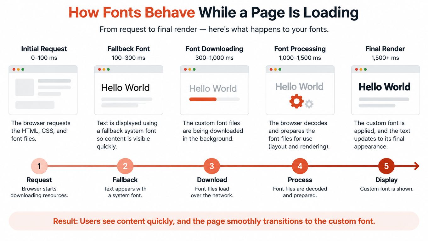
A user opening a page may see invisible text, a fallback face, or a visible change after the custom font arrives. FOIT, or flash of invisible text, hides text temporarily. FOUT, or flash of unstyled text, shows a fallback first and replaces it later. That replacement can alter line lengths, button widths, and element heights after the first paint.
The CSS font-display property sets the browser's preferred behavior. auto leaves the decision to the browser. block can prioritize the custom face while text remains invisible for a limited period. swap shows a fallback immediately and replaces it when the font loads. fallback uses a shorter tolerance for the custom resource, while optional lets the browser skip the download on slower connections.
Select the behavior by page purpose
A campaign page can usually show a fallback first, because immediate readability supports the page's primary job. A transactional interface needs tighter control. A changed label width can move controls, obscure validation messages, or make a familiar workflow harder to scan.
The fallback must also match the web font's metrics. Large differences in x-height or character width create visible reflow when the system face is replaced. Set fallback metrics deliberately, then test the actual combination rather than judging the custom font in isolation.
Preloading the above-the-fold face can reduce waiting when the preload matches the browser's real request, uses the correct resource attributes, and does not compete with more important assets. A preload that targets the wrong format or unused weight adds work without improving rendering.
Modern rendering strategies from SpecStory, Inc. provide useful context for progressive visibility. Show readable content early, then improve its visual fidelity as resources arrive. Treat font loading as part of delivery planning, not as a purely aesthetic setting. Review the related web-font performance and licensing risks before production deployment.
Test the failure path
Performance auditing guidance states that pairing preloads with font-display: optional can reduce layout shift caused by font loading, as described in this font-display performance guidance. Do not apply that combination universally. Test it against brand requirements, the fallback stack, connection conditions, and the role of the typeface.
Use browser developer tools to test:
- A blocked font request.
- A slow connection.
- A cold cache.
- A page with long translated strings.
- A browser that selects a different available format.
Success means users can read immediately, controls remain usable, and the visual replacement causes no avoidable movement. The custom font appearing eventually is only one part of the result.
Licensing Boundaries You Should Not Cross Quietly
A website launch can pass design review and still fail licensing review. A desktop license generally permits installing a font on local computers for design work and producing static creative output. A web font license permits embedding the font in website code so browsers can render live text. Its terms may also depend on page views or traffic tiers, as explained in this comparison of desktop and web font licensing. For a broader project checklist, use this web font license compliance guide.
Buying a font does not automatically authorize every delivery method. The purchase may cover one medium while excluding another. A file that works in a design application can still be unauthorized when copied into @font-face. Treat licensing as a delivery requirement before selecting files for production.
Common exposure points
| License Type | Typical Use Case | Key Obligation | Common Mistake |
|---|---|---|---|
| Desktop | Local design tools and static creative output | Follow installation and output permissions | Embedding the desktop file in browser code |
| Web | Live text rendered by a website | Follow domain, traffic, format, and delivery terms | Assuming one web license covers every property |
| Trial or evaluation | Internal review before purchase | Restrict use to the stated evaluation purpose | Leaving the trial file in production |
| Open-source | Use under the published license terms | Preserve required notices and follow distribution conditions | Treating “open” as permission to ignore the license |
Check more than the license category. Terms can restrict file conversion, redistribution, application embedding, domains, traffic, and delivery formats. Some foundries require web delivery in WOFF or WOFF2, prohibit converting OTF or TTF desktop files for browser use, or limit embedding in applications. A foundry licensing framework shows why permitted format and permitted channel must be assessed separately from possession of the file.
Financial exposure is not hypothetical
Unauthorized font use has resulted in formal claims and settlements. One widely reported U.S. case involved approval of a $2.85 million settlement in a class action alleging unlicensed font use, as described in this overview of font licensing enforcement. That amount does not predict the cost of your project. It does show that misuse can create meaningful financial exposure, not merely a request to remove a file.
For licenses such as OFL or Apache, read the actual terms for attribution, source disclosure, naming, modification, and redistribution. Requirements vary by license and by how the font is changed or distributed. Developers should preserve the license with the deployed assets, while legal reviewers should confirm whether the chosen use fits the grant.
Compliance rule: Keep the invoice, license text, permitted domains, approved formats, renewal terms, and deployed file versions together. Legal review should confirm the interpretation. This article is informational, not legal advice.
Pairing, Accessibility, and Multilingual Reach
A pairing that works in an English homepage mockup can fail in production. It may lose contrast at smaller sizes, strain reading, or break the layout when the site adds Cyrillic, Greek, Vietnamese, Arabic, or another script. Treat pairing, accessibility, and language coverage as one delivery decision, not separate design reviews.
Start with contrast of form. A humanist sans can add warmth and varied rhythm beside a geometric sans. A serif headline can create editorial emphasis beside a restrained sans body. Two faces from one superfamily simplify implementation, but they may not create enough distinction when hierarchy depends only on weight. Test width, rhythm, weight, and hierarchy together.
Readability depends on more than a typeface's marketing description. Evaluate x-height, cap height, stroke contrast, spacing, counters, and line height with the interface's color, component, and text settings. Body copy must remain comfortable at its actual size. Avoid delicate letterforms when users need to distinguish hierarchy quickly.
One Latin choice can create several failures
| Consideration | What to Evaluate | Risk If Ignored | Quick Check |
|---|---|---|---|
| Pairing | Rhythm, width, weight, and hierarchy | Headings and body copy compete instead of guiding readers | Test real headlines beside long-form text |
| Accessibility | Counters, x-height, spacing, stroke contrast, and text settings | Dense or small copy becomes difficult to read | Review at normal size, zoom, and reduced contrast |
| Language coverage | Character inventory, script quality, and consistent metrics | Translated content falls back or changes layout | Test representative strings from every target market |
| Brand consistency | Shared tone without identical construction | Components feel fragmented across regions | Compare the same component in each supported script |
Industry discussion of multilingual and cross-cultural type trends reflects a broader delivery challenge. Brands may want expressive display typography, yet the selected families must remain legible and coherent across scripts and devices. A visually distinctive Latin face does not guarantee an equally strong companion for every language.
Test actual language, not a specimen sentence
Request the supported character set from the foundry and inspect the files. Test names, dates, currency symbols, legal language, navigation labels, and error messages from every market. Include strings with diacritics and script-specific punctuation. A family that handles English well may provide weaker coverage elsewhere, forcing an unplanned fallback and changing line breaks, component heights, or brand expression.
Approve a pairing only after its accessibility and language samples pass. Record the tested scripts, sizes, weights, and representative content so later edits do not reintroduce failures without notice. The visual system must serve people and content first, then express the brand within those boundaries. Performance and licensing review still determine whether the approved pairing can be delivered as intended.
Embedding, Self-Hosting, and Fallbacks in Practice
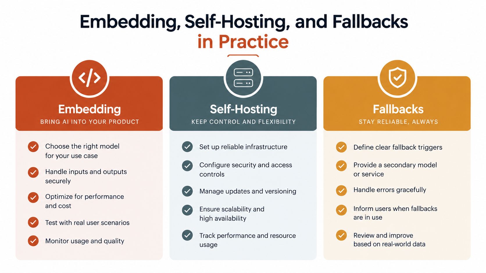
Implementation should follow an ordered checklist. Start by choosing between a hosted delivery service and self-hosting. Hosted delivery can reduce maintenance and provide infrastructure support, while self-hosting gives the team more control over privacy review, cache policy, availability, and file versions. Neither option removes the need to verify the license.
Build the delivery path deliberately
Define the required faces. List the families, weights, styles, scripts, and character ranges used above the fold and in the wider interface. Don't upload an entire family when the design system needs only a narrow selection.
Prepare WOFF2 resources. Use the modern compressed format where the license permits it. Create subsets only after reviewing real content, including punctuation, diacritics, symbols, and translated strings.
Declare coverage explicitly. Use
unicode-rangewhen separate subsets serve distinct scripts or character groups. This keeps the browser from downloading resources that don't match the text it needs.Place
local()carefully. A local source can avoid a download when the correct face is already installed, but it must identify the intended family and version accurately. Put the approved URL in the same declaration so the browser has a reliable fallback path.Create a metrics-aware stack. Name the web face first, then a system fallback with similar width and proportions, followed by a generic family. A stack such as
Brand Sans, System Sans, sans-serifis only a starting point. Compare line wrapping and control dimensions before choosing the fallback.
Verify the browser path
Preload the WOFF2 face used above the fold, set an intentional font-display value, and confirm that the preload and CSS declaration refer to the same resource. In DevTools, check that the browser doesn't make a second request because of a URL mismatch, incorrect attributes, or a different selected format.
Review the implementation after every design-system change. The self-hosted versus hosted decision guide is useful for framing the operational trade-off, but your site's privacy, reliability, engineering, and licensing requirements should determine the outcome.
From One-Off Choices to an Ongoing Typography Standard
A reliable typography system combines performance, accessibility, and licensing into one written standard. Without that standard, a designer adds “just one more weight,” an editor introduces a new script, and a developer copies a convenient file into production. The same errors return because nobody owns the decision.
Write a short policy that names:
- Approved foundries and permitted font sources.
- Required license checks for every deployed family and domain.
- Accessibility checks for contrast, spacing, resizing, and language coverage.
- A total font-payload budget for each route.
- The named owner who approves exceptions and records the decision.
Review the policy on a recurring schedule. Check license terms, Lighthouse font behavior, fallback integrity, unused glyph ranges, and newly added weights. Continuous auditing matters because a site's typography changes through campaigns, translations, acquisitions, agency handoffs, and component updates.
Creative exploration still has a place. A tool that helps teams generate Instagram fonts can support concept development, but a production website needs a separate review of browser delivery, readability, and usage rights.
Typography is infrastructure, not decoration. Treat font audits like dependency upgrades, keep evidence with the deployed assets, and make the person responsible for the system visible to design, engineering, and legal teams.
Font Checker Pro scans live URLs, PDFs, images, and zipped font sets to identify typefaces, inspect weights and styles, flag licensing concerns, and benchmark font delivery and fallback behavior. Use Font Checker Pro to turn your next fonts for website review into an exportable record for design, engineering, and compliance.