A client asks for a page that feels classic, like a well-made book. You choose a serif, set a paragraph, and find that the result looks elegant in the presentation but cramped in the browser. The font name sounds right, yet you still need to understand its letterforms, test its reading performance, and confirm that you can serve its files.
What Old Style Serif Means and Why It Still Matters
A designer opens a printed page and notices letters whose strokes seem to carry the movement of a pen. That impression points toward old style serif, a group of typefaces descended from early European movable-type printing. It names a family of designs, not a single typeface.
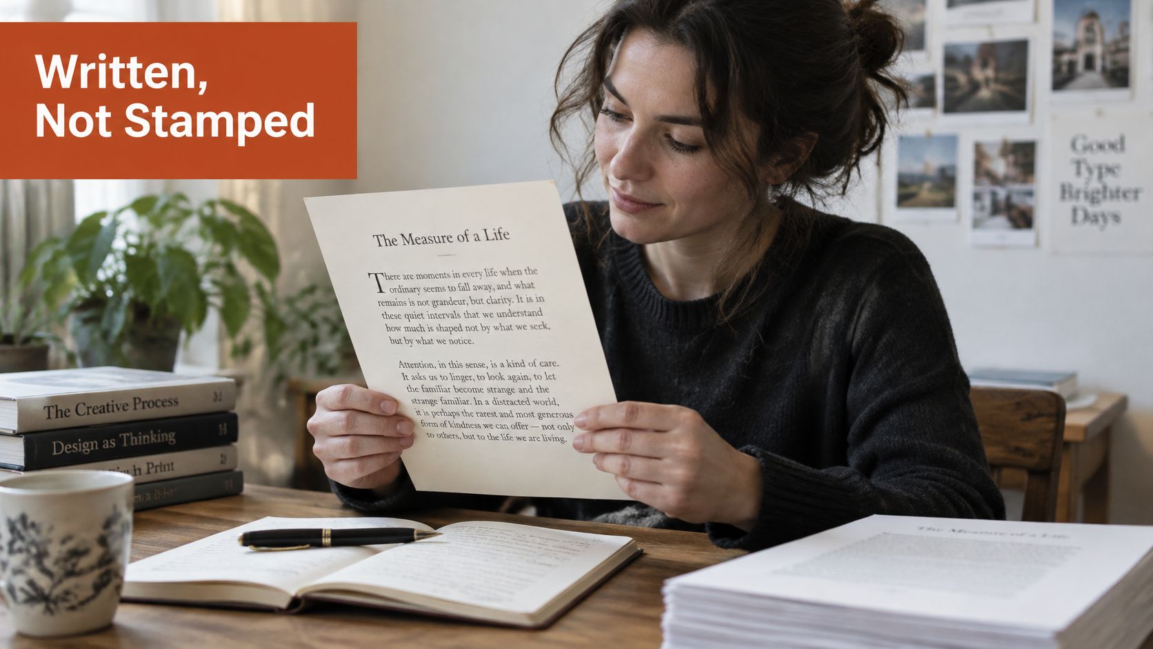
A fountain pen suggests changing stroke thickness and softened joins, while a rubber stamp suggests a more uniform impression. Printed old style letters are repeatable shapes, so the comparison describes their lineage, not the appearance of any single page.
Separate appearance from approval
When I shortlist an old style serif, I'm often seeking a bookish, text-oriented voice. It may suit an editorial page or a brand that wants to suggest continuity and craftsmanship. Those are design judgments. They say nothing about how easily readers will process the text.
The historical category includes Venetian or humanist designs and Garalde or Aldine designs. Both carry traces of handwriting, yet their differences mean two old style families can look quite unlike each other. The classification of early serif forms describes the relationship between calligraphy and printed letters.
Keep three checks distinct:
- Classification: Does the sample show the characteristic construction?
- Performance: Does this family work for its intended readers and setting?
- Permission: Does the licence cover the actual deployment?
A historical label answers the first question. It cannot settle the other two.
Give the visual impression a vocabulary
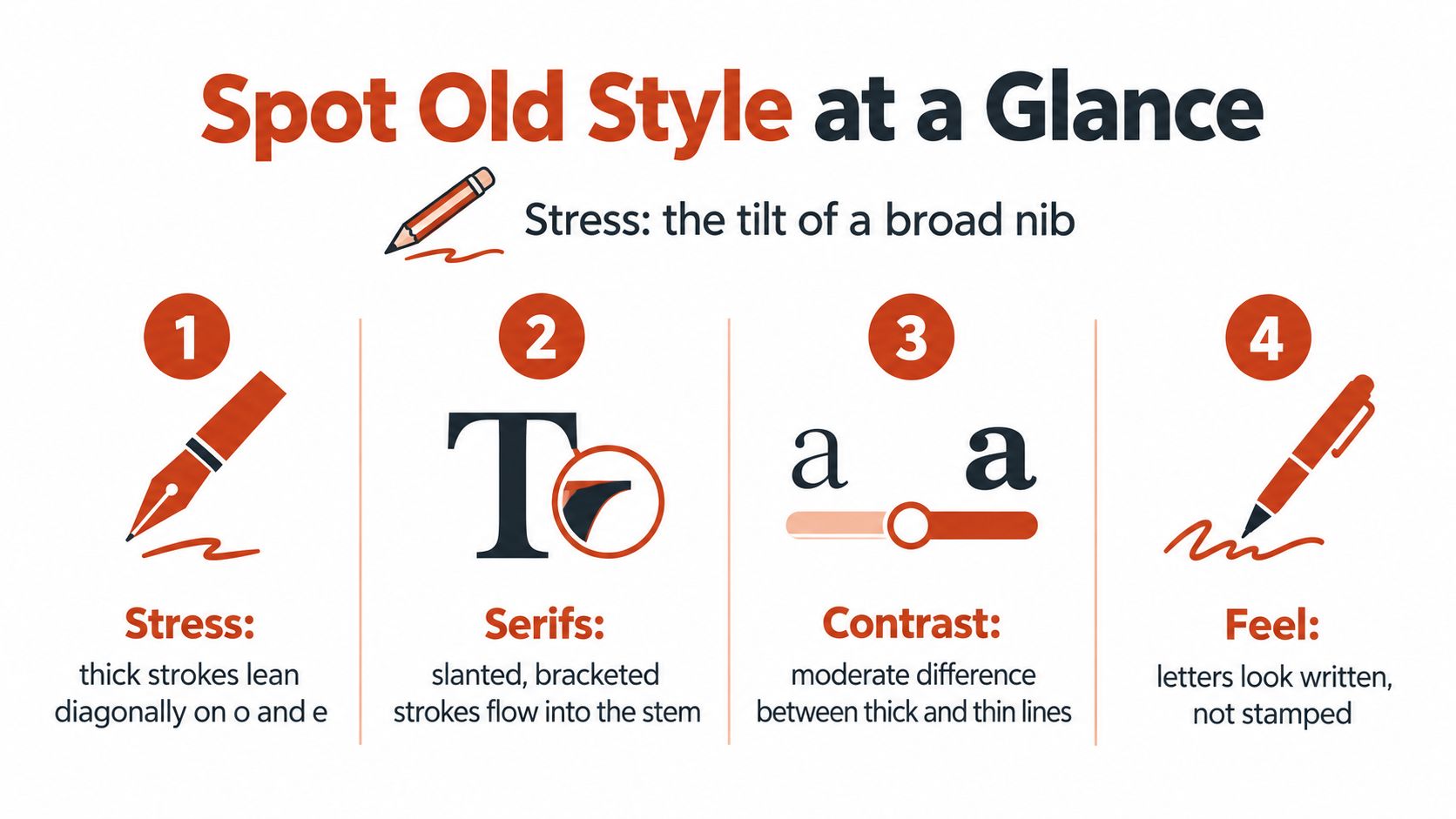
Start with diagonal stress, moderate thick-thin contrast, bracketed serifs, and organic proportions. These terms make a design choice clearer than labels such as “traditional” or “premium.” In a handoff, they also give a developer and designer shared language for discussing the same sample.
The licence needs its own review. A font's historical name says nothing about whether its files may be served on a live site, so a compliance reviewer should assess the licence separately.
Working definition: Old style describes how letters are constructed and where their design comes from. Readability depends on the typeface and setting, while web use depends on the licence.
A sound choice can be explained in plain terms: identify the relevant features in the actual letters, assess the family for its intended use, and document why its files are permitted on the site.
How to Recognize Old Style Letterforms at a Glance
Stress is the apparent tilt within a rounded letter. Think of holding a broad writing nib at an angle: the tool makes some parts of a curve heavier than others. You're looking for that relationship, not for a letter that physically leans like an italic.
Inspect a small group of letters
- Start with the lowercase o. Look for a diagonal axis, with the thinnest areas approximately near the 8 and 2 o'clock positions. The technical description of serif classifications connects this construction to broad-nib writing and distinguishes it from Didone forms.
- Examine n and m. Follow the stem down into its serif. A bracketed join curves into the foot, like a rounded inside corner rather than an abrupt right angle.
- Check the e. Its eye may be angled or fairly horizontal. Don't reject a family because this single letter doesn't match your expectation.
- Inspect the numerals. Old style figures vary in height and may extend below the baseline. Lining figures align more uniformly. A family can offer both.
- Compare lowercase height with ascenders. The x-height is the height of the lowercase body, most easily understood through x. Historical examples often have relatively small lowercase bodies.
- Compare the o with a Didone sample. The Didone's near-vertical stress and much stronger stroke contrast should make the difference easier to see.
The type-classification teaching reference connects old style proportions to historical printing conditions and distinguishes old style figures from uniformly aligned figures.
Compare patterns, not rigid rules
Letterform signals that separate old style from Didone and sans serif
| Feature | Old style | Didone | Sans serif |
|---|---|---|---|
| Stress in o | Diagonal, thinnest near 8 and 2 o'clock | Near-vertical | Often vertical |
| Stroke contrast | Low to moderate | Very high | Often low or uniform |
| Serif joins | Bracketed, curved | Hairline, unbracketed | No serifs |
| Eye of e | Angled or fairly horizontal | Typically horizontal, narrow | Often horizontal |
| Numerals | Old style figures vary in height | Commonly lining, uniform | Usually lining |
| x-height | Small to moderate | Varies by design | Often large |
Treat the table as a specimen guide, not a definition that every font must satisfy. In particular, numeral style is an available feature, not a reliable classification test by itself.
Times New Roman is a transitional serif, a neighbour rather than a standard example of this category. Commercial designs can also blend historical features, so make your judgment across several letters instead of treating one curved serif as decisive evidence.
For a practical test, set a paragraph at 16px, then enlarge a lowercase-heavy line such as one morning among open meadows. Use the enlarged line to inspect construction and the paragraph to judge texture. The display sample reveals the drawing; the paragraph reveals what that drawing becomes in use.
How Old Style Serif Began in Venetian and French Print Shops
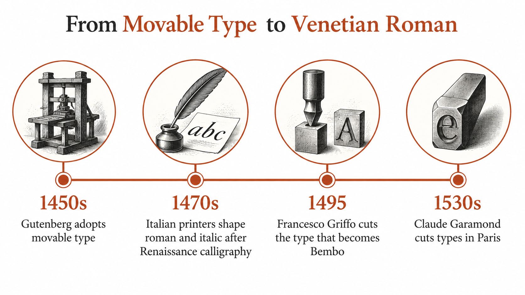
The family tree starts with workshops, not a modern style menu. After Gutenberg's adoption of movable type, Italian printers developed roman and italic forms influenced by Renaissance calligraphy. They translated the movement of written letters into repeatable printing material.
Venice and Paris
In 1495, Francesco Griffo cut type for Venetian printer Aldus Manutius. Claude Garamond's later roman forms followed that model. Garamond, a Parisian punchcutter, is first clearly documented around 1540, receiving payment for the Greek types known as the Grecs du Roi; his roman designs belong to the mid-sixteenth century, with the family commonly associated with around 1549, as outlined in this historical typography chronology.
Those dates need careful reading. A date associated with a modern family name isn't necessarily the moment when every related letterform appeared. Historical models developed through individual cuts, adaptations, and later interpretations.
For a contemporary specimen alongside this history, examine Adobe Jenson Pro. Use it as an opportunity to compare the earlier humanist character with the more refined forms you encounter under Garamond names.
London and the later revival
William Caslon I, born in 1692, trained as an engraver before establishing his London foundry in 1725. His roman type appeared around 1722. His 1734 specimen displayed 47 typefaces, including Roman, italic, Greek, Hebrew, and Arabic designs, according to this historical account of Caslon typography.
The same account associates Caslon type with printing the original United States Declaration of Independence. It also describes Caslon's later revival during the nineteenth-century Arts and Crafts movement.
Read the lineage as connected branches:
- Venice: Printers and punchcutters adapted Renaissance writing to type.
- Paris: Garamond developed forms informed by the Venetian model.
- London: Caslon helped establish an influential English old style tradition.
The name old style became common only in the mid-nineteenth century, after the forms themselves were established. More geometric Didone designs had displaced much earlier book typography during the eighteenth and early nineteenth centuries.
The endurance is understandable: later designers could return to a rich set of working models rather than merely borrow a decorative historical mood.
Notable Old Style Serif Typefaces and Their Modern Revivals
A typeface name can suggest a lineage, but it does not specify how the digital font will behave. Compare the forms, spacing, available styles, and language support in the files you plan to use.
| Typeface | Historical root | Designer or foundry | Licence model | Best fit |
|---|---|---|---|---|
| Garamond | Mid-sixteenth-century Paris | Claude Garamond | Historic model; digital terms vary | Book text |
| Caslon | Early eighteenth-century London | William Caslon I | Historic model; digital terms vary | Editorial and print |
| Bembo | Griffo's Venetian type | Monotype revival | Commercial; check terms | Long-form books |
| Sabon | Garamond-related tradition | Jan Tschichold | Commercial; check terms | Books and journals |
| Adobe Garamond | Garamond revival | Robert Slimbach, Adobe | Commercial; check terms | Book design |
| Minion | Modern interpretation of historical text types | Robert Slimbach, Adobe | Commercial; check terms | Editorial body copy |
| EB Garamond | Garamond revival | Georg Duffner and Octavio Pardo | Open source, SIL OFL; check supplied licence | Web body text |
| Libre Caslon | Caslon revival | Impallari Type | Open source, SIL OFL; check supplied licence | Web text and headings |
| Crimson Text | Historical book-type tradition | Sebastian Kosch | Open source, SIL OFL; check supplied licence | Web body text |
The table's best-fit labels are starting points: a family still needs to work in your actual text and layout.
A historical name isn't a complete specification
Garamond, Caslon, and Bembo are useful reference points, yet a name alone leaves practical questions unanswered. Digital interpretations vary in proportions, spacing, available weights, italics, and character coverage.
Bembo's modern form, issued by Monotype, interprets Griffo's Venetian work. Jan Tschichold designed Sabon to work consistently across hot-metal and phototypesetting systems. Each revival reflects the production needs of its time as well as its historical model.
Adobe Garamond and Minion, both designed by Robert Slimbach at Adobe, approach historical text typography in different ways. At the same text size, one Garamond revival may fit more characters on a line because its spacing or proportions are tighter. Set a sample in each candidate, then compare line breaks and paragraph density.
A revival is an interpretation. Approve the files you'll use, not the historical reputation attached to their name.
Shortlist by the work the family must do
For a printed book, try Minion in a representative page. For web headings, test Libre Caslon. For web body text, examine EB Garamond's family details, then build a reading sample using your own content.
Inspect more than the default alphabet:
- Editorial content: Check italics, punctuation, quotations, and emphasis in realistic passages.
- Language coverage: Paste genuine text from every supported language, including accented characters.
- Production completeness: Confirm that the delivered package includes every required weight and numeral style.
A family's basic Latin letters may look right while its character set lacks forms your publication needs. A regular weight cannot fill in for a missing italic, either. These checks test whether the specific font files suit the work, rather than relying on the family name.
The licence depends on the particular digital release, so check its terms before launch, as discussed in the licensing section.
Choosing and Pairing an Old Style Serif for Your Project
A long-form article, book, editorial page, or quotation-led layout gives an old style serif room to show its letterforms. For a heritage or luxury identity, test whether its literary tone fits the work rather than choosing it for a mood label.
Dense interface controls need their own trial. A family that feels composed in a generous heading may crowd navigation, filters, or compact form labels. Serifs alone do not guarantee comfortable reading.

Assign each family a clear job
Start with the relationship between the serif and its partner. A humanist sans can share open forms and proportions with a humanist serif, but labels such as “humanist” do not prove that two specific families will pair well. Compare them in actual text.
Set roles before adding another family. The old style serif might carry reading text while a sans handles interface labels. If a component feels unfinished, adjust hierarchy or spacing before introducing a third family.
For emphasis, try the serif's italic in a paragraph. Its slant may preserve the text's texture better than a conspicuous weight change. Keep bold for places where readers need a clear hierarchy.
Figures are another practical test. Old style figures can sit naturally within running text; lining figures align more readily in data. For numerical columns, check whether tabular spacing is available and suits the layout.
Break a rule when a visible problem requires it, and note the reason in the design file.
Choose files as carefully as letterforms
A static family usually needs separate files for the styles you load. A variable font may combine supported axes in one file, but weight, width, and optical size are not guaranteed. Inspect the actual font axes, then compare the light and heavy extremes with the intended default. If adjustment closes counters or changes the text's texture, narrow the usable range.
For implementation, compare WOFF2 delivery, language coverage, and the cost of loading styles you do not use. A variable file is not automatically smaller. Subset only after confirming which scripts and characters your content needs. Match the fallback's width, observe line wrapping before and after the web font loads, and check for missing text, an uncomfortable font swap, or disrupted controls.
For more on the technical choices, see this practical guide to website typography for design and code.
A blog might use EB Garamond for articles and a humanist sans for controls, with only the weights the design needs. Before converting files to WOFF2 or removing glyphs, confirm that the applicable licence permits format conversion and subsetting. Then test the files readers will receive, not just the original desktop specimen.
Readability Claims Versus What Testing Shows
A type specimen can make an old style serif look calm and readable. That appearance is a starting point, not evidence about how readers will perform with it. Test the letterforms and reading conditions you plan to use.
A vision-science comparison of fonts that differed mainly in serif presence found no reading-speed advantage from serifs. A small legibility improvement at reduced size or viewing distance was associated more strongly with added letter spacing. A review of 42 peer-reviewed studies also found no universal serif advantage and identified familiarity as a possible influence, as discussed in this research on serifs and legibility.
Accessibility needs more than a category label
The APA's typography accessibility guidance supports considering multiple font choices and describes findings in which serif faces performed better in some long-text contexts. The same guidance reports that a specialised dyslexia typeface did not improve reading accuracy or speed in empirical comparisons.
That finding does not establish that a particular serif works for every reader with dyslexia. It shows why a historical category, or a typeface's name, cannot by itself substantiate an accessibility claim. Check the actual characters, then test with the people and content the design is intended to serve.
Run a controlled comparison
Use a consistent setup so you can tell which differences come from the typeface:
- Hold line-height and tracking constant. If they change, you cannot attribute the result to the font alone.
- Use the actual CSS pixel size. Check real devices and representative content rather than relying on an enlarged canvas.
- Inspect character distinction. At the intended size, check whether e and o remain distinct and whether key letter details render clearly.
- Compare a capable sans-serif alternative. A weak comparison gives an unreliable impression of the serif.
- Record comfort and errors. Ask readers about effort, and observe missed words, confusion, and task completion.
For compact controls, small font choices for UI design can help form a separate interface shortlist. Keep that assessment distinct from evaluating an article face.
Readability scoring formulas and metrics can help organise assessment of the prose. A score for written language does not establish that a font is visually legible.
Judge the specific family in its intended setting. Old style is a classification of letterform features, not a reading-performance result.
Verify Your Old Style Serif Licence Before Launch
A type specimen can help you choose an old style serif, but approval also depends on the rights attached to the font files. This is informational content, not legal advice. Terms vary by font and agreement, so check the licence for the exact files you plan to use.
A desktop licence generally covers installation on specified computers and static outputs such as print, PDFs, logos, or images. It may not permit uploading font software to a server. A webfont licence covers browser delivery, often through CSS and WOFF or WOFF2, and may set conditions for domains, traffic, or hosting. The overview of font licensing rights explains how these permissions differ.
Match the licence to the use
| Use case | Desktop licence | Webfont licence | Open-source licence |
|---|---|---|---|
| Installing on a computer | Covered for licensed machines | Not automatically covered | Permitted under its terms |
| Print, PDF and logos | Usually covered | Only if included | Permitted under its terms |
| Serving files from your server | Not automatically covered | Check permitted hosting | Permitted under its terms |
| Traffic or pageview limits | Not usually applicable | Check tier and limits | Check the applicable licence terms |
| Renaming modified versions | Check the agreement | Check the agreement | Check restrictions, including any Reserved Font Name |
Open-source distributions can use licences such as the SIL Open Font License, Apache, or Ubuntu licence. Keep and review the terms for the specific files; an open distribution does not grant permission for every modification or use.
Describe a font as “free” or “safe” only with its conditions in view. The historical age of an old style design does not determine the rights for its current digital files.
Keep an approval record
Unlicensed use can lead to vendor demands, replacement work, brand inconsistency, or redesign costs. There is no single standard fine or settlement amount; consequences depend on the agreement, circumstances, and applicable law.
Before approving deployment:
- Inventory the live site. Include fonts added through themes, templates, embedded components, and inherited styles.
- Identify each licence and tier. Match the agreement to the files loaded by the site.
- Confirm delivery conditions. Check web embedding, domains, traffic limits, formats, and hosting method.
- Retain evidence. Store the invoice, licence text, and relevant purchase or subscription records.
- Review altered files. Confirm that modified, subsetted, converted, or renamed versions comply.
Assign designers responsibility for selecting the family, developers responsibility for the files delivered, and the appropriate reviewer responsibility for unresolved terms. Use this website font-licensing checklist to help those roles share the same requirements.
Approve the old style serif when the checks pass. A successful specimen is the start of the decision, not the final sign-off.
Font Checker Pro scans live pages to inventory typefaces, identify licence tiers, and flag potential issues such as trial or expired copies. Its report gives your team a practical starting point for review. Visit Font Checker Pro to audit your chosen old style serif and its supporting fonts before launch, then reconcile the report with your licence records.