The best billboard font isn't the boldest one available. Maximum weight can close counters, clog letterforms, and make words merge when a viewer sees the board briefly from a moving vehicle. Fonts for billboards must survive viewing distance, vehicle speed, glare, contrast shifts, production scaling, and a short exposure window. The strongest choice depends on the job: transportation-grade clarity, geometric impact, neutral authority, vernacular boldness, or open-source flexibility.
The eight typefaces below are production decisions, not a popularity ranking. Each has a different balance of structure, personality, spacing, hierarchy, source control, and licensing complexity. The relevant rights can also change when a static outdoor design is adapted for a website, social campaign, or digital display. Licensing guidance here is informational, not legal advice. For a practical final check, FontCheckerPro can audit billboard artwork and related digital assets before release.
1. Helvetica Neue for Maximum Legibility
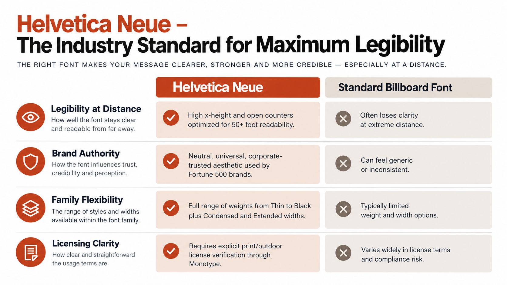
Helvetica Neue earns its place through restraint. Its clean sans-serif construction, consistent strokes, and generous x-height give designers a dependable starting point when a message must remain recognizable at scale. The family's range of weights and widths also supports hierarchy, so a brand can create a strong headline without forcing every line into the heaviest style.
That flexibility matters in real production. A roadside board might use a heavy weight for the central promise, a regular or medium cut for a short supporting line, and a compact treatment for a call to action. The typeface should still be tested in the complete composition, because a familiar face can become difficult to read when tracking is tight, contrast is weak, or the background is visually busy.
Practical rule: Choose Helvetica Neue for its predictable structure, then validate the actual message, size, spacing, and contrast. The name alone doesn't guarantee readability.
Helvetica Neue is proprietary, so the team must confirm the rights attached to the exact version and deployment. A desktop license generally covers local installation for print, logos, and static artwork, while a web license is required for live website use through CSS @font-face, as explained in this guide to Helvetica alternatives for web design. Outdoor print coverage should be checked directly in the foundry's terms rather than assumed from a desktop purchase.
Document the source, license tier, permitted media, regions, and campaign duration. If the artwork is handed to a printer or adapted into digital files, scan the billboard mockup, final PDF, and related URLs with FontCheckerPro to identify substitutions or assets that don't match the approved font record.
2. Futura for Geometric Impact
Futura brings a more visible point of view than Helvetica Neue. Its geometric construction, circular forms, and even strokes create a confident, forward-looking impression that works well for automotive, technology, architecture, and youth-oriented campaigns. At billboard scale, those simple shapes can become an advantage, provided the chosen weight leaves enough internal space in letters such as a, e, and o.
Its personality is also its trade-off. Futura can make a short headline feel distinctive, but its geometry may become less comfortable for longer copy or unfamiliar words. Use it for a clear headline and keep supporting information brief. A condensed or overly heavy cut can create a dense block that looks powerful in a design file but loses word separation in the environment.
Futura's family structure supports contrast between headline and secondary text, but specify the exact weight and width in the production file. Substitution is a common handoff risk when a printer or agency lacks the installed version. A reputable source such as Linotype or Monotype should be recorded alongside the license documentation.

Test the full artwork at scale, including perspective distortion, lighting changes, and the final background treatment. The guide to geometric font design from Bauhaus to 2026 can help teams think about geometric structure, but production approval still depends on the actual board.
Confirm whether the license covers outdoor print, campaign distribution, and any digital derivatives. A FontCheckerPro scan before print can flag an unauthorized variant before it reaches a vendor or regional team.
3. Gotham for Contemporary Versatility
Gotham sits between geometric authority and human warmth. Its open forms and clear construction make it approachable at large sizes, while its distinctive proportions give a billboard more character than a completely neutral sans-serif. That balance suits consumer, technology, lifestyle, institutional, and premium brands that want to appear modern without looking clinical.
The family's breadth is valuable for campaign systems. Gotham includes twelve weights and two widths, allowing a designer to build hierarchy without introducing an unrelated secondary face. A wide, sturdy headline can carry the main promise, while a lighter supporting treatment handles a short qualifier. On a busy urban board, that consistency can make a campaign easier to recognize across changing layouts.
Gotham is proprietary and distributed through Hoefler & Co. Billboard artwork falls under print-oriented usage, but the digital extensions of a campaign may require separate rights. A landing page using the same typeface through @font-face, for example, is a web deployment, not merely an extension of the outdoor artwork. Teams should record each asset type rather than treating the campaign as one universal license.
The typography brand guidelines guide is useful when a team needs to define approved weights, widths, fallbacks, and handoff rules. For a billboard, don't rely on brand guidelines alone. Test the actual words at realistic distance, especially if the design uses all caps or a compressed width.
Buy Gotham from the authorized source, retain proof of purchase, and specify the foundry in the design package. Scan final artwork and derivative digital assets with FontCheckerPro to catch substitutions introduced during export or production.
4. Interstate for Traffic-First Clarity
Interstate is the most context-specific option in this list. Its design language is rooted in highway lettering standards, so it naturally suits boards viewed from moving vehicles, directional campaigns, transport environments, and wayfinding systems. The broad forms, open spacing, and sturdy strokes prioritize rapid recognition over decorative distinction.
That makes Interstate a strong choice when the message has to work under motion and distance. A highway campaign announcing a service exit, a venue, or a short brand promise benefits from letterforms that separate clearly and avoid fragile details. It can also bring transportation credibility to a commercial board, although that association may feel too utilitarian for a luxury or editorial campaign.
Use the family's hierarchy carefully. A bold headline can establish the main message, while a less forceful cut can support a short location or action line. Avoid compressing the type to fit excessive copy. If the words don't fit at a readable size, reduce the message rather than forcing the letters into a cramped container.
Interstate is proprietary and distributed through Hoefler & Co. Confirm that the selected license explicitly covers billboard and outdoor print use. A desktop or web right doesn't automatically grant every other form of deployment. The Bell Centennial reference page provides a useful related point of comparison for transportation-oriented type decisions, but the approved Interstate file and its license remain the controlling production records.
A transportation-inspired typeface works best when the campaign respects its purpose. Give it room, contrast, and a message short enough to decode quickly.
Before production, create a perspective simulation from the intended approach route. Check the headline, brand name, and call to action separately. FontCheckerPro can audit the final billboard file and associated digital assets so an unlicensed substitution doesn't enter the package during handoff.
5. Montserrat for Open-Source Flexibility
Montserrat is a practical choice for teams that need broad language support, a modern geometric appearance, and a flexible production workflow. Designed by Julieta Ulanovsky and distributed through Google Fonts under the Open Font License, it can support commercial billboard work without a purchase fee, subject to the license terms. That accessibility is useful for independent designers, agencies, startups, and organizations managing many regional adaptations.
Open-source availability doesn't remove the need for source control. Download the font from Google Fonts or the official GitHub repository, preserve the license text, and avoid modified or uncertain copies. The team should also confirm that the exact files used in the artwork match the approved distribution. A file with the same family name can still come from a different source or contain unexpected changes.
Montserrat's geometric voice is effective for bold headlines, but its heavier cuts need room. Test counters, punctuation, accents, and multilingual characters at final scale. A typeface that works in a short English slogan may need different weight or spacing when the same campaign expands into additional scripts or longer words.
The practical guide to self-hosted Google Fonts is especially relevant when billboard creative is connected to a campaign website. The outdoor file and the website may use the same family while requiring separate workflow records and different technical checks.
Use one strong Montserrat cut for the main statement and introduce a second face only when it adds a clear information function. FontCheckerPro can verify the font identity and license evidence across final billboard designs and related digital assets, helping the team maintain an auditable record rather than relying on an informal assumption that “open source” means universally compliant.
6. Univers for Systematic Precision
Univers appeals to teams that value a controlled typographic system. Its modernist structure and coordinated range of weights and widths let designers make precise adjustments without changing the overall voice. That matters when one campaign must span roadside boards, institutional signs, venue displays, and supporting digital materials.
The typeface's neutral character is both benefit and limitation. It can communicate competence and order without competing with a strong image or brand mark. It may also feel restrained if the campaign depends on expressive personality. Designers should decide whether the visual concept needs typographic neutrality or a more distinctive shape before committing to it.
Use exact family specifications in every handoff. Record the foundry, weight, width, and file name, then lock those details in the production notes. This prevents a generic “Univers bold” instruction from turning into a substituted file that has different spacing or proportions. At a distance, those small changes can affect line breaks, logo relationships, and the apparent density of the board.
Univers is proprietary and available through Linotype and other foundries. Confirm print and promotional coverage for the billboard, then review separate rights for any live web implementation. A desktop license covers local installation and static work within its terms, but it isn't automatically a web license.
A practical test is to compare the same message in two neighboring weights and widths at realistic perspective. Choose the lightest version that keeps the counters open and the strokes visible after output scaling. Scan the final artwork and derivatives with FontCheckerPro to verify that the approved Univers source survived export, packaging, and vendor handoff.
7. Franklin Gothic for Vernacular Boldness
Franklin Gothic has a direct, unmistakably American advertising voice. Its heavy forms and compact proportions give short headlines a strong presence, making it suitable for automotive, retail, consumer goods, sports, and campaigns that want blunt, energetic communication. It can feel more familiar and emphatic than a neutral modernist face.
That force needs discipline. A heavy Franklin Gothic treatment can dominate the entire board, leaving insufficient separation between the headline, logo, and call to action. Use contrast in scale and spacing rather than adding more weights or decorative effects. If the board already contains a demanding image, a less dense cut may perform better than the most aggressive option.
The family's availability creates a source-verification problem. System fonts, commercial foundry versions, and open-source variants don't necessarily share the same rights or files. A system installation also doesn't automatically mean that a production vendor may embed or distribute that font in a print workflow. Confirm the specific source and permissions before packaging artwork.
The family name is not the license. The file source, license terms, and intended deployment determine what your team may do.
For a regional campaign, include the exact Franklin Gothic variant in the asset manifest. Check whether the printer receives outlined artwork, an embedded font file, or a packaged editable file, because each workflow can create different obligations. The custom fonts by Simon Stratford offers additional perspective on advertising font choices, but the foundry's own license remains decisive.
Run FontCheckerPro scans on the final PDF, source package, and derivative digital assets. The audit can help identify variant mismatches before a bold headline reaches production with the wrong file.
8. Akzidenz Grotesk for Neutral Modernism
Akzidenz Grotesk is a strong fit for brands that want authority without a fashionable visual signature. Its early sans-serif heritage, restrained proportions, and open letterforms support corporate, governmental, cultural, institutional, and high-end commercial work. The result can feel timeless, especially when the imagery and color system carry the campaign's personality.
Neutrality has a practical downside. On a crowded urban route, a restrained face may not create enough distinction by itself. The designer must earn attention through scale, contrast, composition, and message clarity rather than depending on unusual letterforms. Test the complete board from the intended approach, not just the type specimen.
Licensing is particularly important because Akzidenz Grotesk has been released and refined by multiple foundries. Linotype, Monotype, and other sources may offer versions with different outlines, naming, weights, and terms. Specify the foundry and exact cut in the design file. “Akzidenz Grotesk” is not a sufficient production instruction when several authorized-looking sources may exist.
For static outdoor artwork, verify explicit print or promotional coverage. If the campaign also includes a website, app, or live digital ad, map those assets separately. A web license is commonly scoped to website display and may exclude desktop installation or app distribution, as set out in this font licensing guidance. Using a font outside that scope can create contractual and copyright exposure.
Test the family in grayscale and under simulated glare. Then scan the billboard PDF, image exports, and associated URLs with FontCheckerPro to confirm the foundry source, identify substitutions, and preserve an exportable audit trail.
Top 8 Billboard Fonts Comparison
| Font | Implementation complexity | Resource requirements | Expected outcomes | Ideal use cases | Key advantages |
|---|---|---|---|---|---|
| Helvetica Neue – The Industry Standard for Maximum Legibility | Moderate–high (proprietary licensing, multiple weights) | Paid desktop/web/print licenses; family files; scale testing | Exceptional distance legibility; neutral corporate authority | Large-format billboards, corporate outdoor campaigns | Proven legibility, broad family, professional neutrality |
| Futura – Bold Geometric Confidence for Maximum Impact | Moderate (foundry-specific versions; licensing varies) | Paid license from foundry; weight selection; readability tests | Strong geometric impact and high recognition at scale | High-impact advertising, youthful or modern brands | Distinctive geometric personality; strong brand recall |
| Gotham – Contemporary Versatility and Urban Appeal | Moderate (single-source licensing; tiered rights) | Premium license (Hoefler & Co.); full family for hierarchy | Warm, modern legibility with broad appeal | Consumer, tech, lifestyle billboards and campaigns | Large family, approachable modern tone, clear documentation |
| Interstate – Bold Legibility Rooted in Traffic Design Standards | Moderate (proprietary; purpose-built) | Paid license; weights/widths for high-speed viewing; testing | Engineered extreme-distance readability and quick recognition | Roadside billboards, wayfinding, transit signage | Designed for signage; open counters; robust stroke weights |
| Montserrat – Open-Source Versatility with Global Support | Low (OFL open-source; easy deployment) | Free download via Google Fonts/GitHub; verify OFL compliance | Good distance legibility; multilingual support; cost-effective | Budget-conscious, global campaigns, startups | Free commercial use (OFL), many styles, broad language support |
| Univers – Modernist Precision and Optical Refinement | High (extensive family; licensing varies by foundry) | Paid licenses; careful weight/width selection; designer learning curve | Precise typographic hierarchy and consistent optical balance | Institutional, corporate signage, precise branding systems | Systematic family structure, optical consistency, professional polish |
| Franklin Gothic – American Vernacular Strength and Boldness | Moderate (source/variant licensing fragmentation) | Verify source (system/commercial/open variants); testing at scale | Commanding presence and high impact on viewers | Retail, automotive, high-impact commercial billboards | Bold condensed impact, wide availability (with verification) |
| Akzidenz Grotesk – Neutral Modernism and Timeless Legibility | High (fragmented foundries; licensing ambiguity) | Paid license from chosen foundry; confirm print rights | Neutral, timeless legibility and institutional sophistication | Corporate, governmental, cultural institution billboards | Timeless modernist aesthetic, refined spacing, broad authority |
Choose for the Viewing Distance, Then Audit the Rights
Start with the viewing condition, not the font menu. A long-range highway board needs a different decision from a pedestrian-facing display or a digital billboard with changing creative. The available guidance includes both a 30 ft/in legibility index and a second heuristic of 4 inches of letter height per 100 feet of viewing distance for adequate readability, as documented in this billboard readability guidance. The same source notes that 8-inch letters at 30 mph provide about 5 seconds of readability, while 16-inch letters at 60 mph are needed for a similar reading window. These are planning heuristics, not substitutes for testing.
A separate billboard guidance source describes readability at roughly 25 to 40 feet of viewing distance per inch of letter height. On that basis, a 30-inch letter starts resolving at approximately 750 to 1,200 feet, according to the outdoor-display typography research. Another industry guideline uses 1 inch of letter height for every 10 feet of viewing distance, which would make a headline about 25 inches tall at 250 feet and about 50 inches tall at 500 feet, as summarized in this billboard typography guide. The variation between heuristics is a reason to test the actual site, not a reason to choose a smaller type size.
Use this sequence:
- Identify the audience movement: Record whether viewers are driving, walking, waiting, or seeing a digital rotation. Speed and dwell time change the acceptable density.
- Choose the family and weight: Select Interstate for transportation-first clarity, Futura or Montserrat for geometric impact, Gotham or Helvetica Neue for broad neutrality, and Franklin Gothic for a more vernacular, emphatic voice. Treat these as starting points, not guarantees.
- Adjust spacing and contrast: Open tracking can preserve character separation, while strong contrast protects the message against glare, haze, and uneven display conditions. Keep the composition simple enough that the type doesn't compete with unnecessary information.
- Test the complete message: Review the final words, punctuation, logo relationship, and call to action at realistic scale and perspective. A font that looks excellent in a design application can fail after scaling, compression, lighting changes, or digital display processing.
- Record the exact source: Save the foundry, family, style, version, license purchase, permitted media, territory, and duration. This is especially important when a family has multiple foundries or variants.
- Map rights by asset: Desktop rights cover local installation and static work within their terms. Web rights cover live website delivery and are often scoped by traffic or site ownership. Outdoor print or promotional rights must be confirmed for billboard production. These categories aren't interchangeable.
- Audit before release: Scan PDFs, images, font packages, and related URLs. Font Checker Pro can identify typefaces from a billboard image, logo, screenshot, or photograph, which is useful when a regional team supplies an inherited creative file rather than editable source artwork.
A font described as open-source, bundled with an operating system, or available without a purchase fee isn't automatically compliant in every workflow. Teams still need to verify the actual license, source, modifications, embedding terms, and deployment context. Independent compliance guidance warns that fonts are licensed software and recommends checking the source, intended use, and license agreement before deployment through neutral font licensing guidance.
The consequences of a rights mistake can include cease-and-desist demands, retroactive licensing fees, lawsuits, forced replacement, redesign costs, and other legal or operational remedies. A desktop-licensed font used on a website without the separate web right can violate the license, while a web license may exclude desktop installation, app distribution, or use beyond websites owned by the licensee, as described in this enterprise font compliance guidance. This article is informational, not legal advice. Legal or compliance teams should interpret the applicable agreement and obtain professional advice for a specific dispute or campaign.
FontCheckerPro can scan billboard files, PDFs, images, zipped font sets, and related URLs, then produce an exportable typography and licensing audit. It can also help teams compare an image-based identification with the declared production font, which is valuable when final artwork has passed through several agencies, printers, and regional offices.
Visit custom fonts by Simon Stratford for another advertising-focused perspective, then make the production choice based on the actual environment. The right typeface is the one that remains clear at the required distance, supports the message hierarchy, survives the output process, and has documented rights for every asset in the campaign.
Font Checker Pro scans billboard PDFs, images, zipped font sets, live URLs, and related digital assets to identify typefaces and support an exportable licensing audit. Use it to check the exact font source, catch substitutions, and document your billboard typography before sending files to production. Visit Font Checker Pro to audit your next outdoor campaign.