Times New Roman is more than a familiar default. It was commissioned by The Times of London in 1931 and first appeared in the newspaper on 3 October 1932, where its transitional serif structure was built for legible, space-efficient editorial text. The newspaper kept using it for more than 40 years, until a redesign in 1972, helping establish the typeface as a visual signal of authority and tradition. Its documented history explains why Times New Roman still rewards contrast rather than competition.
The best fonts that go with Times New Roman don't merely look attractive beside it. They give the system a clear job structure: Times New Roman can carry articles, legal copy, academic content, or formal documents, while a companion sans serif can handle headings, navigation, labels, and interface controls. The decisions below consider hierarchy, readable sizing, loading behavior, fallback testing, mobile rendering, and licensing. This article is informational, not legal advice.
Before publication, teams can also inspect live URLs, PDFs, images, and font sets with Font Checker Pro, then document what shipped. Even layout details such as understanding padding and margin can affect how a pairing feels in production, because typography needs enough space to establish hierarchy.
1. Times New Roman + Helvetica for Corporate Stability
Times New Roman and Helvetica create a controlled, institutional voice. Times New Roman supplies the formal serif texture, while Helvetica strips the surrounding interface back to clean, efficient shapes. The result suits organizations that need credibility without making every page feel historical.
Use Times New Roman for contract language, report narratives, legal commentary, or long-form financial content. Helvetica works better for headings, navigation, metadata, buttons, and document labels. That division keeps the serif from carrying every visual task and prevents the page from becoming dense.
Where this pairing earns its place
This combination fits legal firm websites, contract templates, financial institution reports, government communications, educational documents, and enterprise intranets. It also translates well to print and PDF, where Times New Roman's established editorial character can support a serious tone.
The trade-off is platform consistency. Helvetica isn't installed on every Windows system, so the fallback stack needs to be deliberate:
:root {
  --serif: "Times New Roman", Times, serif;
  --sans: Helvetica, Arial, sans-serif;
}

body {
  font-family: var(--serif);
}

h1, h2, h3, nav, button {
  font-family: var(--sans);
}
Reserve Helvetica for screen text at comfortable sizes. If small interface labels look cramped or rasterized, test a more screen-oriented sans serif instead of forcing Helvetica everywhere.
Practical rule: A pairing isn't production-ready until it works on Windows, macOS, and Linux, including the fallback font users will actually see.
Audit live pages and PDFs before distribution with this guide to Helvetica font licensing. A desktop installation right may cover local design work, but it doesn't automatically authorize serving the font through @font-face. PDF exports can also embed fonts unexpectedly, so inspect the final file rather than assuming the source document tells the whole story.

2. Times New Roman + Open Sans for Digital Publishing
For digital publishing, Times New Roman and Open Sans work best as a deliberate hierarchy, not as interchangeable text styles. Open Sans gives headings and controls clear forms at screen sizes, while Times New Roman preserves an editorial voice in articles, essays, and commentary. The result feels current without discarding the conventions readers associate with serious publishing.
Assign Open Sans to h1 through h4, navigation, captions, search controls, and interface copy. Keep Times New Roman for article bodies, quotations, testimonials, and other sustained reading. This division helps readers identify structure before they consciously register the typefaces.
A practical web implementation
Open Sans can be delivered as a web font, while Times New Roman may come from the operating system. Use a visible-text strategy so readers are not left with an empty text block during font loading:
@font-face {
  font-family: "Open Sans";
  src: url("/fonts/open-sans.woff2") format("woff2");
  font-display: swap;
}

body {
  font-family: "Times New Roman", Times, serif;
}

h1, h2, h3, h4, nav, .meta, button {
  font-family: "Open Sans", Arial, sans-serif;
}
font-display: swap prioritizes content visibility. fallback may suit a team that prefers a shorter font-display period, but test either choice on mobile hardware rather than relying only on browser emulation.
Use a restrained Open Sans subset when the site needs only Latin coverage. International publishing requires closer review of character coverage, since a system Times New Roman fallback may not include every character the audience needs. Inspect the declared stacks and delivered files with Open Sans font information from Font Checker Pro.

This pairing suits news sites, academic journals shifting toward digital-first publishing, nonprofit reporting, and subscription publishing platforms. Test the fallback font users will see, along with loading behavior, line spacing, and contrast. Confirm whether Times New Roman is system-provided, licensed for web delivery, or replaced in the live environment. Font rights differ between desktop use and web delivery, so verify the applicable terms. This information is not legal advice.
3. Times New Roman + Roboto for Product Interfaces
Roboto gives Times New Roman a distinctly product-oriented partner. Its precise, flexible sans-serif construction suits navigation, dashboards, data labels, and control surfaces, while Times New Roman can remain an occasional editorial voice for documentation or explanatory content.
This isn't the right pairing when every screen is an interface. A Times New Roman headline inside a dense SaaS dashboard can feel disconnected from the product's operational purpose. It works better when the product includes a meaningful editorial layer, such as help content, research notes, onboarding essays, or a knowledge base.
Keep the roles narrow
Use Roboto for UI text, navigation, form labels, status messages, and table content. Introduce Times New Roman for article introductions, policy pages, customer stories, or long-form documentation. The contrast should clarify context, not force users to switch reading modes every few words.
@font-face {
  font-family: "Roboto";
  src: url("/fonts/roboto-400.woff2") format("woff2");
  font-weight: 400;
  font-display: swap;
}

@font-face {
  font-family: "Roboto";
  src: url("/fonts/roboto-500.woff2") format("woff2");
  font-weight: 500;
  font-display: swap;
}

.ui,
nav,
label,
[data-type="data"] {
  font-family: "Roboto", Arial, sans-serif;
}

.editorial,
.prose {
  font-family: "Times New Roman", Times, serif;
}
Load only the weights the interface uses. Roboto 400 and 500 can look close in some browser environments, so stronger emphasis may need a heavier weight rather than a subtle jump that users barely perceive. On high-density displays, test the delivered font and fallback separately, since rasterization changes the apparent weight and spacing.
A UI font should make controls easier to scan. If the serif starts competing with data labels, reduce its role rather than adding more weights.
For a focused audit, inspect Roboto font usage and licensing evidence. Check whether the file comes from a trusted origin, whether the site is self-hosting it, and whether any Times New Roman variant is bundled in a way the relevant rights don't cover.
4. Times New Roman + Lato for Friendly Professionalism
Lato and Times New Roman create a warmer editorial tone, since Lato's humanist curves counterbalance Times New Roman's institutional gravity. The result suits organizations that need to sound capable without appearing distant.
Universities, healthcare organizations, nonprofit fundraising sites, impact reports, and approachable consulting firms can use this pairing effectively. Times New Roman carries essays, testimonials, reports, and policy explanations. Lato handles the outward-facing layer, including calls to action, navigation, service labels, and section headings.
Control the weight contrast
Keep the hierarchy measured. Use regular Lato for supporting copy and medium or bold weights for headings. Very heavy Lato beside regular Times New Roman creates a sharp jump that can feel promotional rather than editorial.
body {
  font-family: "Times New Roman", Times, serif;
  line-height: 1.55;
}

h1, h2, h3, nav, .button {
  font-family: "Lato", Arial, sans-serif;
  font-weight: 700;
}

.lead,
.eyebrow,
.meta {
  font-family: "Lato", Arial, sans-serif;
  font-weight: 400;
}
Whitespace contributes as much as font selection. Lato's approachable character becomes cluttered when headings, cards, buttons, and paragraphs sit too close together. Increase spacing around grouped elements, then use color to distinguish actions instead of adding heavier weights.
For smaller interface text, test older devices and lower-quality displays. Humanist forms may render differently across environments, particularly when the browser substitutes a fallback. Font Checker Pro's Lato reference helps teams compare the declared family, delivered asset, and observed usage before approval.
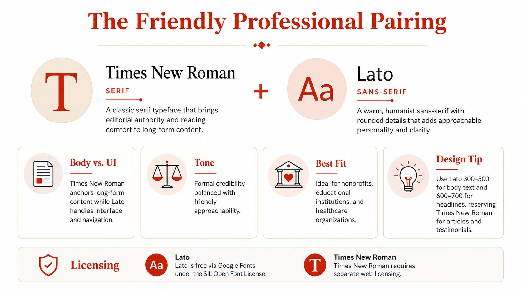
Treat Lato as a web-hosted font only after checking the applicable rights. A local mockup, public website, app, PDF, and client deliverable may involve different licensing conditions. This is practical guidance, not legal advice.
5. Times New Roman + Inter for Modern Systems
Inter was designed for interface work, making it a deliberate companion when Times New Roman anchors editorial content. Its variable-font capabilities can give a team flexible weight control through one adaptable asset, while the serif remains reserved for content that benefits from a more traditional reading texture.
The pairing fits developer platforms, financial technology products, documentation systems, and applications where precise spacing and quick scanning matter. It also supports brand systems that need a clear distinction between product mechanics and editorial explanation. Use Inter for the system layer, then let Times New Roman signal sustained reading.
Use variable behavior deliberately
A basic implementation can preserve a fallback path while allowing modern browsers to use the variable file:
@font-face {
  font-family: "Inter";
  src: url("/fonts/inter-variable.woff2") format("woff2");
  font-weight: 400 700;
  font-display: swap;
}

.ui {
  font-family: "Inter", Helvetica, Arial, sans-serif;
  font-weight: 450;
}

.editorial {
  font-family: "Times New Roman", Times, serif;
}
Add feature detection when the project supports clients with different variable-font capabilities:
@supports (font-variation-settings: normal) {
  .ui {
    font-variation-settings: "wght" 450;
  }
}
Assign Inter to navigation, controls, tables, alerts, and dense interface text. Keep Times New Roman for long-form content, policy documentation, research notes, and selected introductions. Small dashboard labels should prioritize legibility and space constraints rather than applying the serif everywhere in the brand guide.
Production insight: Variable fonts can reduce delivery complexity, but teams still need to test fallback behavior, file size, rendering, and license scope.
Review the delivered file with Inter font details from Font Checker Pro. Confirm that the variable asset is used, then check exported PDFs and documents for embedded Times New Roman files. Desktop use and web embedding involve separate rights questions. This information is practical guidance, not legal advice.
6. Times New Roman + Montserrat for Contemporary Editorial Work
Montserrat's geometric construction gives headlines a distinct presence, setting them apart from Times New Roman's editorial body copy. The pairing suits lifestyle publishing, creative agencies, fashion, hospitality, and startup pages that need contemporary energy without abandoning a familiar reading voice.
Assign Montserrat to headlines, navigation, section labels, and campaign statements. Keep Times New Roman for article bodies, case-study narratives, longer captions, and supporting explanations. Using Montserrat across every text layer can make continuous reading feel rigid, especially in narrow columns.
Protect the hierarchy from visual noise
Keep the active weight set small. Regular works for utility copy, semibold for subheads, and bold for primary headlines. This creates a clear hierarchy without adding unnecessary files or making the system appear improvised.
body {
  font-family: "Times New Roman", Times, serif;
}

h1, h2, h3, nav, .tag {
  font-family: "Montserrat", Arial, sans-serif;
}

h1 {
  font-weight: 700;
}

h2, h3 {
  font-weight: 600;
}
Montserrat can serve body copy when line length is generous and the layout has room to breathe. Times New Roman remains the safer choice for narrow article columns. Test line length, paragraph density, and mobile wrapping together. A headline that works in a wide desktop composition may become oversized when it breaks across several short lines.
Review the live stylesheet and exported assets with Font Checker Pro. Confirm the Montserrat files, self-hosted variants, and rights covering Times New Roman in the final environment. A web font and a desktop installation can involve different licensing terms, so check that the selected use is covered. This information is practical guidance, not legal advice. For a related interface comparison, see Inter font details from Font Checker Pro.
7. Times New Roman + Poppins for Contemporary Hybrid Brands
Poppins pairs with Times New Roman by softening the serif's formality through rounded, geometric forms. The result suits fintech, modern education, health technology, and startup brands that need trust with approachability. Its geometric construction brings a contemporary signal, while Times New Roman keeps longer or formal material grounded.
Assign Poppins to buttons, tabs, navigation, account controls, and promotional headings. Use Times New Roman for educational material, policy documentation, editorial articles, and explanatory content. This division gives users a consistent cue: the sans serif marks interaction, while the serif identifies sustained reading or formal information.
Test compact controls in the real interface
Poppins can remain legible in small interface contexts because its forms are open and relatively large in appearance. Verify that advantage at actual mobile sizes. Check labels, disabled and active states, muted colors, and uppercase navigation, which can become too wide when tracking and padding are generous.
.ui,
nav,
button,
input,
label {
  font-family: "Poppins", Arial, sans-serif;
}

.ui {
  font-weight: 400;
}

.ui strong,
.ui .emphasis {
  font-weight: 600;
}

h1, h2, h3 {
  font-family: "Poppins", Arial, sans-serif;
  font-weight: 700;
}

.prose,
.policy,
.article {
  font-family: "Times New Roman", Times, serif;
}
Keep the active weight set limited. Regular, semibold, and bold cover most interface hierarchies, reduce loaded files, and make CSS rules easier to audit. Combine the type choices with clear color contrast, visible control states, and enough spacing. A contemporary appearance is not a substitute for usable interaction.
For fintech and education platforms, inspect the rendered page and exported assets. Font Checker Pro can identify Poppins delivery, expose unexpected weight overrides, and flag Times New Roman usage without a matching web license. Keep the audit report with release documentation, and verify that each font's web or desktop rights cover the intended environment. This guidance is practical information, not legal advice.
8. Times New Roman + Quicksand for Approachable Technology
Quicksand's rounded geometric forms make Times New Roman feel less institutional, which suits consumer apps, wellness products, travel interfaces, children's learning platforms, and lifestyle services. The pairing works when the type roles are deliberate, not mixed for contrast.
Use Quicksand for navigation, microcopy, onboarding prompts, and calls to action. Reserve Times New Roman for terms, policies, editorial content, and help articles. This separation keeps formal information credible while giving task-oriented screens a more approachable tone.
Preserve clarity in the smallest controls
Quicksand needs room around its rounded forms. Dense tables, crowded cards, and tightly packed menus can reduce letter distinction and weaken scanning, so simplify the interface and separate labels from controls.
body {
  font-family: "Times New Roman", Times, serif;
}

nav,
button,
.microcopy,
.input-label {
  font-family: "Quicksand", Arial, sans-serif;
  font-weight: 400;
}

button.primary,
.cta {
  font-weight: 700;
}
Test the actual small sizes on physical phones, including muted colors, focus states, and low-contrast conditions. A bold Quicksand treatment can prioritize one call to action, but applying it to every label removes hierarchy. Check line wrapping and tap-target spacing at the same time.
For app assets, inspect PNG and SVG exports alongside the web stylesheet. Image-based font identification can reveal whether the intended face survived export, while a live scan can show whether Times New Roman is embedded through a web-delivery method that its license does not cover. Keep the audit evidence with the design handoff, verify the files before launch, and confirm that web and desktop rights match the intended use. Font licensing guidance is practical information, not legal advice.
Times New Roman, 8 Font Pairings Compared
| Pairing | Implementation complexity | Resource requirements | Expected outcomes | Ideal use cases | Key advantages |
|---|---|---|---|---|---|
| Times New Roman + Helvetica (Corporate Stability) | Low on desktop; moderate for web (Helvetica may need licensing/fallbacks) | Minimal payload when using system fonts; define robust fallbacks; broad charset support | Authoritative, formal, highly legible across print and UI | Legal, finance, government, enterprise docs and intranets | Trusted corporate tone; pre-installed on many OS; very legible; low file overhead |
| Times New Roman + Open Sans (Modern Digital Balance) | Moderate, mix of web-hosted Open Sans + TNR fallbacks; manage font-display to avoid CLS | Open Sans via Google Fonts (free, multiple weights); Times New Roman needs system or separate web license | Balanced editorial credibility with screen-optimized readability | News sites, digital publishing, educational platforms, nonprofits | Free, well-tested web font; strong screen hinting and accessibility; good Unicode coverage |
| Times New Roman + Roboto (Google Ecosystem) | Moderate, standard web loading from Google Fonts; careful weight selection recommended | Roboto (free, many weights) + TNR licensing for web if required; low–moderate payload | Modern tech-friendly editorial balance; scalable across devices | Tech companies, SaaS, Android/Material Design products, docs | Open-source Roboto with strong UI performance; tight metrics for dense interfaces |
| Times New Roman + Lato (Friendly Professional) | Moderate, web-hosted Lato with tuning for weight balance | Lato via Google Fonts (free, 10 weights); Times New Roman separate web license if used | Warm, approachable professionalism while retaining authority | Education, healthcare, nonprofits, consultancies | Humanist warmth improves brand approachability; good legibility; budget-friendly |
| Times New Roman + Inter (Modern Systems Font) | Moderate–high, optimal when using Inter as a variable font with CSS feature detection | Inter variable font reduces payload (single .woff2); requires modern browser support; TNR licensing | Performance-focused, accessible UI combined with editorial anchor | Developer platforms, modern SaaS, fintech, documentation sites | Variable font efficiency; strong accessibility and Web Vitals alignment; developer-friendly |
| Times New Roman + Montserrat (Contemporary Editorial) | Moderate, many weights available but recommend limiting selection to avoid excess | Montserrat via Google Fonts (many weights → higher payload if overused); TNR needs separate licensing | Contemporary, geometric editorial look with strong personality | Creative agencies, lifestyle brands, modern magazines | Distinct geometric voice; extensive weight range for rich hierarchy; visually striking |
Choose the Pairing You Can Defend
The strongest choice depends on the job Times New Roman needs to perform. Choose Helvetica when the system must feel formal, corporate, and controlled. Choose Open Sans for publishing, news, academic content, and digital editorial products that need a calm screen companion. Choose Roboto when Times New Roman is a limited editorial layer inside a product interface, dashboard, or documentation system.
Lato is the better fit for approachable institutions. It gives universities, healthcare organizations, nonprofits, and consulting firms warmth without discarding authority. Inter is the practical choice for performance-focused systems that need flexible interface weights, responsive behavior, and a clear separation between product UI and editorial content.
For expressive editorial work, Montserrat creates the strongest geometric contrast. It can give a lifestyle brand, creative agency, or magazine a more deliberate visual identity, but it needs whitespace and restraint. Poppins fits contemporary hybrid brands that want polished interaction design with a softer personality. Quicksand belongs in friendly consumer experiences where rounded forms support the brand rather than undermine formal content.
Whatever the pairing, test the system as a complete production decision. Check heading and body hierarchy, contrast, line length, fallback behavior, mobile rendering, PDF output, image exports, and the files delivered through the browser. Matching x-heights and compatible stroke rhythm matter because successful pairings differ while retaining enough structural harmony to feel intentional. Practical type-pairing guidance also recommends clear role assignment, a limited type palette, device testing, and readable body sizing.
Licensing deserves the same attention as visual quality. A desktop license generally covers local installation for design work, print layouts, mockups, presentations, or exported creative assets. A web font license covers serving the font to site visitors through mechanisms such as @font-face, and those permissions aren't interchangeable. Usage terms may also depend on pageviews, monthly visits, domains, or the number of properties covered, so a typeface that works in a local mockup may need different rights on a public website. This overview of desktop and web font compliance explains why teams should verify the intended use instead of assuming installation rights are enough.
In the United States, statutory copyright damages for font misuse can range from $750 to $30,000 per infringed work, rising to $150,000 per work for willful infringement, and rights holders may also seek retroactive fees. The licensing explanation from SK Legal Guidance provides that context, but this article isn't legal advice. Have counsel review disputed rights, contracts, and jurisdiction-specific exposure.
Document the font source, license tier, file name, fallback stack, and final output. For teams that need an exportable audit trail, Font Checker Pro can scan live URLs, PDFs, images, and zipped font sets, identify typefaces and likely source evidence, benchmark payload and fallback behavior, and produce reports for operational or compliance review.
Font Checker Pro can inspect the Times New Roman pairing you plan to ship across live pages, PDFs, images, and zipped font sets, while helping surface licensing evidence, fallback issues, and delivered font assets. Visit Font Checker Pro to review your typography before launch and keep a defensible record for your next handoff.